Flaws in UX design standards: Empty states
An empty state is something that is easily overlooked by inexperienced designers, however, they can be an important factor when it comes to an app’s overall user experience.
Sometimes designers see error messages and empty states as blank canvases where there’s a good opportunity to do something creative. But that design phrase that is as old as design itself comes into play: “less is more.”
Take this empty state from Google Photos:
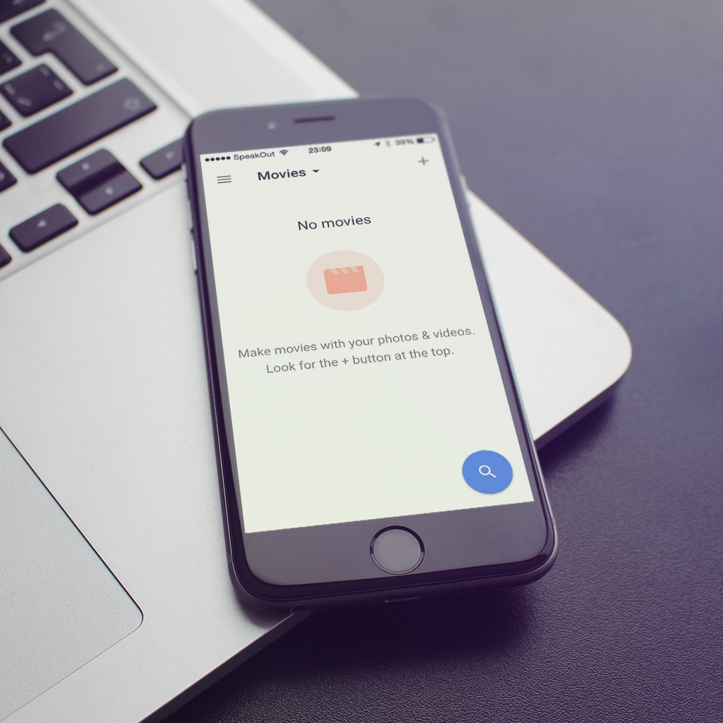
At first sight, it seems great, right? Well composed layout following the guidelines, with beautiful graphics on it.
At a second glance, though, there are some strange things here:
- Why is there a prominent search button if there are no collections? Why would you want to search in nothing?
- The second most prominent element, the image is obviously not tappable (although many would try).
- The hint says I should be looking for the ‘+’ sign on the top which is super awkward. Why does the hint itself not contain an Add button? It’s like saying “click on the Continue button to continue”.
Empty states in all cases should read like this, “Oh, doesn’t look like you have any of the things. Let’s go get the things right now by pressing this large button that gets the things!”
Like I said, less is more. Have a browse of Emptystat.es for a full gallery of further examples.