What is flat design?
The digital world today is dominated by flat design. But what exactly is flat design? Where did it come from, and is it here to stay?
In this post, I break down the ins and outs of flat design according to five useful articles:
- The beginner’s guide to flat design, Creative Bloq
- The history of flat design: How efficiency and minimalism turned the digital world flat, The Next Web
- The future of flat design, The Next Web
- Is Flat Design a Web Design Standard That’s Here to Stay? 10 Designers Chip In, Adobe Dreamweaver
- The Pros, Cons and Future of Flat Design, Canva Design School.
What is flat design?
Flat design is a design that’s stripped of any sort of impression of the third dimension.
Unlike rich design – which includes drop shadows, gradients, textures and 3D elements – or skeuomorphism, which represents items as their real-world counterparts, flat design takes a minimalist approach which values usability and functionality over ornamentation.
Flat design is characterised by:
- open space
- crisp edges and clean lines
- grid layout
- bright, contrasting colours
- two-dimensional illustrations
- simple typography (typically sans-serif)
- concise text
- clear UI elements (buttons and links).

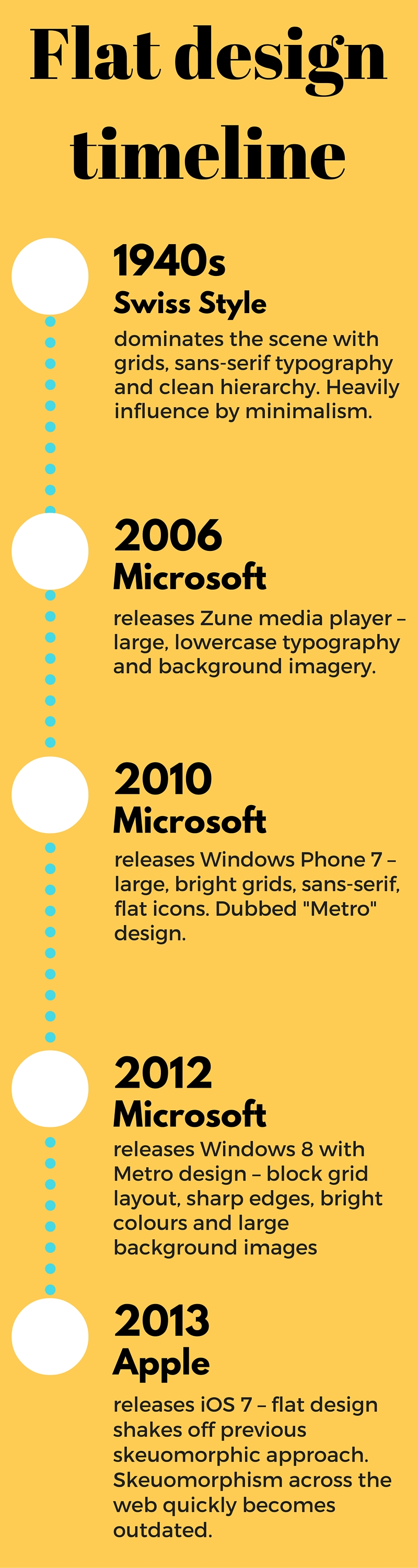
Where did flat design come from?
Flat design has a history stretching back to the Swiss Style of the 1940s and 50s. This timeline shows the main events that helped shape flat design as we know it today:
Why use flat design?
There are many pros for using flat design. According to The Pros, Cons and Future of Flat Design, these include:
- Responsive design: the grid layout of flat design allows web elements to be easily resized or rearranged for different devices and screen sizes.
- Flexible framework: the grid layout makes it easier to scan and navigate web pages quickly. In addition, designers are able to use flat design to showcase content, rather than “squeezing content in a predetermined layout.”
- Clean, readable typography: large, uniform typography without shadows and other effects makes text more accessible and easier to read.

As with all design approaches, there are cons to using flat design, which include:
- Lack of visual cues: flat design relies on user’s familiarity with common web UI elements, but sometimes designers fall in the trap of removing all visual cues that something is clickable or not, making scanning and usability more difficult.
- Lack of distinctiveness: “Sticking to a simplistic, narrowly defined visual style often results in designs that look very or somewhat similar.” – The Pros, Cons and Future of Flat Design
- Too focused on trends: designers sometimes sacrifice easy readability to follow trends in flat design, such as long shadows or thin and light typefaces.
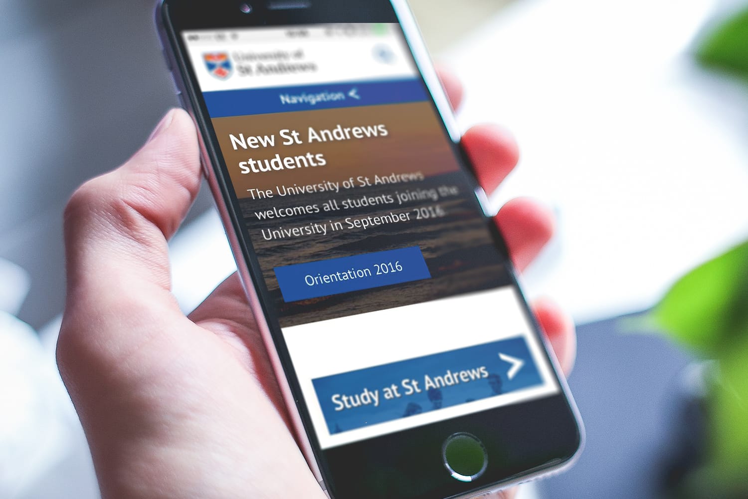
Flat design on the University website
The University of St Andrews website uses flat design elements on all of the central pages, which include:
- sans-serif typography (PT Sans): this typeface is easy to read and scan.
- Bold colours: the colours for buttons and navigation bars meet accessibility requirements and help UI features stand out.
- Grid layouts: a geometric layout makes the website responsive for different screen sizes.
- Large, high-quality photo images
- Ghost buttons: the text on some tile links have semi-transparent backgrounds that share the focus with the images behind them.
By using flat design, the University website is keeping up-to-date with current design trends, making sure that we meet the expectations of web users. It’s always necessary, however, to keep abreast of new design trends making their way to the forefront so that we don’t fall behind the competition.
What is the future of flat design?
Flat design is beginning to shift away from the purely two-dimensional look. Google appears to be integrating flat design with rich elements, such as subtle gradients and drop shadows.
Other elements recently introduced to flat design, according to The future of flat design, include:
- Long shadows: a darker colour dropping away from text or UI elements at a 45° angle.
- Ghost buttons: simple or transparent outline that allows the background to share focus with UI elements.
- Parallax scrolling: background images move by the camera slower than foreground images, creating an illusion of depth in a 2D scene and adding to the immersion.
- Photos: large, photo images used as main visual content are being used “in concert with flat elements, navigation and typography.”
- Material design: a visual language developed by Google which uses paper-like layering (with subtle shadows) on grid-based layouts to create a hierarchy.
Hybrid flat designs, such as “Flat 2.0” or “almost-flat”, are subtly reintroducing richer elements such as shadow and texture.
tl;dr Flat design prioritises usability and content over fluffy design features, and works well with different screen sizes and accessiblity needs.