It’s time to make your site retina ready
Some members of the digital communications team have updated their hardware. Right now, I’m rocking around the internet using a 2K “built-in retina display” monitor and the best comparison I can make to how it feels is when you put new prescription glasses on for the first time. The clarity is remarkable. However, viewing the internet from this perspective has changed the way I see the University’s website.
What is retina display?
For those who don’t quite understand the improvement that a retina display can bring, here is Steve Jobs introducing the concept back in 2010.
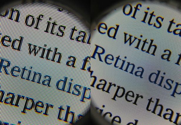
Comparing to a non-retina display under a microscope says it all.
Most modern smartphones have retina displays and have done so for quite sometime now. With a 4K display technology boom in process, it’s only a matter of time before this level of clarity for all web users will become the standard for all devices. From my perspective, it’s time that we all prepared our websites for a super high-definition internet world.
Images on a retina display
Standard-resolution images will look fuzzy on a retina display because retina displays have four times more pixels than standard screens. A 360 x 240 image is scaled to 720 x 480 pixels, but there’s no additional detail. This can be noticeable when compared to crisper fonts and other high-resolution images.
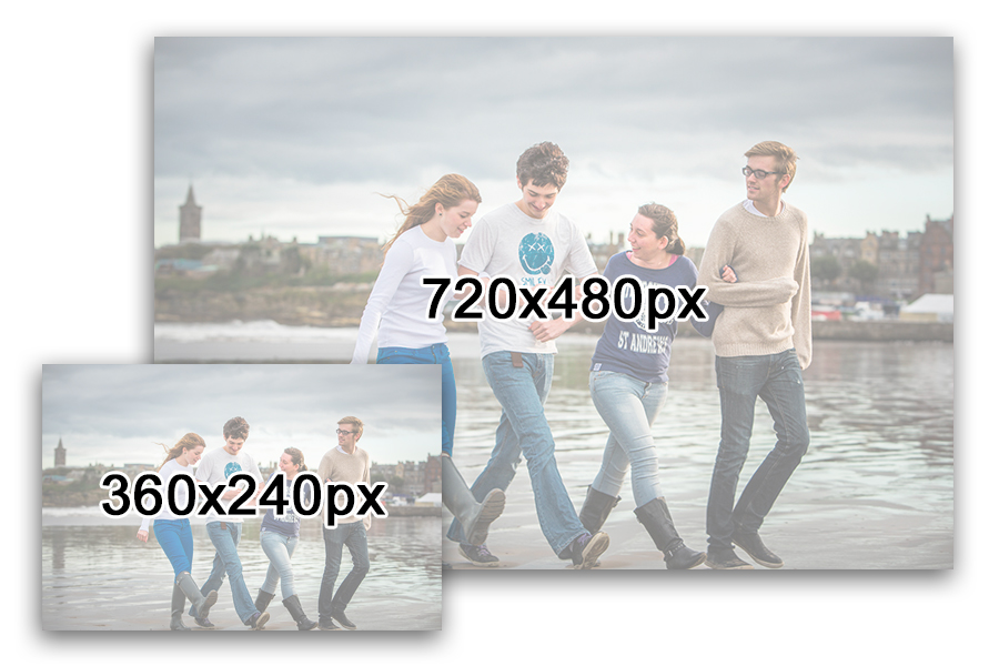
We have used 360 x 240 sized images across many areas of the University website. In order from them to render well on high pixel density displays, all of these images will have to be replaced with 720 x 480 alternatives.
An image that is double the size is likely to weigh double the file size as well. This is where image compression tools will be required to reduce unnecessary weight. It is important to work carefully with image compression tools before uploading any image to a website.
I recommend using ImageOptim for image compression.
Scalable vector graphics (SVGs)
When re-designing the ‘Study at St Andrews’ site back in 2013, it was our intention to cater towards retina displays with the latest in best digital practice. The trick to catering to retina displays on the web is through use of scalable vector graphics and CSS3 effects. The size of SVG images are determined in browser — they will always be smooth because they are defined using vectors (lines and shapes) rather than individual pixels.
On the University website, the most notable SVG image we use is the University of St Andrews logo. Embedded below is the SVG image that is currently in use on the University homepage.
See for yourself, zoom in and notice how the image will always scale appropriately.
Pretty neat, huh?
Webfonts icons
Sourcing SVG images for all required icons is unnecessary as there are various commercial and free-to-use webfont sets available online that cater almost every user interface possibility.
We use a well-supported webfont set called Font Awesome for any icons used on the University website. These icons range can from email envelopes, telephones, widget controls, and social media logos.
A list of all the icons we support are listed within the Font Awesome page within the digital pattern library.
I’ve been able to view the University website through retina displays on mobile devices for the past four years. Although the reduced quality of the images has bothered me slightly, I have never regarded it as a priority until I started using my updated display.
Unless you are already catering for retina displays, it’s only a matter of time before image quality on your own site will start to become an issue.