New University library homepage
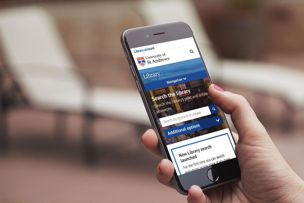
On Monday 13 January 2019, the digital communications team launched an improved University library homepage. This update was made in light of the feedback gathered by library staff in focus groups and from the design sprint we ran in October 2018.
The updated homepage was made to improve the library’s digital experience. This post looks at some of the key changes we’ve implemented.
What’s new?
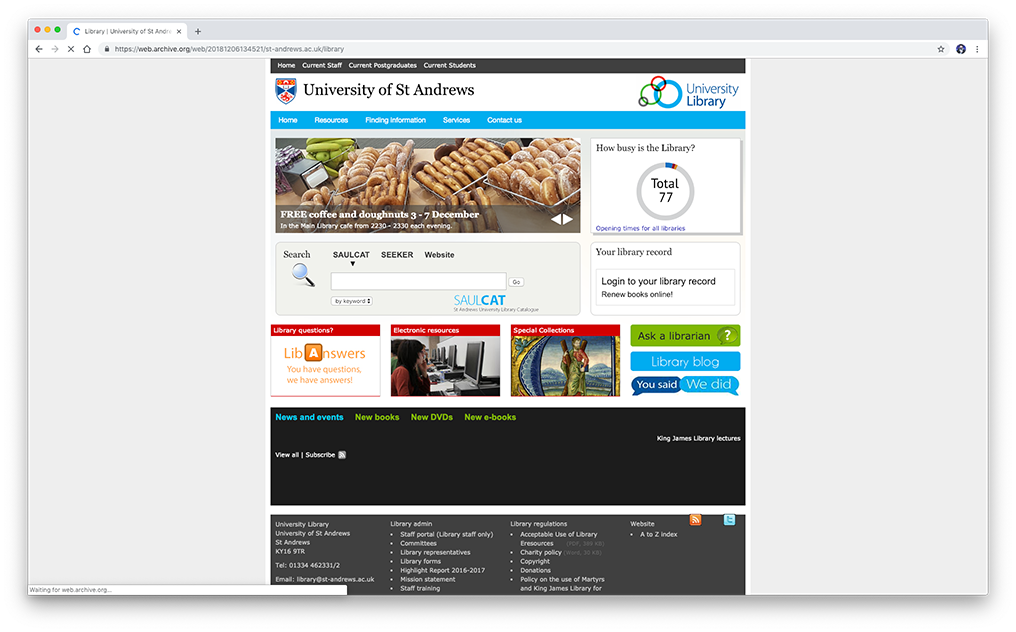
Most noticeably, the look and feel of the site is consistent with the main University website and now displays correctly on mobile devices. Here’s what the old library homepage looked like:
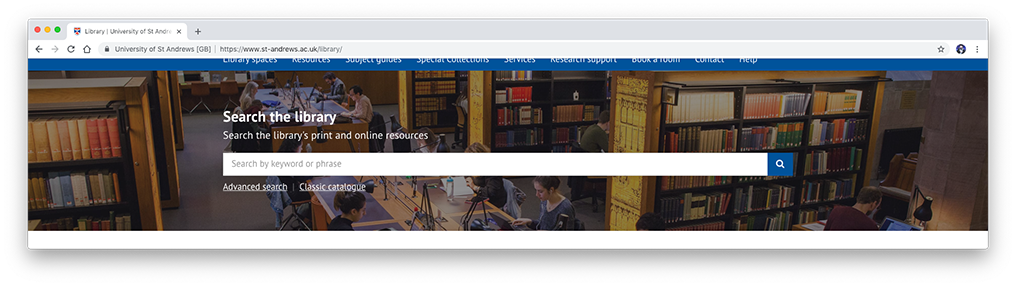
And here’s the updated library homepage: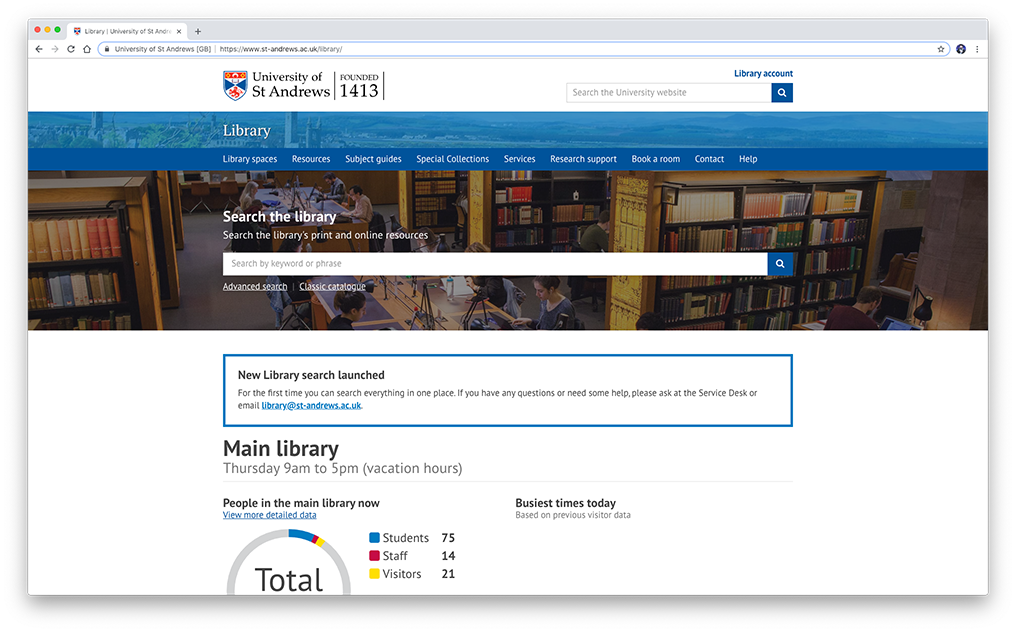
Main improvements
Search bar banner
The catalogue search bar banner is now the most prominent feature on the library homepage. One of the findings from the design sprint was that the terminology and functionality of the tabs on the previous search banner were confusing. Users were also using the search banner field if they were lost on the library homepage.
We have removed the tab features from the initial search. There is now a feature to filter through your results after an initial search.
Users have the ability to use the advanced search and the classic catalogue if required.
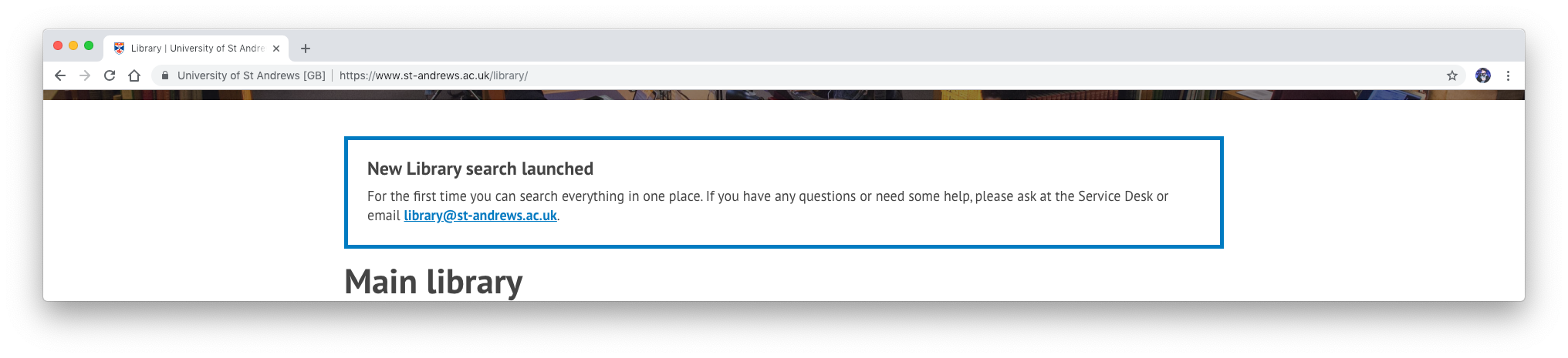
Alerts
Alert boxes can now be added to the homepage when critical information needs to be communicated to library users.
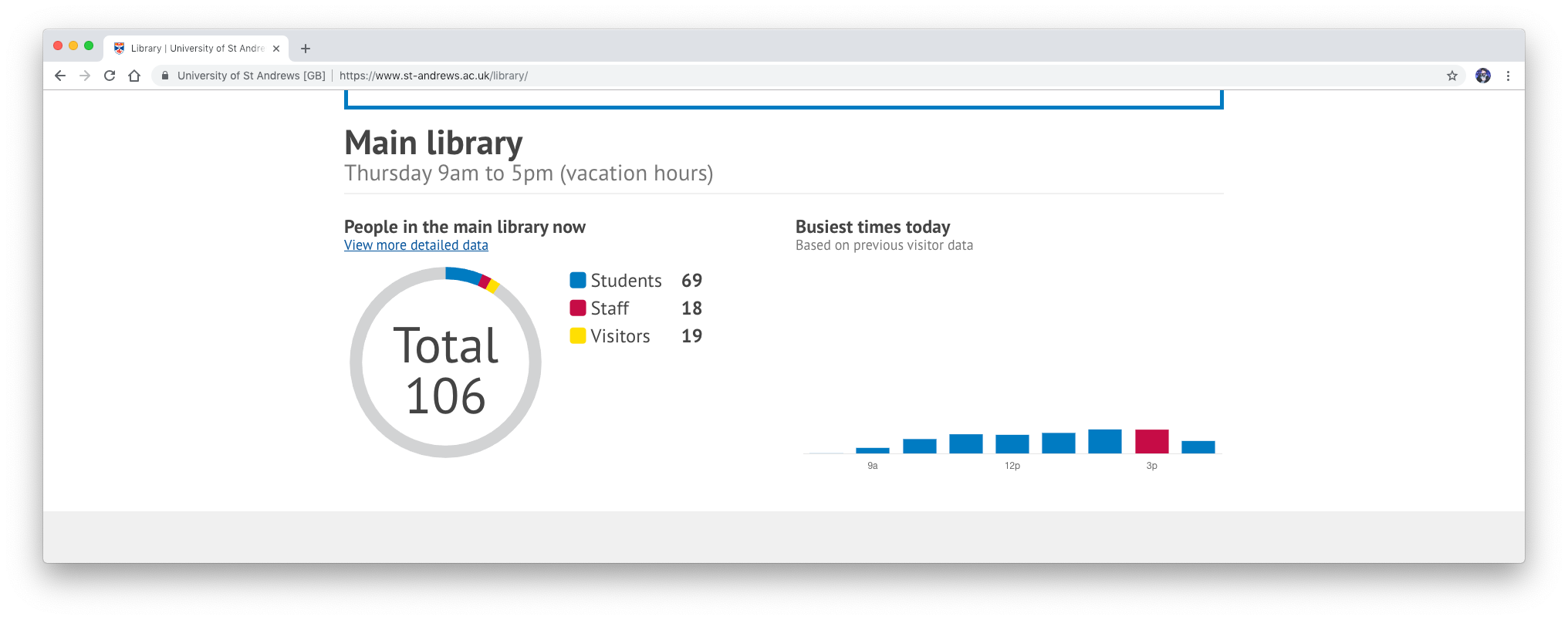
Detailed library occupancy data
We have improved the data displayed on the library homepage regarding main library building busy times and current building occupancy.
We have taken inspiration from Google to display busy times on the library homepage. The graph displays previous visitor data from the year before to gauge estimated volumes of students in the present.
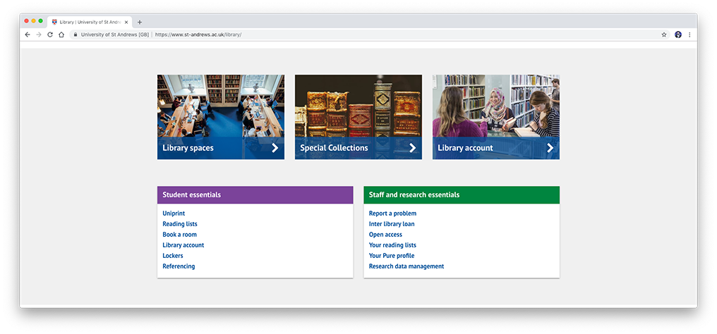
Navigation essentials for students and staff
Similar to our changes to the University homepage, we have added panels below the three main navigation boxes which include quick links to cater top tasks based on audience. Future usability testing will determine the user satisfaction and success rates of this inclusion.
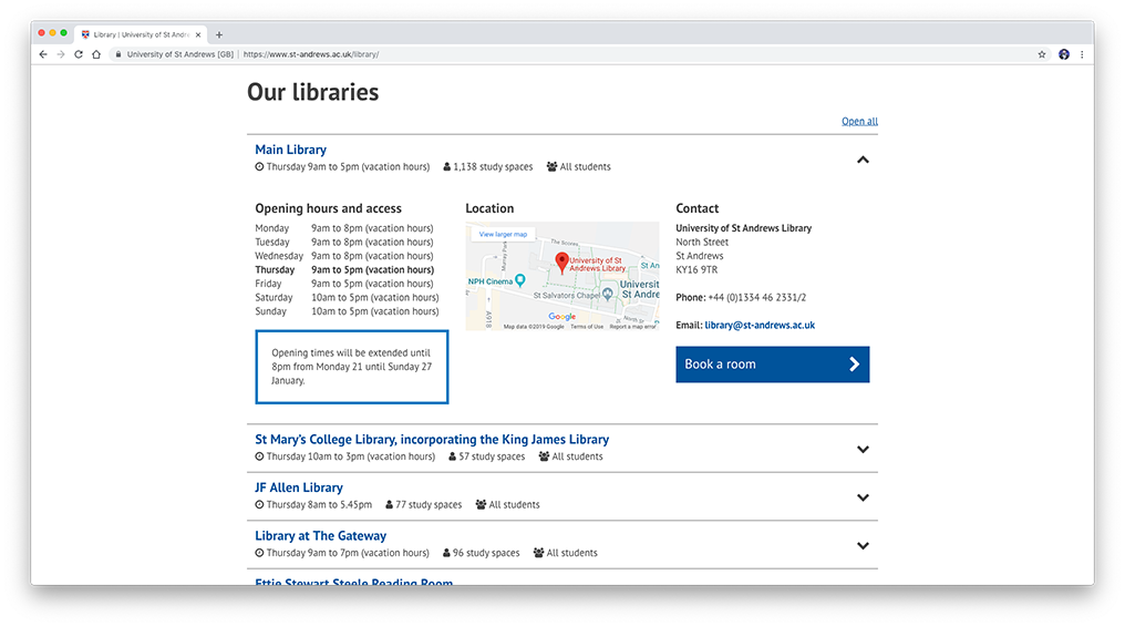
Accordions with key library info
Quickly finding key information such as opening times and student access for each library was a strong user requirement. Location and contact information for each library was a secondary user requirement.
Previously, in order to find this information, users had to know to navigate to the correct page. This critical information is best displayed on the homepage.
To cater this, we have included accordions on the library homepage which prominently displays daily opening times, maximum study spaces available, and audiences which can access the facilities.
Upon opening the accordion, full opening time information is displayed along with the libraries address and location on a Google Maps embed.
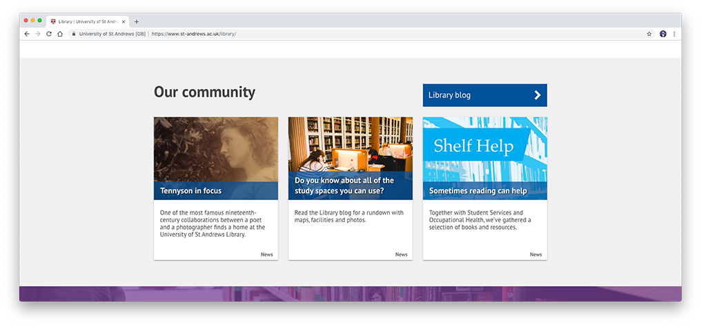
Community
The carousel on the previous library homepage displayed community news and upcoming events. In the modern web age, image carousels are problematic.
To counter act this, community news is displayed via news tile patterns.
There is future scope to improve this section with a combined feed of news, events, and social media posts.
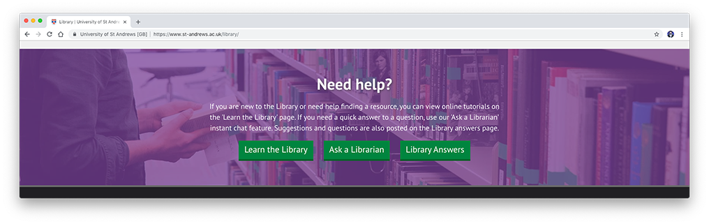
Help banner
While links to the main ‘help’ page are present in the top navigation bar and footer, an expanded help banner sits at the bottom of the main content for users who require it as a last resort.
Future usability testing will determine the user satisfaction and success rates of this inclusion.
Future updates
The digital communications team are dedicated to supporting and improving the University website in response to the requirements of the user. If you use the University website in any capacity, we welcome any feedback you may have regarding your experiences with it.
We will also be conducting usability testing regarding these changes in the near future. If you would be interested in participating, or you would just like to send us any feedback, please contact us by email via [email protected].