Improvements to accordions
Frequent users of the University website may have noticed a visual change to the accordion patterns. We have applied some much needed improvements to the accordion pattern in line with the design methodology of GOV.UK.
Problems with the old accordions
Use of colour
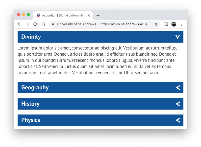
The old accordions used our primary blue as an accent colour. This colour is also used on the website to associate a navigable or interactive element causing a lack of distinct visual difference between accordions and buttons.
This reduced the visual importance of buttons and links, particularly on pages with a significant number of accordions. Users would be presented with an overwhelming amount of the primary blue colour, and the buttons would largely be hidden in the clutter.
While accordions are interactive content components, they have no navigation functionality. The prominence of an accent colour should be reserved for links, buttons, and other web elements that confirm a navigation action can by carried out by the user.
Arrow direction
The previous accordions had chevrons that pointed to the left and when opened would rotate to point downward. This style was adopted from BBC global experience language back in 2013.
The initial arrow direction did not make it clear to users that this was an accordion pattern and could be opened. It was styled as if it would take you back a page.
The chevron icon was a PNG image file requiring an additional file download to display, increasing load times in regions with slower connections and reducing the usability of the pattern if never loaded at all.
They could not open all at once
The previous accordions were created individually and could not be grouped. This meant that we could not target all of the accordions on a page to open at once. This was a desired feature on pages which featured many accordions.
Spacing
Accordions were styled each with a bottom margin that allowed spacing. This would leave the content disjointed and made them further look like buttons.
The new accordion pattern
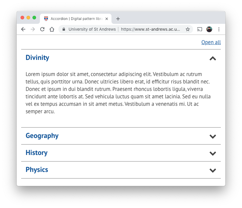
Flows with content visually
The updated accordion pattern more closely relates to other content on web pages. It no longer bears resemblance to buttons, allowing for links to be easily identifiable.
Improved arrow direction
Logically, the arrows of the accordion now point upward and downward depending on whether the accordion is open or closed. The animation of the accordion opening remains to allow the user to visually recognise that they have successfully revealed more content.
Keyboard accessibility
Accordions are now fully navigable with a keyboard, improving accessibility.
Accordion groups
Associated accordion items are now grouped together to give more semantic meaning.
Open or close all
Now that accordions can be grouped correctly, an open or close all toggle is available which will set all accordion items to open or close in that respective accordion group.
Font Awesome
The PNG chevron image has now been replaced by a similar icon style from the Font Awesome library. This improves the clarity of the icon as it is now in a vector format and it removes an unnecessary download. This icon is also used on our navigation bar and navigation box patterns.
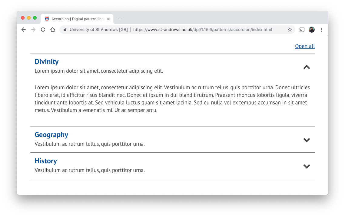
Accordions with summary
Sometimes it can be hard to convey the exact content of a closed accordion panel in a short clickable title. For this reason we have also included the option to add a short summary to compliment the accordion titles. This is intended to help users quickly identify a specific accordion to open, rather than clicking on multiple items to find their desired content.
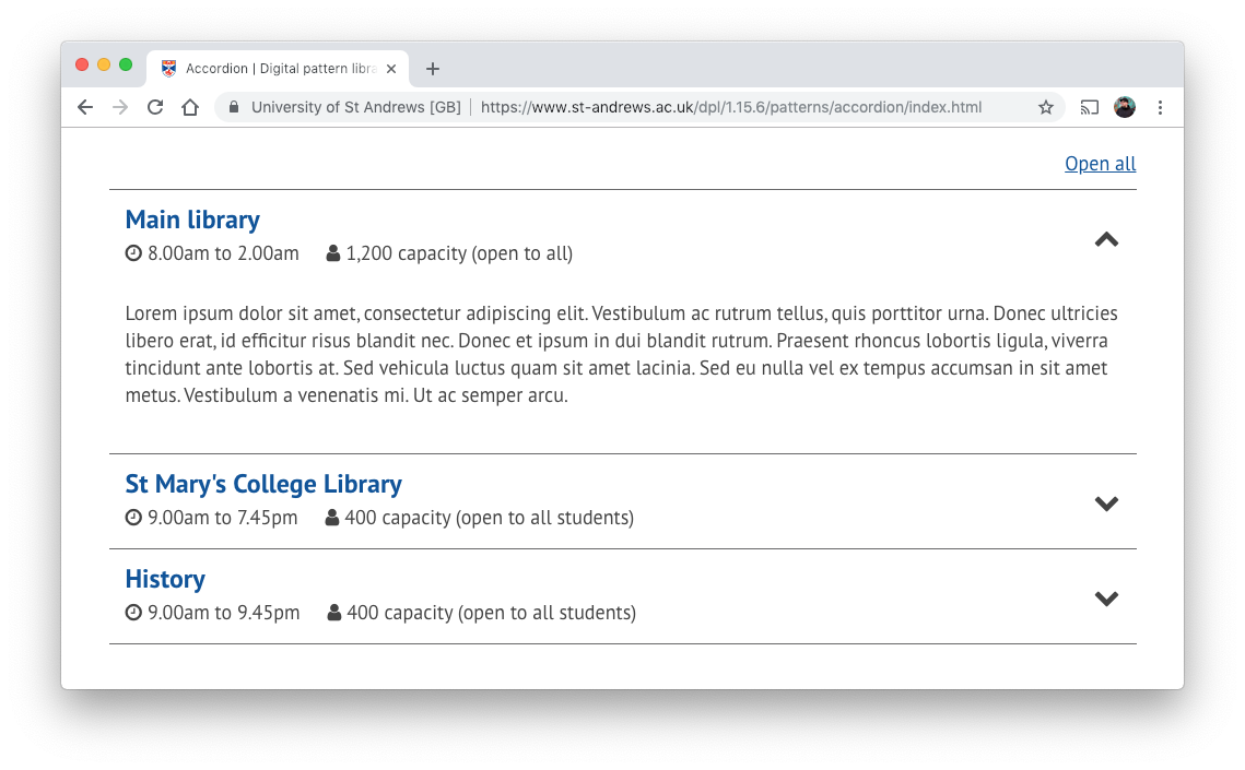
Accordions with key info
Another scenario where summary information can be broken down into a small number of key data items required a slightly different approach. This option would be best applied when the key data conveys the most important information contained within that accordion and opening the accordion will reveal additional secondary information. The intention for this is to reduce the number of users who will need to interact with the accordion in the first place.
The accordion element is part of the digital pattern library which is the responsibility of the digital communications team. It will continue to evolve to meet the needs of its user base through usability testing, accessibility guidelines and analytical data.