Designing for users on the autistic spectrum
Users on the autistic spectrum can benefit from accessible web-based services. This guidance is for web and digital professionals who want to make sure that their service is accessible for users on the autistic spectrum.

Use simple colours
Don’t use bright contrasting colours.
Some users may experience sensitivity to sensory information such as colours which can cause anxiety or pain. Use a colour contrast ratio of at least 4.5:1 for text and test it with your users to get the right balance.
You can test contrasting colours with WebAIM’s colour contrast checker tool.
High contrast helps many people read and understand content, but some people with dyslexia, for example, suffer from contrast sensitivity meaning that black text on a white background is unlikely to be the best solution.
Bonus design tip: Never use pure black for text or backgrounds.
Write in plain English
Don’t use figures of speech and idioms.
Users on the autistic spectrum perceive language differently and might take figures of speech and idioms literally. Writing clear, plain language will mean your content is understood by more people.
Avoid the use of metaphors, exaggeration, ambiguous language or turns of phrase that may have more than one meaning.
Plain english: “It was raining heavily.”
Phrase: “It was raining cats and dogs.”
Writing in plain English is also beneficial to users who are deaf or hard of hearing as they may consider English to be their second language. Sentence structure differs between English and British Sign Language and therefore content must be kept simple.
Bonus tip: Avoid institutional jargon that average users will not understand.
Resource: Guides on how to write in plain English
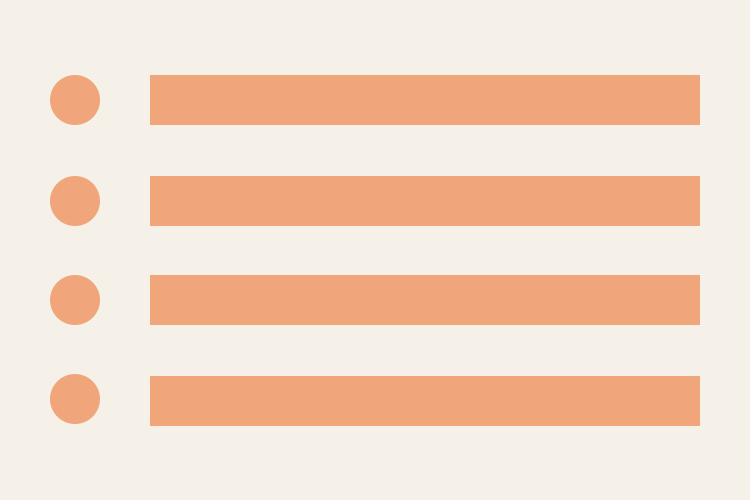
Use simple sentences and bullets
Don’t create a wall of text.
Lots of unbroken text can be hard to focus on, making it frustrating to read. Breaking text down into simple sentences and using bullets for important points will make your content easier to understand.
It can be helpful provide visual alternatives to textual material as autistic users are more likely to benefit from visual material.
Walls of text on the web are major engagement killers not only for users on the autistic spectrum, but for all users.
Breaking up walls of text with headings, lists, images, appropriate spacing, and other HTML formatting is important for visual purposes and serves and important technical purpose for SEO and screen readers.
Bonus advice: Use “Too long; didn’t read (TL;DR)” to be concise.
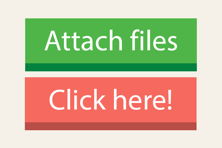
Make buttons descriptive
Don’t make buttons vague and unpredictable.
Not knowing what will happen after clicking a button or link can cause users stress and anxiety. Descriptive buttons and links will help users know what to expect and give them a sense of control.
This is also best practice for all users as there is a clear indication what the button or link will actually do.
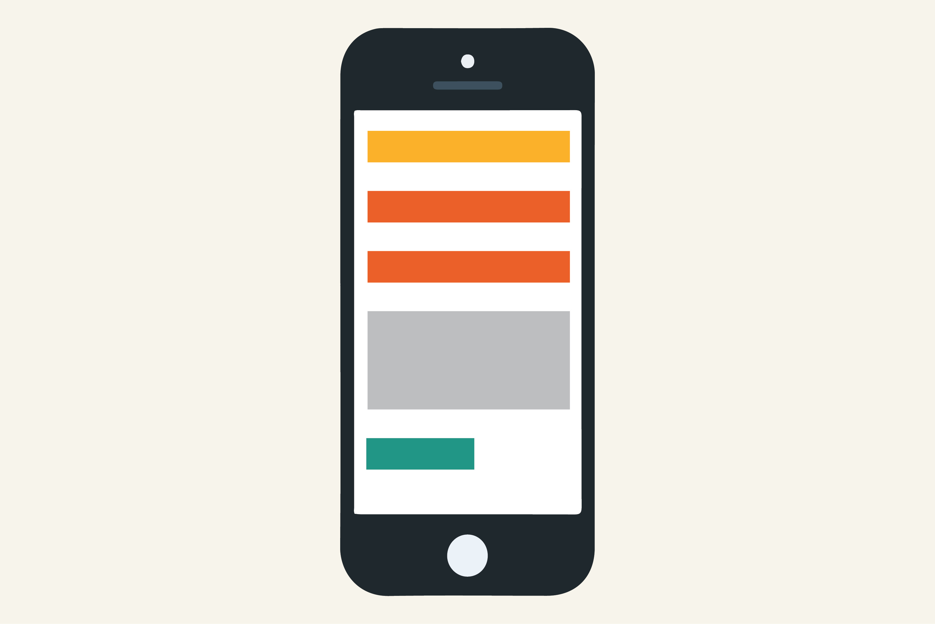
Build simple and consistent layouts
Don’t build complex and cluttered layouts.
Complex and cluttered layouts can be overwhelming for users to process. Make your layout predictable and consistent. Put common components such as navigation and search on the top of a page in a highly visible area.
We still stand by our visual design principles as a standard:
- Consistency
- Separation
- Simplicity.
Use logic when building your services and don’t make your users think too much. Websites should never be a problem-solving task for the end user.
No one should be excluded because of their disability.
As well as being the ‘right thing to do’, it’s a legal requirement to treat people with disabilities equally, in terms of opportunities and experiences. When designing a service, accessibility should be a priority.
Understanding accessibility means we can build services that work for everyone, whatever their access needs.
For best practice, follow current accessibility and plain English guidelines, as well as the requirements of the Equality Act 2010 and Northern Ireland equality legislation.
Resources for this article
- Information from this post heavily used advice from the poster series, Dos and don’ts on designing for accessibility, designed by the Home Office
- A case study on a user with Asperger syndrome
- National Autistic Society
- Websites and Mobile Applications Accessibility Regulations 2018