Designing for users with low vision
In a fact sheet on vision impairment and blindness, the World Health Organization (WHO) estimates that approximately 1.3 billion people live with some form of vision impairment.
“Low vision” refers to visual impairments other than blindness. In many contexts, low vision only includes impairments that are not corrected with regular glasses, contact lenses, medicine or surgery.
Most low vision is caused by eye diseases and health conditions such as cataracts, glaucoma, and diabetes. These are more prevalent in older people. Some low vision is from birth defects or injuries.
Five categories of visual impairment that impact web use (not including total blindness) are:
- Low visual acuity (blurriness)
- Light sensitivity (photophobia)
- Contrast sensitivity
- Field of vision loss
- Colour blindness
This guidance is for web and digital professionals who want to make sure that their service is optimised for users with low vision.
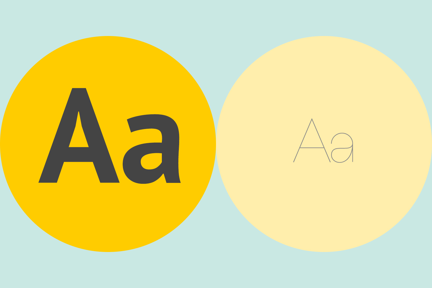
Use a font with a high colour contrast and a readable font size
Don’t use low colour contrasts and small font sizes.
Making the default appearance of text easy to read will mean that people with visual impairments can take in the information quicker, particularly if assistive technology is not available.
You have to forgo aesthetic for legibility. That means:
- no light grey font colours on white backgrounds
- no uppercase formatting on all letters
- a standardised default typeface.
To check if your font colour is accessible, use the WebAIM contrast checker tool.
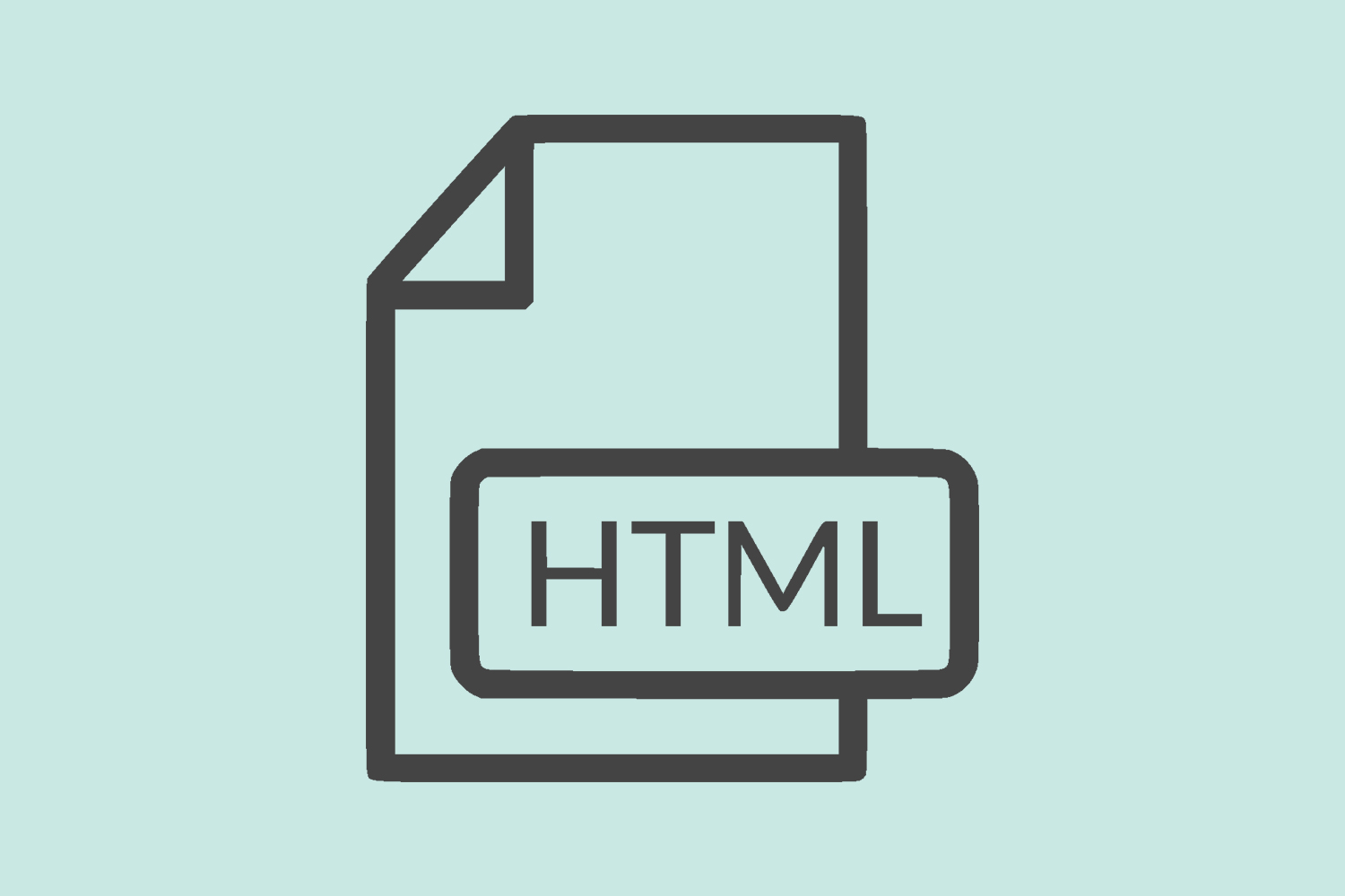
Publish all information on web pages
Don’t bury information in downloads.
HTML is the most accessible format because users can change the appearance of web pages to meet their needs – for example, changing background colours and increasing font sizes. The text can also be read aloud.
Other formats often require extra steps and software to open, and can be harder to navigate and have less flexible display options such as inaccessible PDF files.

Use a combination of colour, shapes and text
Don’t rely on colour alone to convey meaning.
Colour vision deficiency (colour blindness) is a common condition which makes it difficult to identify certain colours. This can make it hard to understand elements like buttons and graphs which rely only on colour to convey information. Use other signifiers like text labels or different styles of dashed lines in those cases.
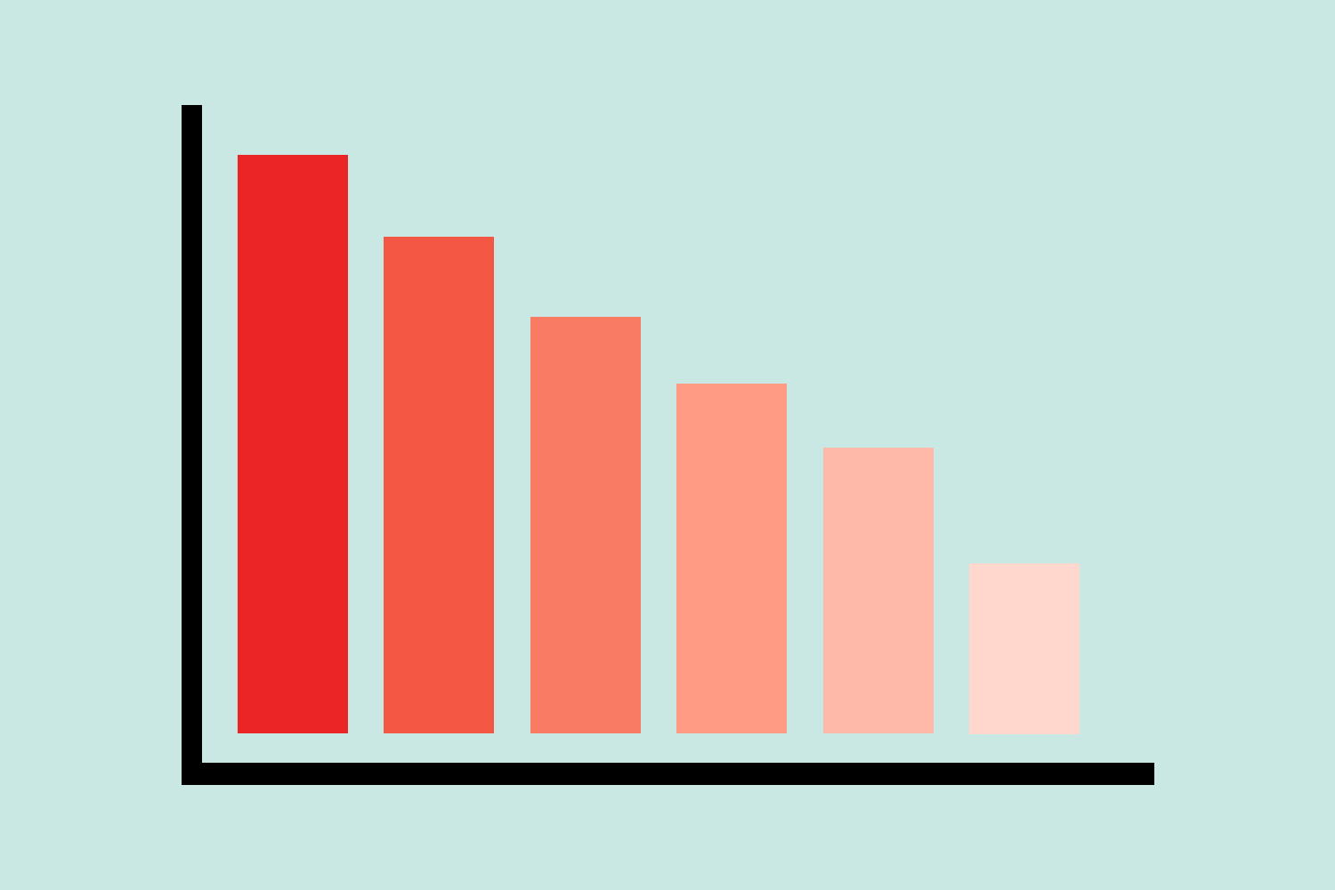
Use a single hue scaled colour palette for comparative data
Don’t use contrasting colours.
Colour blind users with achromatopsia (total colour blindness) are always at a disadvantage when reading charts and graphs as they essentially see in black and white.
When displaying comparative data with charts and graphs it is important to refer to a single colour palette. This will mean that differing colours (and the corresponding data) can be identified based on how light or dark they are. Using contrasting primary colours may be easily distinguishable for typical users, but they may share similar hue values and therefore look identical to a user with achromatopsia.
Here is a data colour picker tool using colours on a single hue scale.

Follow a linear, logical layout
Don’t spread content all over a page.
Users of screen magnifiers can miss content like side columns if they are not well signposted or expected. This is particularly likely to affect users if they rely on the tab key to move between links and form elements. Place features in a logical order where users would expect them to be.
Some users choose to enlarge text, as well as, or instead of, using magnification features. The design should flex accordingly, showing a mobile, single column layout.
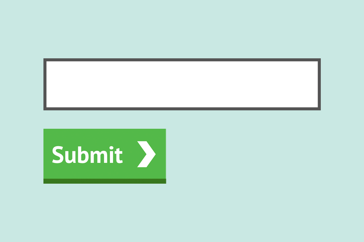
Put buttons and notifications in context
Don’t separate actions from their context.
When using a screen magnifier, it is disorientating for a user to hunt around the page for an element. Put things like help text, error messages, submit buttons and notifications close to the thing they relate to.
I want to see like the colour blind
If you want to emulate different colour blindness conditions when browsing the web there is a free-to-use Chrome plugin available, I want to see like the colour blind, that I use regularly myself.