Designing for users with dyslexia
This guidance is for web and digital professionals who want to make sure that their service is optimised for users with dyslexia.

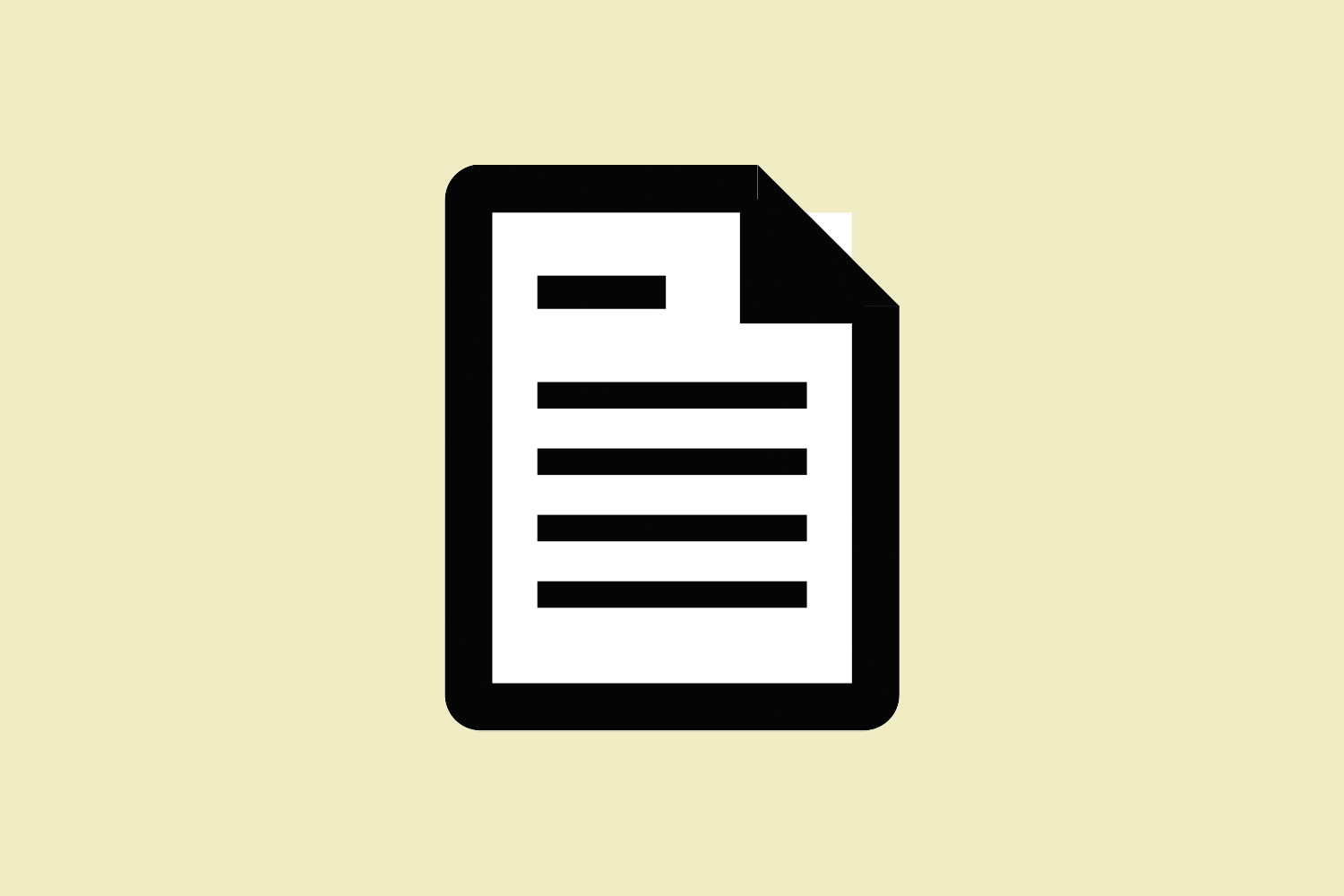
Use images and diagrams to support text
Don’t use large blocks of heavy text.
Some people with dyslexia have trouble focusing when reading on a screen. They can experience visual distortion where letters and words get jumbled.
Large blocks of content can be intimidating. Use images to help illustrate the point and break up copy.
Walls of text on the web are major engagement killers not only for users with dyslexia, but for all users.
Breaking up walls of text with headings, lists, images, appropriate spacing, and other HTML formatting is important for visual purposes and serves an important technical purpose for SEO and screen readers.
Align text to the left and keep a consistent layout
Don’t underline words, use italics or write in capitals.
A consistent layout will help someone with dyslexia navigate a screen. It will help draw their eyes to relevant content and build familiarity and confidence as they go.
Serif fonts have hooks at the end of letter strokes that can cause letters to run together – the same is true for italics.
Do not use justified text on the internet. It is not only difficult to read for dyslexic users, but for non-dyslexic users as well. This is because it creates large uneven spaces between letters and words.
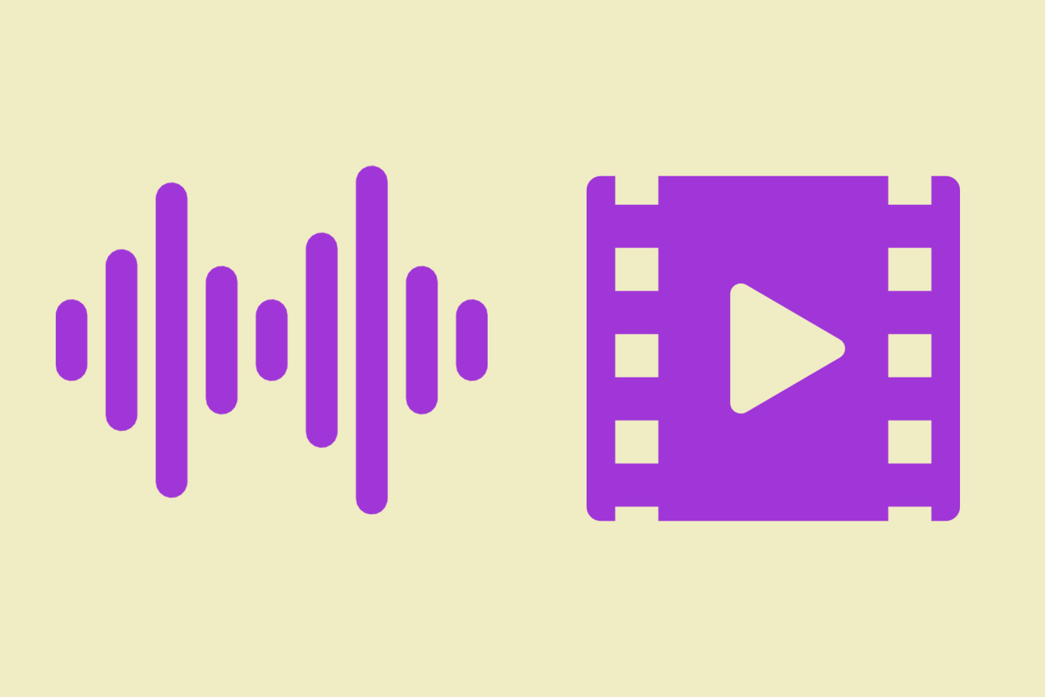
Consider producing materials in other formats (for example, audio or video)
Don’t force users to remember things from previous pages – give reminders and prompts.
Many people with dyslexia experience anxiety about being able to read and retain the information given to them. They may feel pressure if they are presented with lots of information on separate screens.
Some people are able to remember information better if have listened to it or watched on a video. Video, graphics and photos help to create a visual memory.
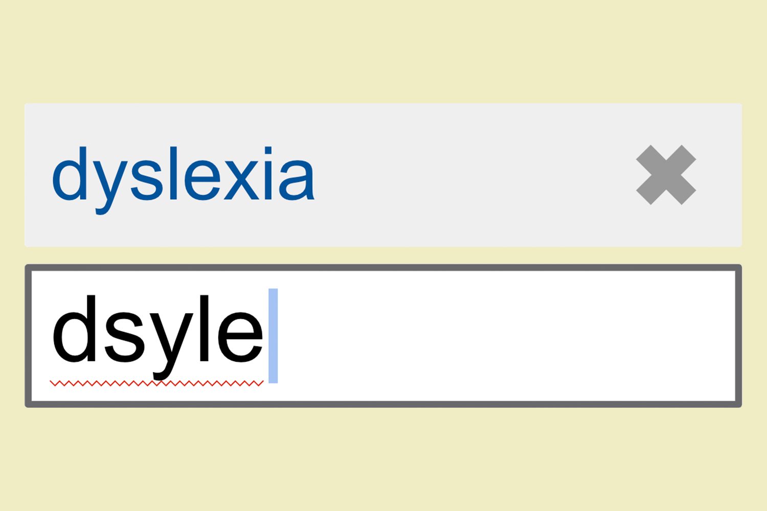
Keep content simple and help with predictive text tools
Don’t rely on accurate spelling. Use autocorrect or provide suggestions.
Fewer words are better for someone who has trouble reading. Use bullet points to help guide a dyslexic user through your content.
People with dyslexia may find spelling and word order challenging. Tools like predictive text, autocorrect and speech recognition can help them get things right.
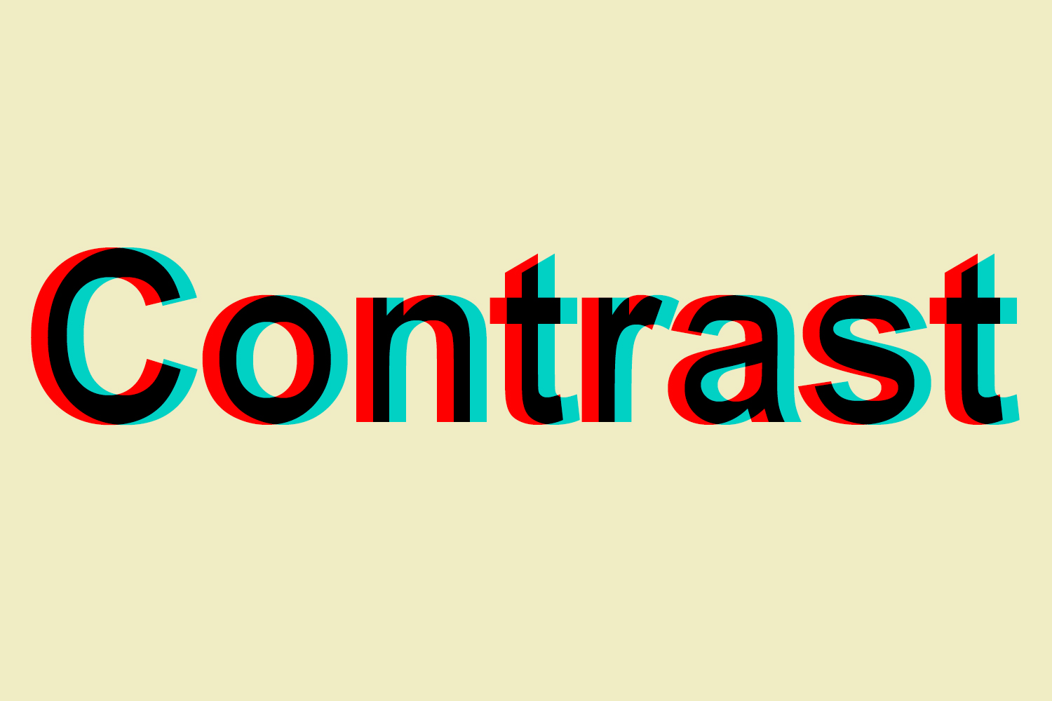
Let users change the contrast between the background and text
Don’t put too much information in one place.
Many dyslexic users are sensitive to the bright, high contrast colours. They can make words swirl and blur together.
Many users adjust their screen contrast or use coloured filters on their screen to help ease this symptom.

Build simple and consistent layouts
Don’t build complex and cluttered layouts.
Complex and cluttered layouts can be overwhelming for users to process. Make your layout predictable and consistent. Put common components such as navigation and search on the top of a page in a highly visible area.
We still stand by our visual design principles as a standard:
- Consistency
- Separation
- Simplicity.
Use logic when building your services and don’t make your users think too much. Websites should never be a problem-solving task for the end user.
What does the internet look like for someone with dyslexia?
A developer named Victor Windell created a simulation that lets users see what it’s like to have severe dyslexia and read online content.
Resources for this article
Document Design for Users with Reading Disorders
Web Site Design Suggestions for People with Dyslexia
Good Fonts for Dyslexia
The British Dyslexia Association
Dyslexia, Wikipedia article