How to indicate required and optional fields in forms
Online forms can be complicated to complete. How can we make it easy for users to know which fields have to be filled in and which ones are optional? An article by the Nielsen Norman Group recommends that all fields should be marked as being mandatory or optional. However, it is not as straightforward as that.
Marking required fields in forms
Give written instructions?
It often common practice to put a message at the top of a form to tell people to complete all the fields unless specified. However, most don’t read the instructions. When people see a form they jump into filling the form, or they might forget the instructions if they are interrupted.
Use asterisks to indicate required fields?
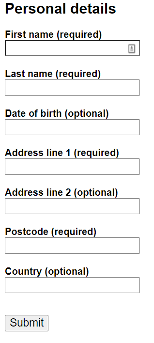
Another common approach seen in forms is to mark the mandatory fields with an asterisk and not mark the optional fields.
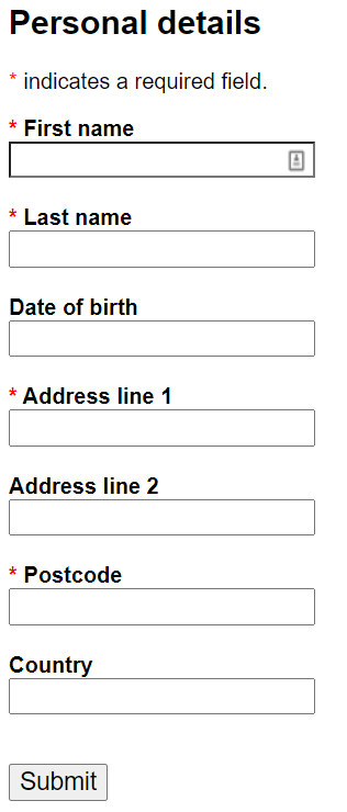
While an asterisk to the left of the label makes it easy to see, it assumes a user understands what this means. Using a red asterisk makes a user more fearful, increases risk of errors and reduces form completion form (UX Collective). Also, given the earlier observation that users don’t read instructions, they will probably skip the explanation of what an asterisk means.
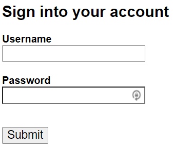
The other problem with asterisks is that most of the fields in a form are typically required. The form then gets littered with asterisks that are unnecessary. An extreme example of this is the login and password fields for a login. There is no need to indicate that these fields are required as it is obvious you need a username and password to get access to a site.
Mark all fields as required or optional?
Instead of marking the required fields, or the optional fields, the Nielsen Norman group advocate marking all fields as required or optional. They claim this makes it clear to the user what is needed. This approach is also advocated by the Baymard Institute.
The optimal solution
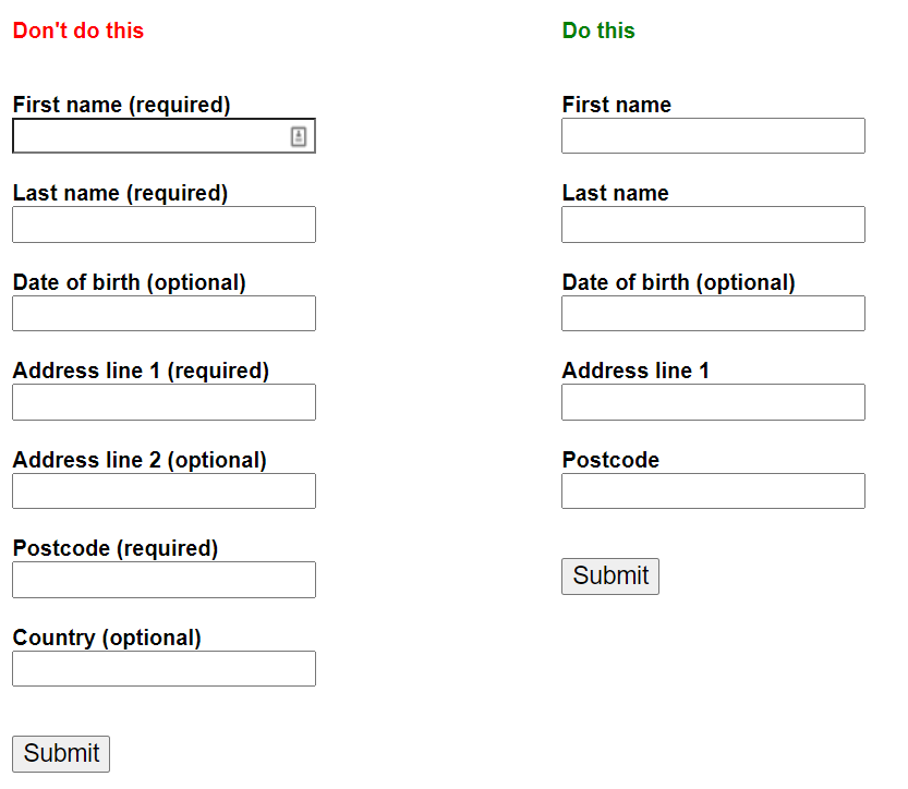
What the Nielson Norman and Baymard Insitute articles don’t advocate is the amount of optional fields to include. If a form has a lot of optional fields, the user is being asked for a lot of unnecessary information. Therefore, a well designed form should have no optional fields, or as few as possible (UX Collective).
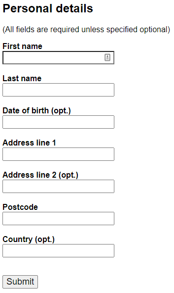
The UX Collective advocate that you only mark the optional fields. All the other fields are assumed to be mandatory. This keeps visual noise to a minimum, makes the form more readable and therefore faster to complete. This is also the approach recommended by UX Experience and UX Planet (16 tips that will improve any online form).
Summary
The digital communications team approach to forms is:
- Keep optional fields to an absolute minimum.
- Only indicate the optional fields with the word ‘optional’ beside it.
References
- Marking required fields in forms – Nielson Norman
- Marking required fields in forms – video – Nielson Norman
- Website form usability: top 10 recommendations – Nielson Norman
- E-Commerce checkouts need to mark both required and optional fields explicitly (only 24% do so) – Baymard Institute
- Form fields – required vs optional – UX Collective
- Mark or don’t mark required fields if all are required? – User Experience
- 16 tips that will improve any online form – UX Planet