
Bad UX design fails
The internet is a wonderful place. It is a modern library of all knowledge, the epicentre of human creativity, and the source of horrible user interface patterns that create an infinite amount of frustration.
Anything related to web design, but not usability (that’s another category) unless there’s overlap.
The internet is a wonderful place. It is a modern library of all knowledge, the epicentre of human creativity, and the source of horrible user interface patterns that create an infinite amount of frustration.
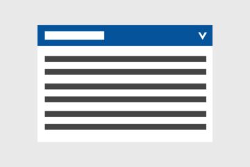
An accordion is a content block that can be expanded to reveal hidden information, usually to shorten the length of a page that contains large amounts of text. Accordion icons differ greatly across the web, either in…
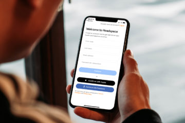
App onboarding is the process of getting users familiar with a new interface, by using dedicated flows and user interface elements that are not part of the regular app interface.
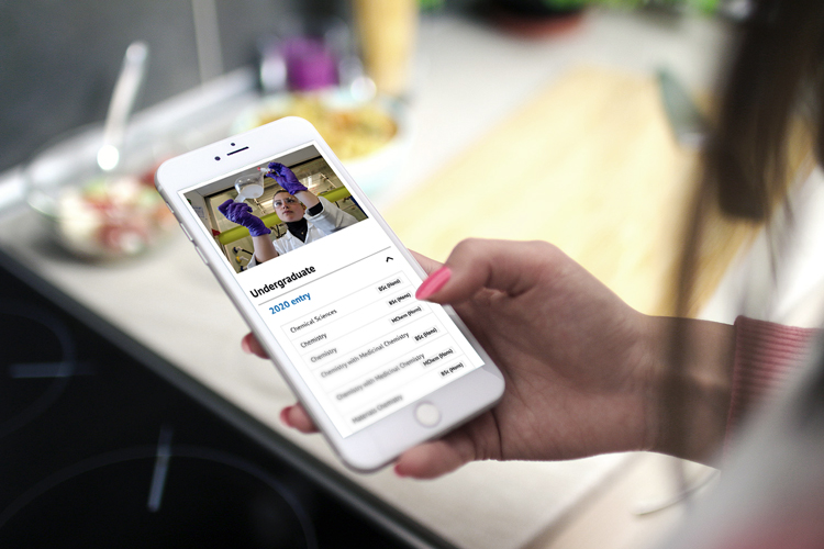
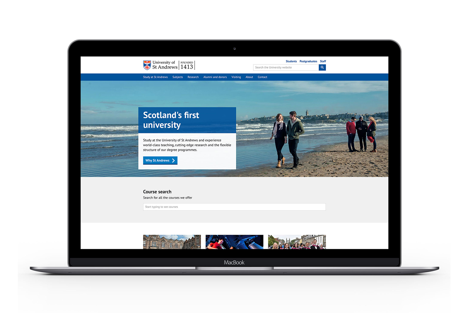
Since autumn 2018, the digital communications team has been looking at how to improve the University’s subject pages to better meet users’ needs. As part of this process, we created a new design for the subject pages.…

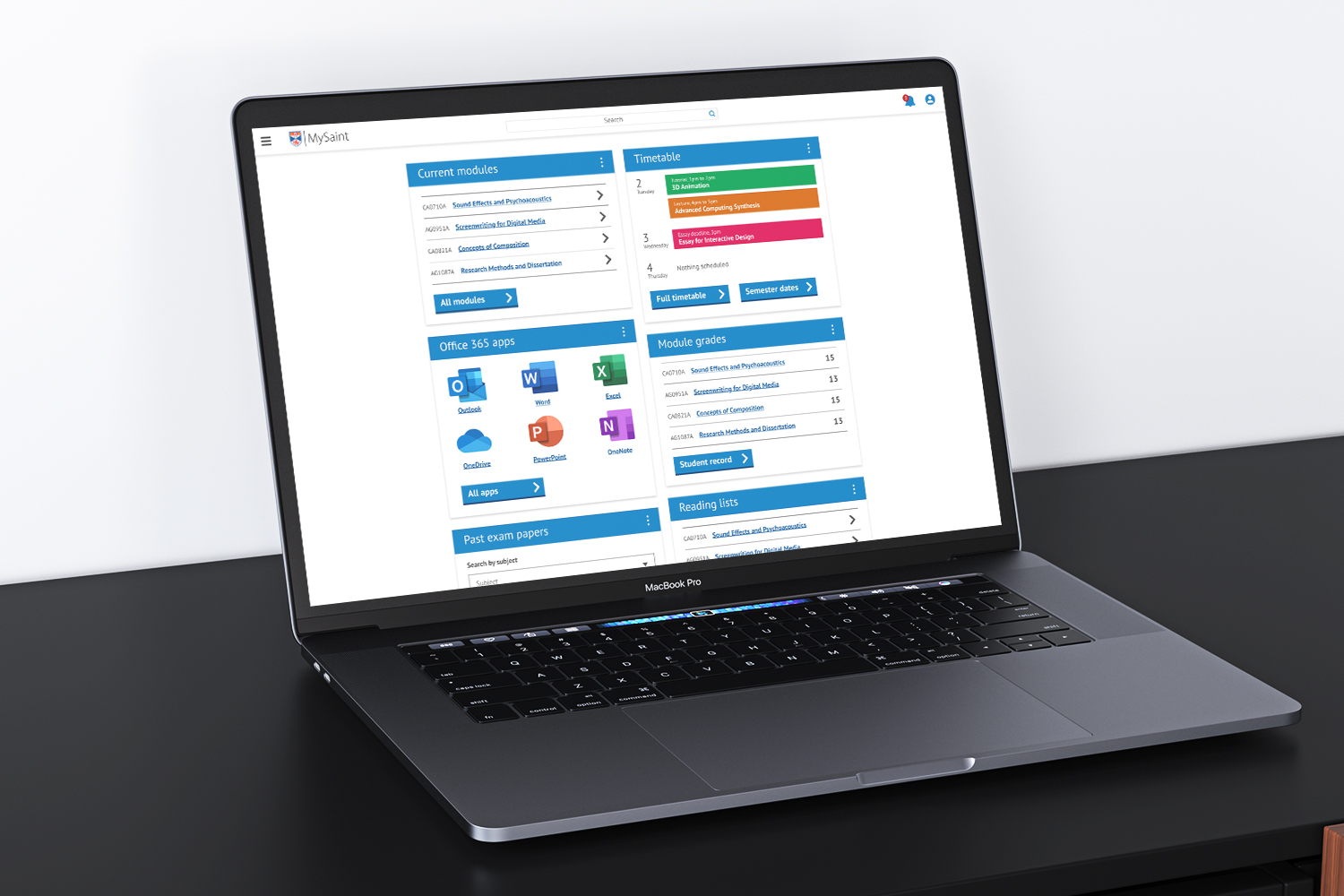
MySaint, Moodle and MMS have been updated with a new look and feel so they are more accessible and responsive on mobile devices. This update was made by the Technology Enhanced Learning (TEL) project team. See the new…
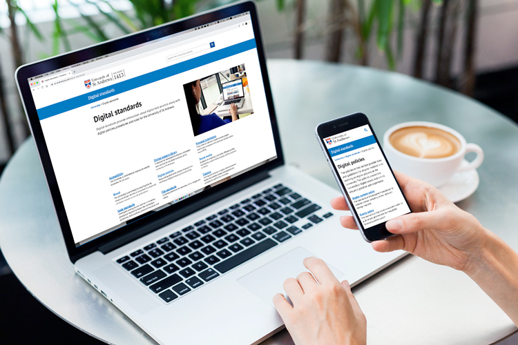
Last week we launched a new, updated version of the University’s Digital standards. The standards provide information about digital best practice along with digital policies, procedures and rules for the University of…
On behalf of the Technology Enhanced Learning (TEL) project Board, the digital communications team hosted a design sprint with students to help redesign certain elements of the student portal.
We have taken feedback into consideration and optimised the hero banner used for home pages. The current hero banner has been in effect since 2015 with minor adjustments to improve accessibility over time.
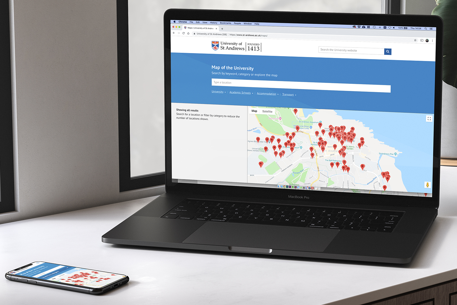
The University maps page has been in existence since 2008. It uses code from Google to display locations on a map of St Andrews. The map has now been redesigned so that it uses the latest Google code and the digital…
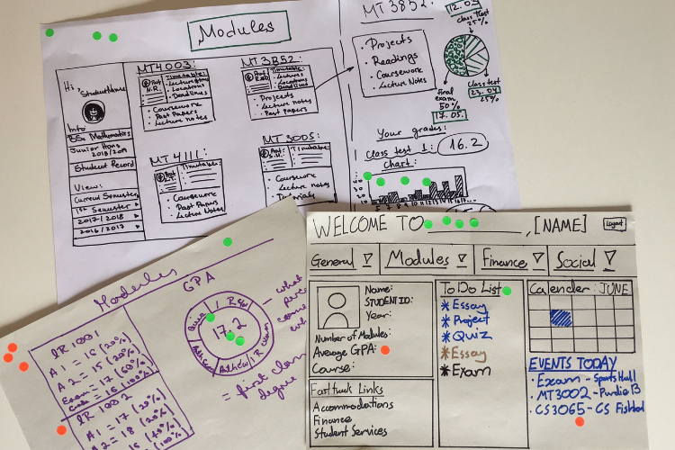
As part of the Technology Enhanced Learning (TEL) project, the digital communications team hosted a design sprint with students to help redesign certain elements of the student portal. Currently, students access…