Correct and incorrect use of the University of St Andrews logo
The strength of the University of St Andrews logo is dependent on its consistent application, which means that the correct logo graphic must always be used without any modifications or additions.
As well as not modifying or adding to the logo in any way, it should always retain the original proportions when resizing the logo to avoid distorting the image.
Staff and students of the University may download all variants of the University logo in PNG format from the brand webpage.
If you are external to the University and require these logos, please contact [email protected].
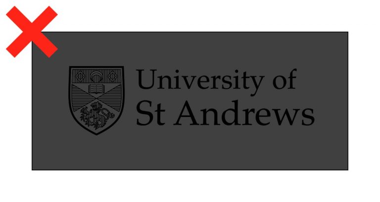
Here are some examples of the correct and incorrect applications of the University of St Andrews logo.
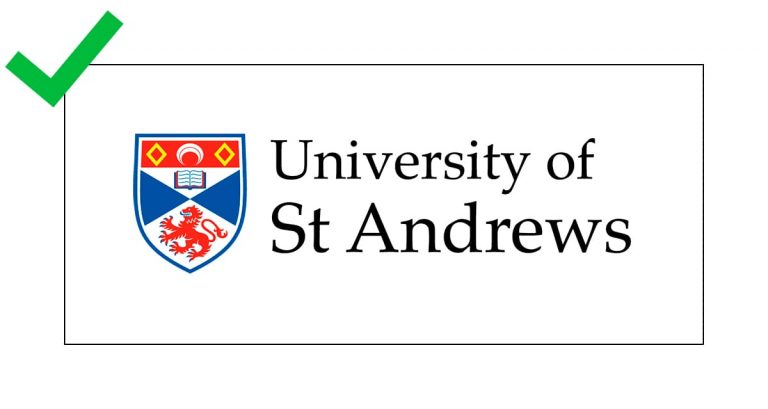
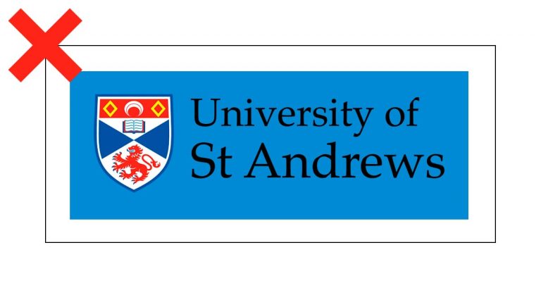
Only use the dark text logo on a white background.
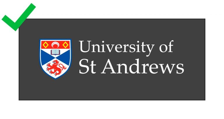
Only use white text on a dark background.

If logo is on an image, use the white text logo. Image must be dark.
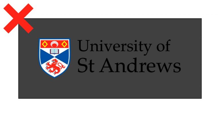
Do not use dark text on a dark colour background.

Colour version of logo should not be black and white.

Monochrome version of logo should be used when black and white is required.

Do not use light monochrome version on light background.
Do not used dark monochrome version on dark background.
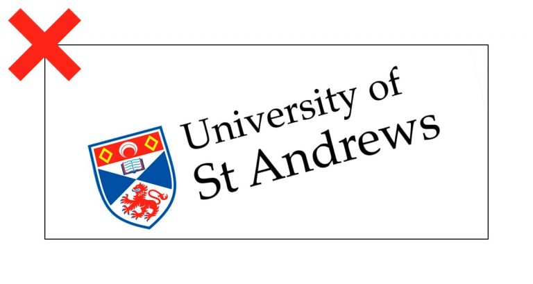
Do not rotate the logo.
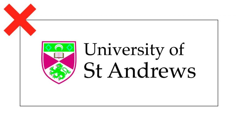
Do not alter the colours of the logo.
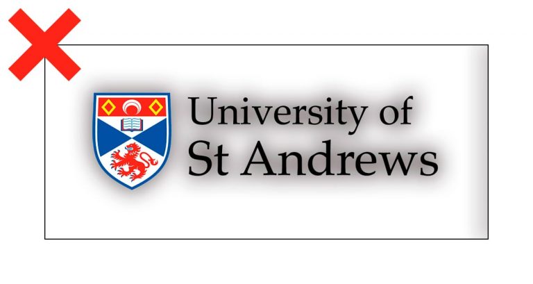
Do not add drop shadows or any other special effects.
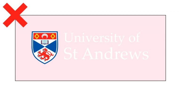
Do not use the white text on a light coloured background.
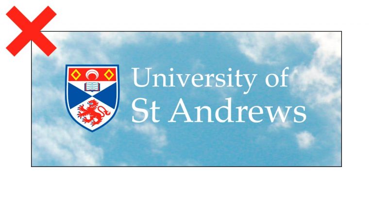
Do not use the white text on a light image.

Do not fill the logo with a solid colour.
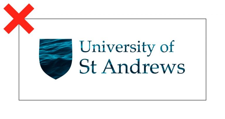
Do not use the logo as a window for imagery.
Do not alter the proportion of the logo.
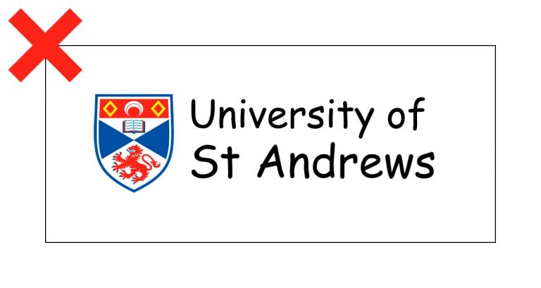
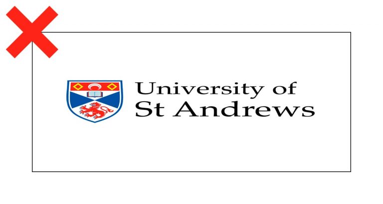
Do not substitute the logo with any typed text.
Do not create a container for the logo.

Do not use the logo over a busy image.
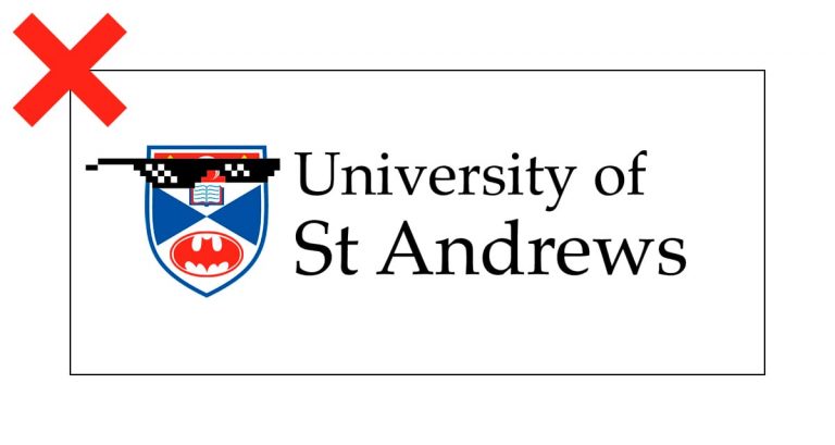
Do not alter the imagery of the University crest in any way.