Retirement of old long form page styling
We are retiring the old long form page styles due to their accessibility issues.
Using SiteImprove, we have ran extensive audits of the University website in regards to accessibility. One style of page that kept appearing in our reports was those using long form content types.
We have been using the long form content types for stories and promotional pages since June 2015. Since then, accessibility has become increasingly prioritised by the team and the long form pages have started to show issues.
Our digital pattern library has an example long form style page for reference.
Colour contrast is not sufficient
We have blogged in the past about the importance of using fonts with high colour contrasts for users with low vision.
In short, making the default appearance of text easy to read will mean that people with visual impairments can take in the information quicker, particularly if assistive technology is not available.
You have to forgo aesthetic for legibility.
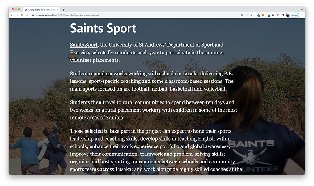
Our long form style pages would typically feature paragraphs of text over an image background.
This image would have a dark overlay to increase visability, but still, there are too many variables in the image to guarantee stable colour contrast levels.
This would differ for all devices as the width of the window would change, therefore the text that may have been legible on a desktop at a certain width, may not necessarily be as legible on a mobile device.
We had a very similar problem to the hero banner pattern and it required to be redesigned entirely to accommodate.
Overuse of italics
Text on a webpage should be aligned left and have a consistent layout. Styles such as underline, italics, and uppercase should be used at a bare minimum.
A consistent layout will help someone with dyslexia navigate a screen. It will help draw their eyes to relevant content and build familiarity and confidence as they go.
Serif fonts have hooks at the end of letter strokes that can cause letters to run together – the same is true for italics.
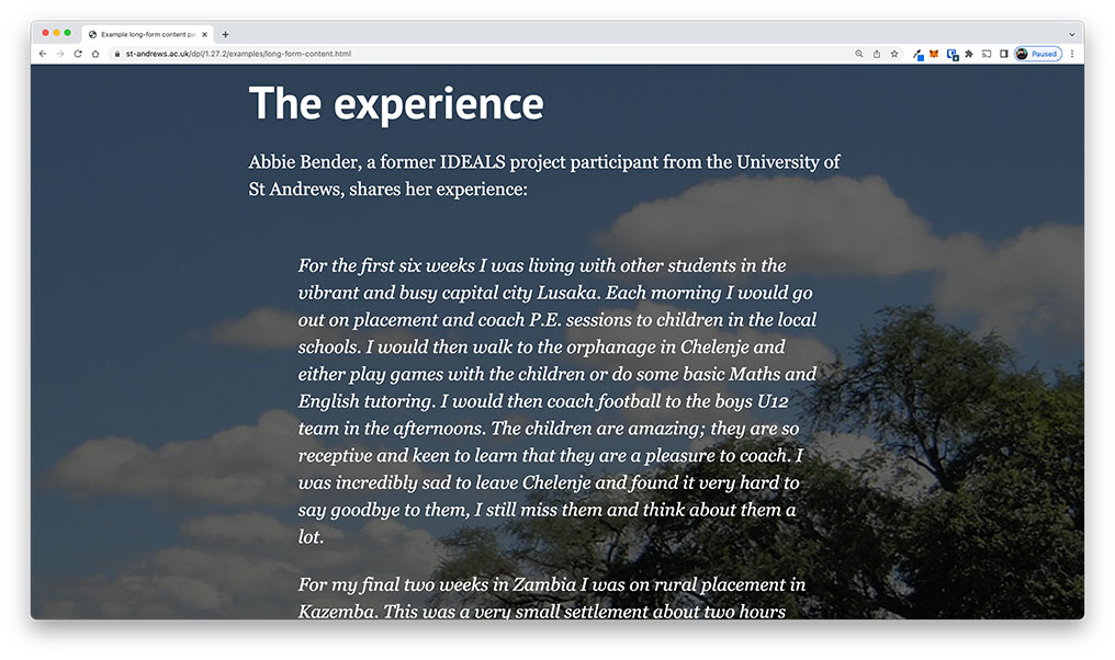
Quotations on our long form style pages would all be italicised, sometimes for paragrahs at a time.
This would also be on top of an image background, meaning the text would be even harder for those with visual impairments to read.
Our solution
We decided the best course of action was to retire the long form patterns from our digital pattern library. They were being used less frequently and were becoming cumbersome to maintain. We have since updated pages which used the long form content types to use more accessible options, while still maintaing the imporantance of story and promotional material.
Examples of pages using new content types
- Why study foundation at St Andrews
- Student experience at St Andrews
- The 600th anniversary campaign
- The Quad
- Breaking Bonds
Deprecation of long form patterns
The old long form patterns will be deprecated from our digital pattern library and will be removed in a future version.
The long form patterns that will be deprecated are:
- Long-form intro
- Long-form end piece
- Long-form credits
- Long-form asides
- Long-form gallery
- Long-form quotes
- Long-form sections
Concerns?
If you have an queries or concerns about the removal of long form patterns and content types, please get in touch with us via email at [email protected].
We are happy to help devise solutions for web content that is accessible for all.