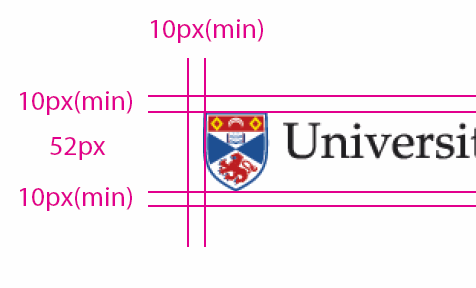
Updating the University shield

Here’s a minor update that I made to the University website this afternoon: I updated the University shield across most of the central website.
As you can see from the screenshot above, the problem with the old one was that, while it looked fine on a blue background, when it was embedded on a white background (for example, if someone linked to a University page from within Facebook, or was printed) then it looked awful!
So I created a new one, at the same dimensions (42 x 52 pixels) and for the first time it now adheres to the new corporate identity guidelines…

It the little things that make me happy!
Update
A couple of people have asked me on Windows Live Messenger and on Twitter why it was like that in the first place.
Well, it was to do with a slight colour mismatch between the graphic files we got from the designers (who were using CMYK values) and the web team (who were using RGB values). So we made the shield’s inner blue colour transparent so that it could pick up the RGB colour in the header behind it.
It seemed like a good idea at the time.
I’ve been meaning to change it for some time, since receiving the new batch of updated University crests months ago (in which those who pay attention will notice that the lion has lost his genitals). And with today being Fix-it Friday… I fixed it.
The next time we do a major refresh of the University website’s design I expect we’ll use a PNG and some tasty alpha transparency for that even smoother finish.