IWMW 2012 in Edinburgh

About a month ago (this blog post has taken ages to write) I travelled down to Edinburgh with my colleague Duncan for the annual Institutional Web Management Workshop (IWMW) which this year was being hosted by the University of Edinburgh under the theme of “Embedding Innovation”.
Venue
This was my fourth or fifth IWMW conference, since I started working in higher education in 2006, and was by far the easiest to get to. I know Edinburgh fairly well, having lived there for five years; two of those years was spent in Marchmont, just a stone’s throw (using a bionic arm) across the Meadows from the conference venue at Appleton Tower, which I discovered was named after physicist Sir Edward Appleton (1892-1965).
Appleton Tower—bless it—isn’t the bonniest of buildings, either inside or out. It is joked that Appleton Tower offers one of the best views of the Edinburgh skyline as it is the one view that absolutely guarantees that Appleton Tower isn’t a part of it. In my experience, it wasn’t the most comfortable conference venue but it also wasn’t the worst.
The accommodation on the other hand was lovely, at nearby Pollock Halls.

In fact, it was lovely in both my rooms. I noticed that the shower was broken in my first room, which had a pleasant view (above) of the accommodation office and St Leonard’s Hall, which you’ll notice was built in the Scottish Baronial style, so I was moved to a room with a fabulous (and gently uncomfortable) double bed and a view of the Salisbury Crags.
Workshop sessions
I signed up for three workshop sessions:
- #A2: Experiences in User Centred Design at the University of Edinburgh, with Neil Allison (University of Edinburgh).
- #B3: Large-Scale Responsive Websites: Tools and Techniques, with Keith Doyle (Navopia) and Paddy Callaghan (University of Bradford) .
- #C1: Responding to the Cookie Monster, with Claire Gibbons (University of Bradford) and John Kelly (JISC Legal).
Each ‘workshop’ session was 90 minutes long—too long in my opinion, and suited more for those whose learning style has ‘lectures’ right at the top. The thing about workshops is that I expect to leave it with something useful, something usable. To my mind ‘workshop’ implies a more hands-on approach, more discussion, more trying-it-out for ourselves. The word ‘workshop’ implies that something is going to be built; the context implies that it’s me that’s going to do the building. Criticisms aside, I enjoyed at least something from each of the sessions.
A few things that I took away from each of the sessions:
Experiences in User Centred Design
I particularly enjoyed Neil Allison’s explanation of user personas: “hypothetical archetypes of actual users” who represent real users during the design process, such as departmental secretaries, heads of school, international students, etc. One neat tip was to use alliteration in choosing their names to make them more memorable, e.g. Angela Admin, Herbert Head-of-school.
I would have enjoyed working in a small group to create a persona for ourselves, as an exercise. That would have really given it more of a hands-on feel.
Large-Scale Responsive Websites: Tools and Techniques
This was a very popular session that would have had the building’s fire officer sweating with worry; in fact it had us all sweating the room was so packed.
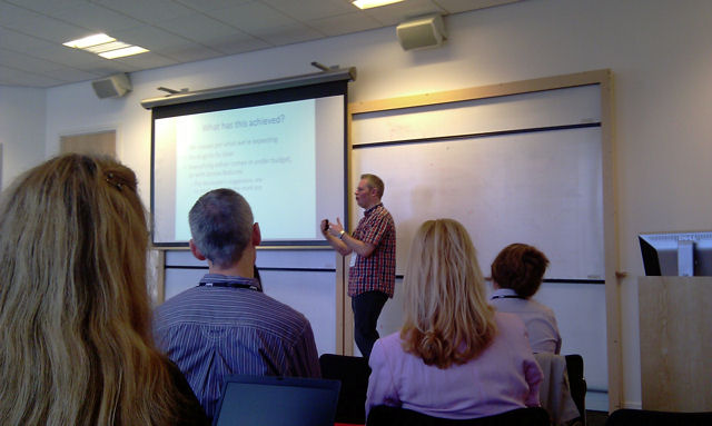
This workshop was in two parts. Paddy Callaghan gave a high-speed tour of a recent responsive web design project he’d been working on. There were two main elements here: the design decisions about what should show or hide at different sizes, and the practical coding of the responsive site (meta tags used, how media queries work, etc.) I would have appreciated 90 minutes on this alone—even given my previous comments about workshop length.
Keith Doyle then gave us a tour through a design pattern library for responsive sites, which I found particularly interesting and helpful. I took copious notes… and then lost my notebook on the train on my journey home. Bah!
I wasn’t surprised how popular this session was. Responsive web design is on a lot of people’s radars. My only criticism, really, is highlighted in a post by Garr Reynolds about scope vs depth. This presentation tried to cover both. In the end I experienced quite a bit of information-overload. I would have happily listened to half of the material but in greater depth.
Responding to the Cookie Monster
Ah! The session looking at the recent EU cookies legislation was, as you might expect, popular; unlike the legislation.
While it was interesting listening to someone from JISC Legal, I didn’t leave with any clearer an idea of where we go from here. Except that I now have a sneaking suspicion that we need to do more about this.
Conclusion
Like many of these conferences the most valuable thing that I got was the opportunity to network with members of other university web teams, to make new connections and build on existing relationships.
A huge thank you to everyone who was involved in making IWMW 2012 such a success. I’d better go now, I’ve got some innovation to embed…