Hero banners: Why are they so attractive?
What is a hero banner?
You see that big, wide section at the top of most modern websites?
That section with the large catchy slogan and button that is effectively tempting you to click it?
That section with the fresh, inspiring photograph that really compliments the company’s brand?
Yeah. That’s a hero banner.
Four years ago, if you Googled “hero banner” you would have found that most of the search results would relate to Marvel’s superhero “Bruce Banner” more commonly known as “The Incredible Hulk”. Now, you get dozens of articles discussing why are hero banners so effective, and “Top 5 examples of great hero banners”.
All the key players are following this trend now. Why are they doing it? Because it is an extremely effective method in directly communicating with a user and delivering the content they need in the most streamlined way possible.
Why is it important?
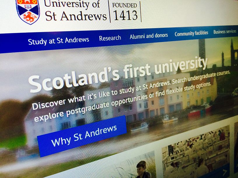
Big. Bold. Straight forward message. Strong visual impact. Clear call to action. It is the user’s first impression of the website. This section of the University’s website, to the people outside the bubble, is a feature that should immediately captivate, direct, and maybe even inspire the user.
The hero banner is a powerful aspect to a user’s journey that reflects who we are as a university, where we are in our industry, and what our quality of courses and services are like. It is imperative that we make sure we are conveying the appropriate message to our consumers.
Why is a hero banner better than a rotating carousel?
The answer is simple. Image carousel banners hide content. Numerous user tests have revealed that users can, do, and will scroll to look for content on a site. Long gone are the days of old where we would slot our important content in a slide of an image slider that a user would either have to wait 10 to 15 seconds to appear, or go hunting for it themselves. If the important is not immediately available to a user, then the design and placement of the content has ultimately failed. The user will burrow into other pages of the website, or they’ll simply do a google search.
This web element has become a fundamental to modern web design and it has quickly become the standard for users to intuitively find the most important and popular content a website delivers
Can I have my content on the hero banner?
The purpose of a hero banner is to directly deliver the most important content to a user. This importance is determined by numerous factors: institutional priority, user journeys, and analytical data to convey the contents popularity.
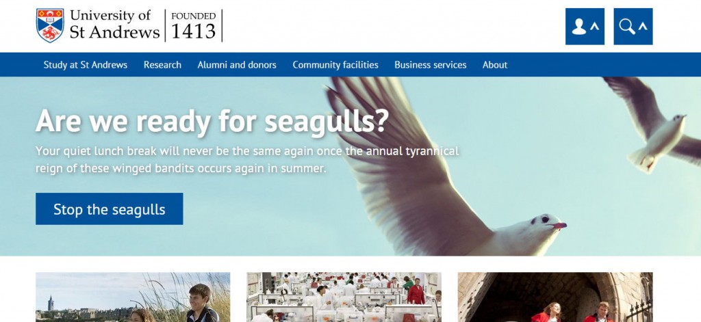
Your content would have to meet these factors and prove it’s importance. We can’t have a user’s first impression of the university being a passionate rant from a member of staff about how a seagull stole their lunch.
Strong imagery
The modern web is very visual heavy. From social media giants, to start up retailers. All companies and organisations with a strong brand are amplifying their visual presence with large rich images. A picture is worth a thousand words after all.
Would you rather have an image featuring a dull winter mood, or a warm and comfortable summer climate? The image selected for a hero banner must feature strong rich colours to effectively express an aesthetically pleasing climate to the user. This visual appeal can go a long way to secure a user’s trust allowing them to appreciate a brand. As a university, our hero banner should capture the main appeal of what student life is like in St Andrews.
The image selection for the Study at St Andrews hero banner intentionally mimics the image selection of the undergraduate prospectus. The digital communications team are attempting to align web imagery closely with existing print materials in order to provide a consistent user experience.
Let’s breakdown the composition of the hero banner image a little more…
Using the current prototype home page’s hero banner let’s breakdown the composition a little more.
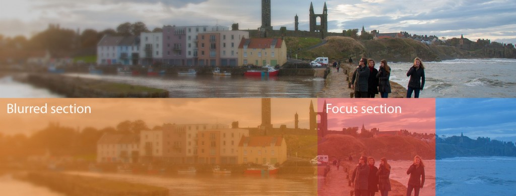
There was an early design decision to have all text and buttons hold equal prominence to the image selected. This allowed us to focus on an institutional message and call to action, as well as a strong visual appeal to St Andrews. This is why the text floats to the left as opposed to the centre, as is the most common hero banner design.
Accessibility is one of our main focuses throughout this re-design. This is why the left side of the image is blurred to allow the text to be sharper and more legible. What’s the point in displaying an important message if it cannot be read properly?
The “focus section” highlighted in red is the small area of the hero banner that acts as the main focal point of the image. In our case, this is the region of the image that is populated by the iconic St Andrews imagery. Bonus points if there are people in this section. It’s always easier for a user to relate to a brand if there’s a photo of someone enjoying it already.
Finishing thoughts
A thought-provoking and entertaining way to think of the importance of the design of a hero banner is to imagine that the user is drunk. Not that the target demographic of a university website might ever be drunk; but it is important for the user experience to be as simple and intuitive as possible. Australian web company, Squareweave, demonstrated this in their video “The User is Drunk”.
Examples of major players doing hero banners done right
User testing
(User testing is little less minimal, but it shows how you can effectively pack a bit more content in if needed.)