Improving navigation on the University website
We are currently working on a project that will provide a subtle but significant improvement in the navigation of the internal University websites (for current staff, students and postgraduates).
What we have just now
 Currently, the majority of webpages aimed at internal audiences have a global navigation menu that is the same across the entire website.
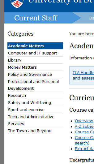
The screenshot on the right shows the menu used for the Current Staff webpages. These are links to the 11 main categories that are presented on the Current Staff homepage.
While these links allow users to skip easily between different sections of the website, they are not very helpful at all when it comes to navigating through the pages that you are currently viewing.
What will be changing
 Our aim is to reveal the true hierarchical structure of the webpages in the left hand navigational device. This will make it much easier to navigate through the website and drill down to content that is deeper in the hierarchy.
We already take this approach in many other parts of the website, including all of the pages aimed at external audiences. The example to the right shows a page within the pages aimed at prospective students.
All of the feedback about this has been positive, which has made us confident that this is the right thing to do.
The process of making these changes
Creating these new navigational menus is quite easy. It is simply a case of changing an option in the way the pages are set up.
However, we can’t ‘flick the switch’ yet. As soon as we began to look at this project, we realised that a lot of tidying up was required first. We are currently in the process of working to ensure that the structure is good and that content is up to date.
This requires a fair bit of work. We need to map out what is currently there, work out if anything needs to be changed and decide what should and shouldn’t display in navigation.
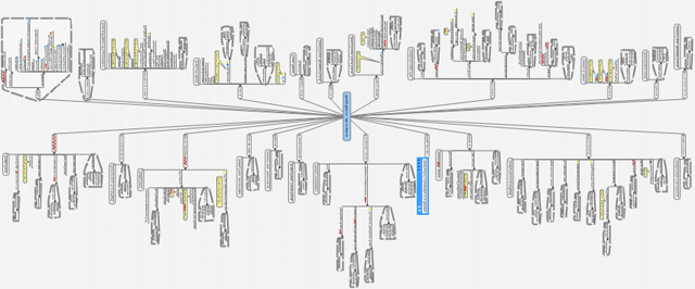
To assist in this, we have been using mindmapping software to map out the current behind-the-scenes structure of different parts of the website. To give you an idea of the scale, this is an image that shows how big the mindmap for the Money Matters section is — and this is nowhere close to being the largest section of the website.
Timescale
From this, we can quite easily see what pages currently exist and what needs to be done to improve the structure. We are at this stage of the project for most of the Current Staff website at the moment. But today we will be switching The Town and Beyond section over to the new approach.
Our hope is to have the new navigation system in place across all of the Current Staff website within the next couple of months. Over summer we will work to do the same on the Current Students and Current Postgraduates websites in time for the start of semester.
