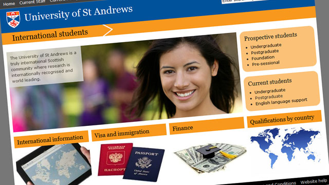
International students landing page

Last year we were asked to create a section specifically aimed at at international students (current and prospective). This represented a reversal of the previous approach, which was to house information for international students in the appropriate sections of the existing websites aimed at prospective students, current students and current postgraduates.
Information architecture
This posed a puzzle in terms of the information architecture. The University website is structured into separate sections aimed at specific, distinct audiences. Visitors to the main homepage are given clear options to select: current staff, current students, or current postgraduates. In turn, information for prospective students is housed in its own specific section. These are quite simple choices from the user’s point of view.
Introducing a separate international students section into the mix complicates this picture significantly. The international students section contains information that is aimed both current and prospective students. Adding this option would be asking the user to browse different sections of the website rather than being able to find all the information they require within (for instance) the prospective students section.
One of the drivers for creating a new international students section was a requirement to somehow raise the prominence of some of the content aimed at international students.
The compromise solution was to create a landing page for international students, which would highlight key information, and take the users off to the relevant parts of the website.
However, in cases where content is clearly aimed at all international students (such as visa information), this has been added to the international students section.
Visual design
I struggled a lot coming up with the visual design of the landing page. To reduce the chance for confusion, I wanted to avoid the colour schemes used on the existing websites aimed at students. This rules out blue and red. (I am also fed up with so many of our webpages being blue!)
An early version of the design was yellow. I opted for yellow because it is the one colour in the University crest that is not used in a major way on the University website. However, after I created the yellow page, I soon realised why yellow isn’t used.
So I began looking at the University’s secondary colours. The most obvious choice seemed to be light blue. But despite blue normally being a safe choice, the particular shade of ‘St Andrews Light Blue’ (#00aeef) also looked very garish on screen.
That is how we have ended up opting for orange. I have never been terribly sure about it, but it got good feedback from those that saw it. And at least it makes a change from blue!