The evolution of the Study at St Andrews design
We had intended on writing an article about the design process for the Study at St Andrews website. Sadly, there is this thing called proper work, and we haven’t had the time to do it.
Today I began cleaning up the files on my PC because it had become very unmanageable. I came across a number of files from the designs as we worked on them. I thought it would be interesting to publish some screenshots to demonstrate the evolution of the design.
May 2013: early concepts

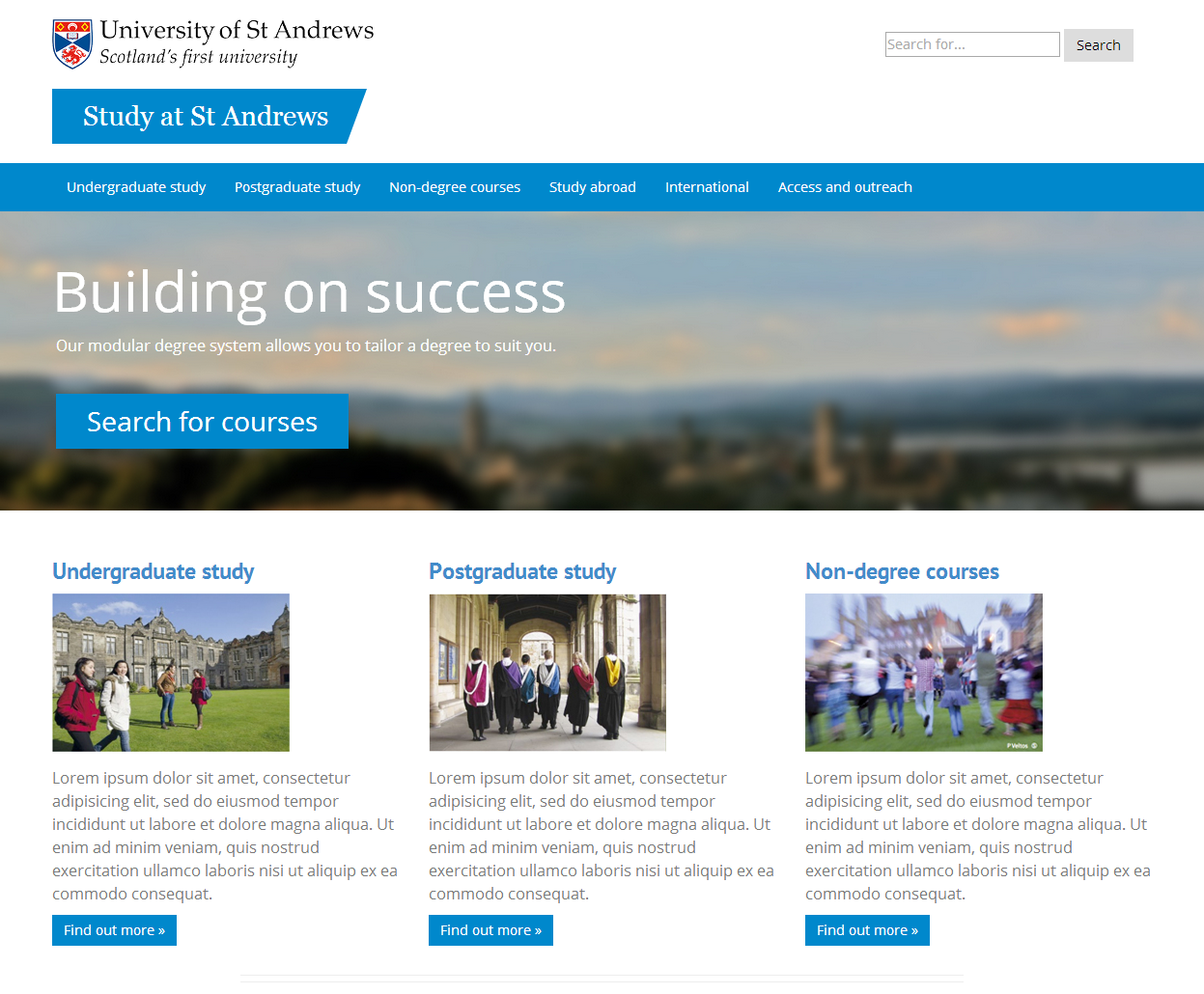
When I was working on the project largely on my own early last year, I created this mock design in a couple of days.
I built it using Bootstrap, because that was the direction the web team had been heading in, and developers in IT Services were keen to use Bootstrap as well. As such, the design was responsive.
This design ticked a few boxes. It looked like it was part of the St Andrews family, and it brought together elements of the existing web design with the relatively new directions that print publications were taking. It was also cleaner and simpler than previous web designs.
However, it lacked visual impact and we went no further with this design.
September 2013: fresh ideas

In September we hired our web designer, Lewis Wake. He came on board with a fresh perspective and very quickly created this striking mockup. This formed the foundation of the concept for the Study at St Andrews design, and the rest of the work was an evolution from this point.
It is interesting to note that the logo Lewis used for his mockup was not an official University logo. However, he was keen to use a logo of this shape because it is better for the web, particularly on mobile devices. This ultimately influenced the new University logos, which have recently launched.
Early December 2013: evolving the concept
 Lewis’s original mockup was visually stunning, but it was not suitable in some respects. It did not adhere to the corporate identity guidelines of the time, the navigation was slightly confusing, and there was no search field.
Our web content editor, Carley Hollis, had also joined us by this stage. She was able to contribute to brainstorming sessions about the designs, bringing more fresh ideas into the mix.
When we started building the website in HTML and CSS, this was what we began with. It was a step in the right direction, but not quite there yet. Still, you can see the introduction of some concepts that have become central to our visual language.
This was the first design to contain the heading style with the diagonal finish, which we “borrowed” from our colleagues in Print & Design.
However, something that frustrated us was that we were unable to work out how to get this blue banner appearing from the very edge of the screen, while having the text appearing in line with everything else.
During a regular catch up with our colleagues in the web team, we brought up this puzzle. Gareth sat there for a few minutes deep in thought, similarly puzzled. Then all of a sudden, out of nowhere, he worked out the code that would work.
The solution was one of those classics: so simple, but only if you know how. It was perfect, and we continue to use that code on our designs.
That was a great moment, and was a lesson not to give up too easily on pursuing a strong vision, even if it seems tricky to pull off at first.
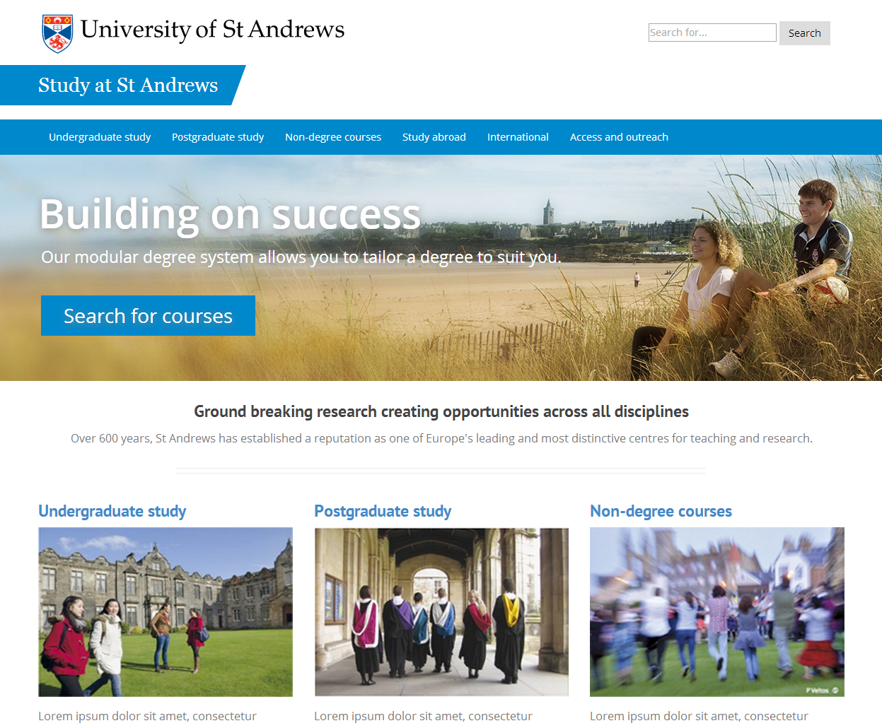
In mid December we updated the hero banner image to reflect the Undergraduate Prospectus cover for 2015 entry. We made this decision simply to tie it in with the print publication, but it had the added advantage of brightening up the homepage, which had previously used a dark, muted image.
As the background image was made brighter, the text became more difficult to read, so Lewis added some blurring to the image in addition to some text shadow.
Mid December 2013: getting there
Lewis was keen to add elements of transparency to the design, echoing some concepts used in print publications. This ultimately led to a reworking of the main boxes for choosing your study level, found in the middle of the page. This design stuck, and also ended up being used for our navigational pages and main calls to action across the website.
This was the first appearance of the ‘chevron’, the white arrow found in these calls to action and accordion headings. The shape of the chevron is taken from the University crest. This is also a nod to arrows found on the toolbars on older St Andrews web designs.
At this stage, we were also questioning font choices. Early designs used a mixture of two sans serif fonts — Open Sans and PT Sans — which was quite jarring. This screenshot shows the whole website being displayed in Open Sans. But we later opted for PT Sans.
As I recall, we made this decision simply because we liked PT Sans better. It feels a bit more modern and a bit sharper. It is also the closer of the two to Myriad Pro, the font used in print publications.
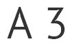
Over time, I have come to see PT Sans as a good match with our other visual cues. For instance, the angular nature of characters like the A and the 3 chime with the chevron.
Early January 2014: developing the final product
In January we began making more tweaks to the design. At this stage we introduced colour coding for the level of study boxes. Undergraduate remained blue, but we used green for postgraduate study to tie it in with the colour coding historically used in print. We opted to use purple for non-degree courses, as a few print brochures already used purple.
We also updated the search bar to include a search icon rather than the button as before.
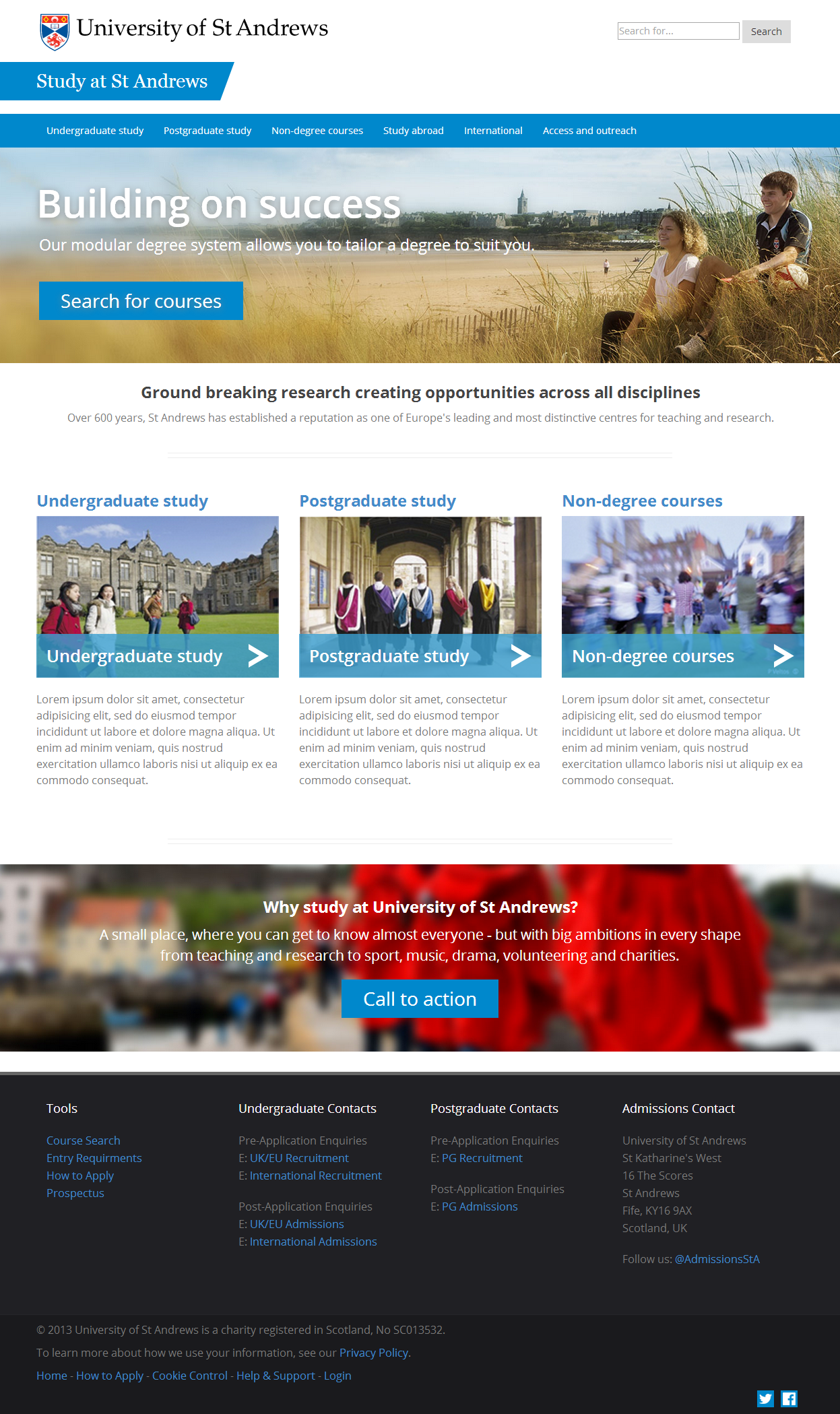
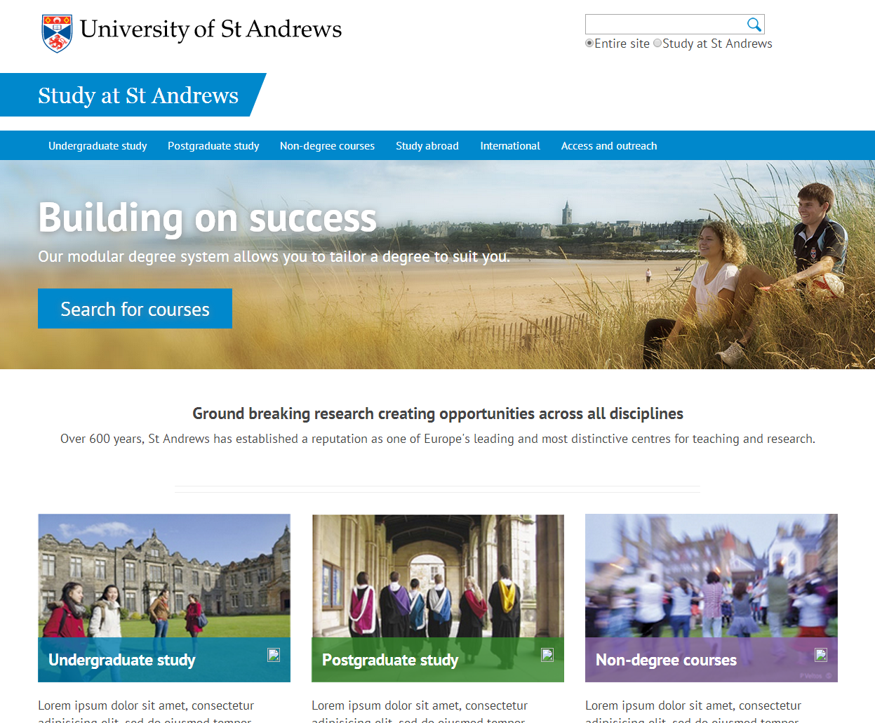
Late January 2014: ta dah
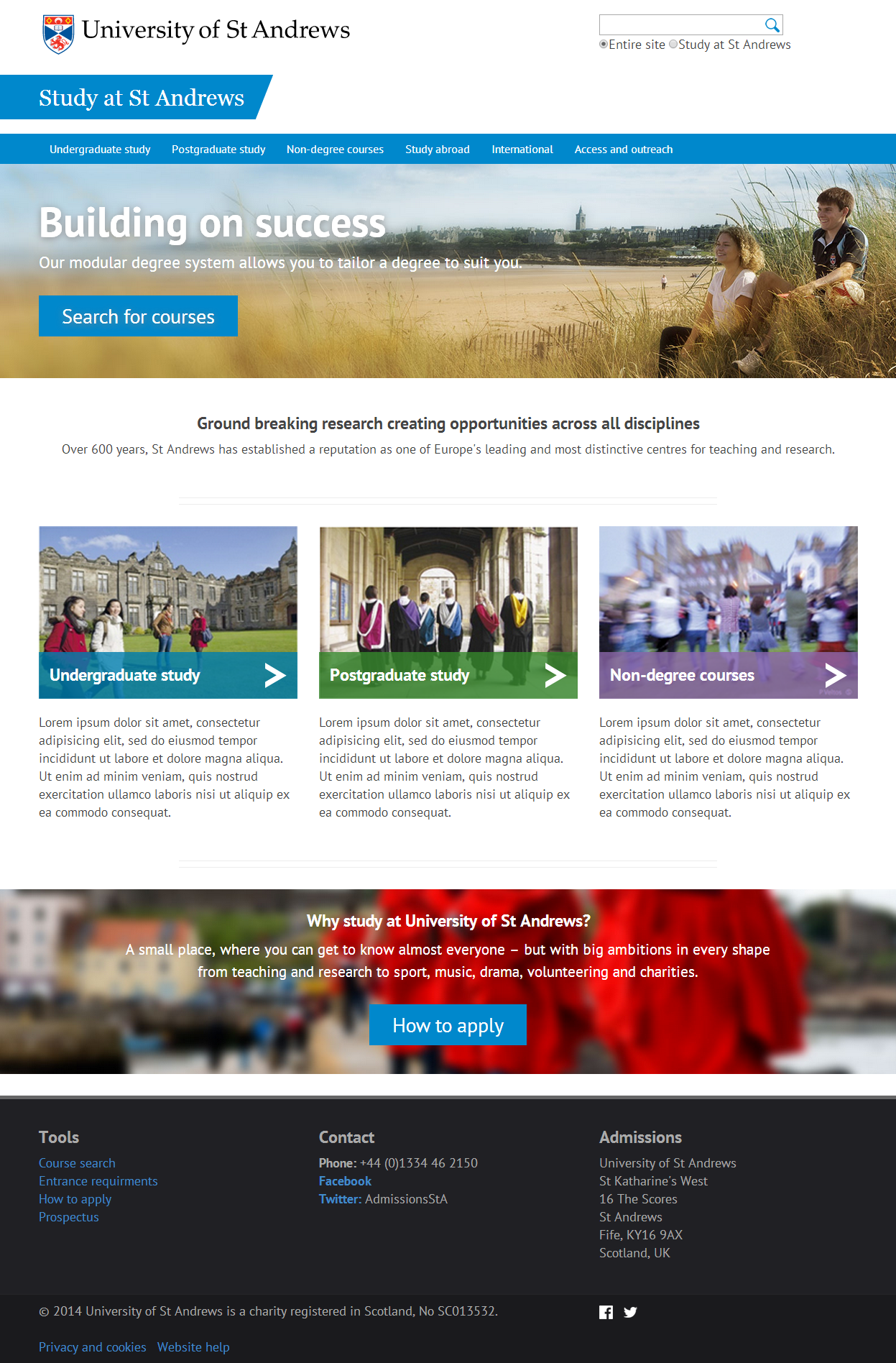
This was not quite the finished design, but as you can see it is pretty close. We launched a test version of the website to staff members in February. During that phase we continued to tweak the design until the launch in March.
The design will continue to evolve. Not everything about it is right, and there is lots still to improve. We learn more about our audience all the time. The nature of the web means that it is changing constantly.
Looking back over how the design has evolved so far, I am pleased with the progress we have made and proud of the methodical manner in which we have done it. Each iteration is better than the previous. Hopefully that will continue.