History of the homepage prototype project
The prototype homepage aimed at external audiences has been unveiled this week. It is the outcome of over a year of work.
It has been an eventful year for the digital communications team. One year on from the launch of Study at St Andrews, we are now in a very different place.
Following the perceived success of the new principles developed as part of the Study at St Andrews project, and a recognition that the University needed to rethink the way it approaches digital, the digital communications team and the web team merged. (The new name for the team is digital communications team, which brings to mind a certain Spitting Image sketch.)
Since then we have been undertaking a major piece of work to create a digital framework that will help us with our aim to create a simplified, more user-centred website. You will hear much more about that in the coming weeks.
Our main deliverable product to sit alongside this is the creation of the homepage prototype.
The problem with the existing homepage
Transformed digital landscape
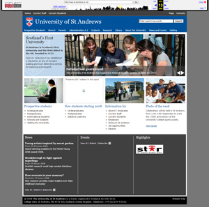
The University homepage last underwent a substantial redesign in September 2008. The design did a good job of meeting the required standards of the time. But the digital landscape moves quickly, and the design is no longer suitable for today’s users.
To put it in perspective, the iPhone was still a new piece of technology, and the mobile web was not yet taken seriously in the way it is today. The first iPad was launched 18 months after the University homepage was last redesigned. Mobile and tablet traffic now makes up over a quarter of all our external visits.
Instagram was launched two years after. In 2008, Facebook had 145 million monthly active users. By the end of 2014 that figure had increased to 1.19 billion.
Google Chrome had not yet been released. The most popular web browser was Internet Explorer 7, a browser that many major websites now do not even support.
The digital landscape has transformed completely in the past seven years. Users have very different expectations. If anything, the pace of change is increasing. As such, a rethink of our website is long overdue.
Institutional pressures
Challenges from within the University have also left the existing homepage creaking at the seams. When the existing homepage was launched it contained 52 hyperlinks. Today that same design accommodates 74 links as more and more stakeholders have requested space on the homepage.
Part of the digital communications team’s challenge is to streamline the homepage to improve the focus on our external audiences. We must ensure that the homepage is meeting external users’ genuine needs, as opposed to serving who shouts the loudest across various internal silos.
Stakeholders may see adding yet another link to the homepage as an easy solution to their problem. But every link added dilutes the user’s experience and makes it harder to find the information they are looking for.
We have some difficult decisions to make.
First steps: looking at the data
The first step came before the original digital communications team was even formed, when I was working by myself with Admissions on the new Study at St Andrews section. I had also been tasked with investigating the creation of a redesigned University homepage. So in October 2013 I took the time to analyse the real usage of the existing homepage.
There is a great deal of web usage data available to us, primarily through Google Analytics. This data could be used not just to inform us about how people use the website, but to give us a deeper understanding of how all our target audiences interact with the institution as a whole. But historically we have not effectively used this data.
Looking at data on usage of the homepage across an entire year, I was able to build up a picture of how a redesign of the homepage could help us better meet users’ needs.
The most popular link on the existing homepage is to the current students section. However the target audience of the homepage is external audiences. So in order to determine the true relevance of a page to external audiences, we need to look beyond the raw numbers.
Many pages get a lot of traffic from ‘external’ users that are actually internal users that happen to be outside the University network (for example, students checking the website from home).
I looked both at the popularity of a section among external users, and what proportion of a page’s views were from external users.
An analysis of the main navigation options yielded some fascinating findings.
Performance of global navigation menu options
| Navigation menu item | Rank | % of pageviews external |
|---|---|---|
| Prospective Students | 5 | 95.89% |
| Courses | 3 | 98.49% |
| Academic Schools | 7 | 81.55% |
| Alumni | 50 | 91.03% |
| Parents | 78 | 96.32% |
| Admin A-Z | 37 | 58.09% |
| Research | 67 | 90.28% |
| Library | 12 | 33.92% |
| About us | 31 | 96.10% |
| News | 82 | 79.25% |
| Events | 53 | 69.25% |
| Visiting | 26 | 93.88% |
Perhaps unsurprisingly, Admissions, Course search and Schools all attracted a lot of visitors, and a high proportion of external visitors.
At the other end of the spectrum, Library, while popular in terms of raw numbers, only has one third of its traffic from the homepage coming from external audiences. This is the lowest figure I have seen for any webpage.
The News section came out as the least popular global navigation menu link, despite additionally appearing in two other locations on the homepage.
Relationships between external-facing sections
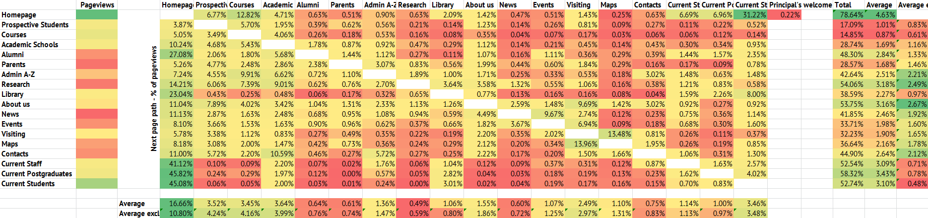
I then analysed traffic between different global navigation menu items. Some interesting patterns emerged.
It was clear, for instance, that there was scope to improve the user experience for the Alumni and Research sections, two priorities for the institution in terms of our external audiences, both of which send a significant amount of their visitors straight back to the homepage.
The About the University section attracts a reasonable proportion of its visits from other external-facing sections. Strong relationships were found between News and Events, and Visiting and Maps (which otherwise attracts very few visits from any page, despite being at the top right of almost every page).
Based on all these findings, I put together a report of some recommendations. I re-ran the exercise in February 2014 to make sure that the statistics were not a blip, and I found broadly similar data.
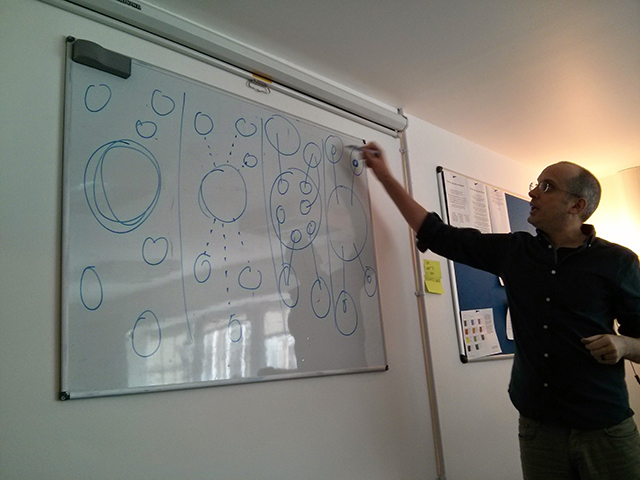
Card sorting
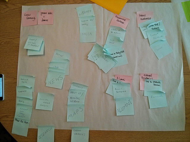
Having established how users were using the existing website, the digital communications team sat down with our colleagues in Corporate Communications to brainstorm what information needs to appear on the homepage and who our key audiences are.
We then performed a card sorting exercise. This is a common user experience technique whereby you group similar concepts together. This is another way of helping us see what sections of the website may relate to each other, which in turn informs the navigation.
Personas
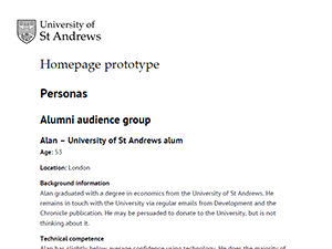
The brainstorm about our main external audiences led to the development of six personas to help inform the homepage prototype project. Having established the broad audience groups, we worked with stakeholders across the University and the digital advisory board to establish the personas’ individual needs.
Personas are another user experience tool that help us think about the website from the user’s point of view. We plan to develop up to six personas for each major project we take on, so we will be writing more about them soon.
Information architecture
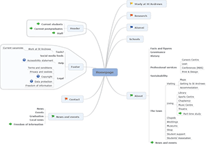
On the back of all this work, we developed a draft information architecture. This outlined the structure of the rethought external website. The outcome was a greatly streamlined navigation structure, while maintaining a key focus on user needs and institutional priorities.
The pages we have built for the prototype so far only include the homepage itself and a new About section. But creating a fuller information architecture has allowed us to conceptualise the new navigation menus and helped us focus on what really needed to be included on the homepage.
Key concepts of the prototype homepage
- Strengthened focus on external audiences.
- Streamlined navigation based on user needs confirmed by analytics, and institutional goals.
- Hero banner with seasonally relevant content.
- Facility to add temporary messages (for example in the event of an emergency).
- Flexible area containing a number of current University highlights.
Gathering feedback from internal stakeholders
In December 2014 we began to show an ‘alpha’ test version of prototype homepage to a variety of internal stakeholders — content knowledge holders and those who have been engaged in the process via the digital advisory board.
Throughout the alpha phase we have been taking your feedback on board and have worked hard to include more content improve the quality of the design.
Usability testing
In February we held a number of usability testing sessions. This is the best way to find out about any functionality problems with the website. Again we have worked with stakeholders to help us set up these sessions (we are particularly grateful to Admissions for allowing us hold a focus group with prospective students visiting on an access event).
We held four sessions:
- Task-based usability test with external audiences (members of the St Andrews community).
- Task-based usability test with current students.
- Guerrilla testing outside the library.
- Focus group with prospective students (local S5 pupils).
The findings from these sessions were fascinating. We will share more about them in a future blog post.
Outside consultancy
We have been privileged to work with Paul Boag for two days in February. Having worked with over 30 higher education institutions, he knows his stuff when it comes to University websites. His input has also fed into the development of the prototype.
What’s next
Now we have launched the prototype to a much wider audience. This is just the beginning of a conversation with our users about how the University website will evolve in future.
We are still seeking feedback. That feedback, usability testing and analytics data showing us how people use the new webpages will help inform future developments.