Visual design principles for the University of St Andrews website
On 15 June 2015, the digital communications team launched the new University of St Andrews homepage. This is the first major milestone in a project that has been on-going before I started work here in 2013.
We have created a product that’s functionality can be updated as web design trends progress. This allows our website to meet modern web expectations and consistently innovate. The homepage is easily adaptable and fluid. Gone are the days in which a website would launch with a big bang and remain the same until it was “re-designed” 3-5 years later.
Re-visualising a website effectively isn’t just about choosing the right colours, and making it look “pretty”. Many different visual design theories are put into practice. One theory you may be familiar with is ‘Gestalt theory‘.
In summary, there were three main rules that all decisions on design abided by before any commitments to visual aesthetic were made.
These are the three fundamental visual design principles that were considered:
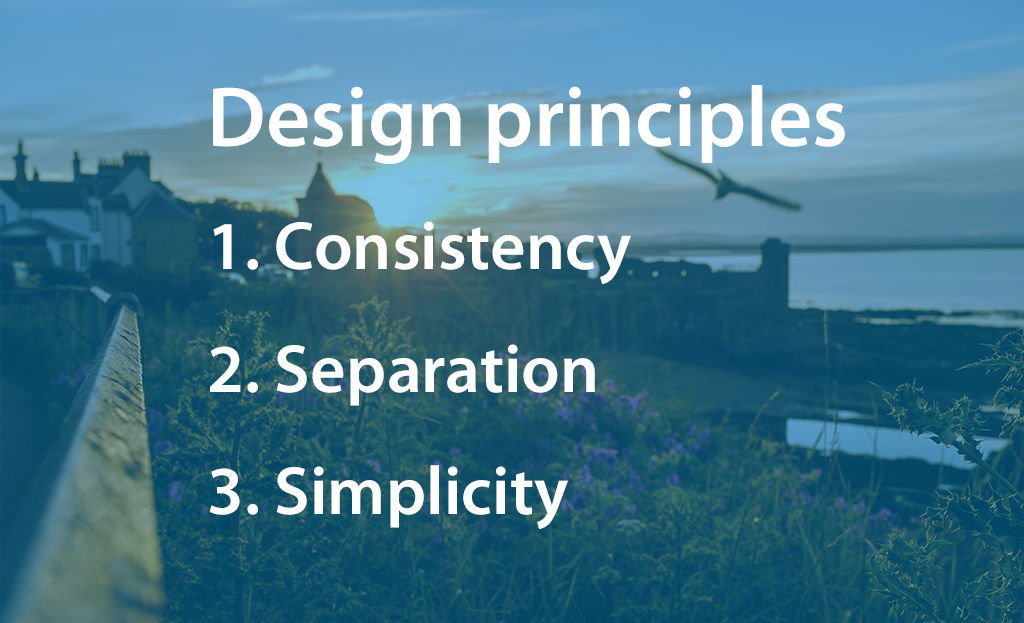
Consistency
Consistency means making every style and all our products match. Heading sizes, font choices, colouring, button styles, spacing, design elements, illustration styles, photo choices and so on. Everything should be themed to make the design coherent between pages and on the same page so the user has a “consistent” user-experience and never feels out of place or lost.
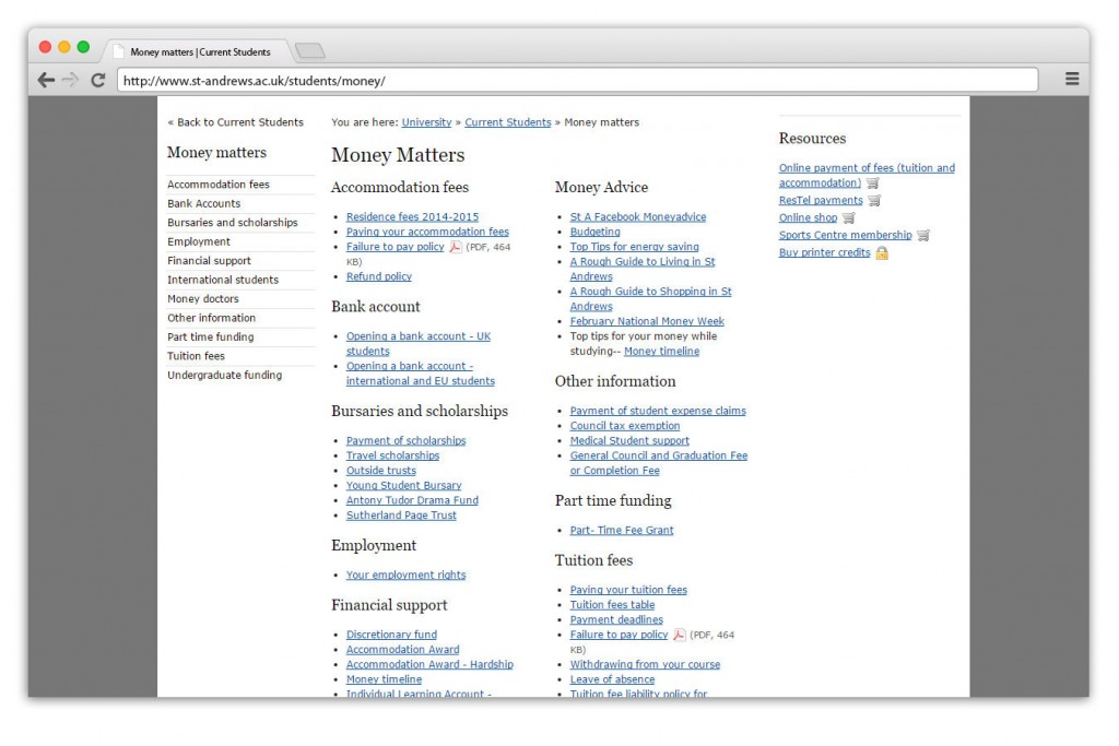
The University already has print material with a strong visual aesthetic. The website is designed to be consistent with existing print material, and we have liaised closely with the print and design department.
Simplicity
The next generation of students we’ll soon see at the University will all be expert web-users. It’s also very likely they won’t remember the days before broadband. We live in a digital age where everything is fast, and if you want to make even the most mild mannered person annoyed, just slow down their internet connection for a minute. Statistically speaking, 1 in 4 users will leave a website if it takes more than 4 seconds to load.
Our websites don’t just have to be faster to load -they also have to be faster to understand.
If your website’s design is heavy and littered with content it will slow your user down and, just like a slow connection, they will leave your site.
Simpler sites are faster at gratifying users. Simplicity is not just a fashion: it’s the future. Expect it to only continue.
Separation
This final principle enhances simplicity. When all your content is cluttered together, it is even harder to navigate. The user has no idea where they’re expected to start. Allowing suitable separation between your content grants it breathing space and therefore makes it similar for the user to locate their content.
Don’t let your users experience claustrophobia.