Flaws in UX design standards: Hidden navigation
Experienced designers will likely agree that inspiration from other sources is not stealing when it comes to user interface design. It’s called “best practice research”. One phrase I reiterate when others over-complicate a potential design solution by creating something new is, “why reinvent the wheel?”. I mean, if someone else has already solved the problem, why not adopt their solution to fit our requirements? Some may argue that it kills creativity, but the priority in user interface design is implementing a visual solution that your users will instinctively be able to use and understand without a moment’s hesitation.
So that’s it settled, right? All designs have been designed, and all websites and apps will work the same from now on. Not necessarily. Just because the major internet players are doing it, doesn’t mean it’s right. I’m sure you’ve used a Google / Facebook / Amazon product and you’ve stopped at some point to think, “What does this button do? Why is that there? What’s the point in this?”.
So here’s the problem, some designs that are considered “best practice” don’t seem to work as well as they should.
Hidden navigation
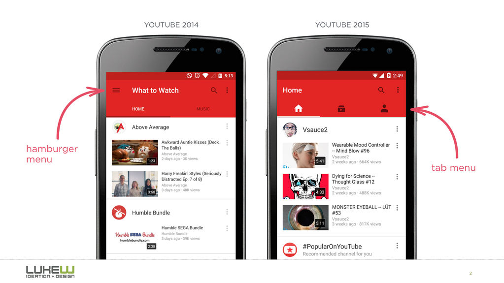
By now we’re all pretty familiar with the infamous “hamburger” menu. Ultimately, whether you’re for or against it, the problem this poses is not about the icon itself but rather about hiding the entire navigation behind an icon.

Slide menus that pop from the side of screen are often a flexible and convenient solution for a designer. There is no need to worry about the limited screen estate when cramming a ton of links onto a page. Just squeeze them all into a scrollable overlay that is invisible to the user unless they press the button that looks like a hamburger.
Well, apparently, the hamburger menu decreases user engagement. Experiments show that exposing menu options in a more visible way increases engagement, user satisfaction and even revenue. That’s why all the big players are now shifting from hamburger menus towards making the most relevant navigation options always visible. We have every intention of doing the same one day.
Tl;dr: If your navigation is complex, hiding it does not make it mobile friendly. Prioritization does.