Flaws in UX design standards: Icons
Due to limited screen estate, it seems like a no brainer to save space by replacing text labels with icons wherever possible. Icons take up less space, they don’t have to be translated, and people are familiar with these after all, right? And every other app utilises icons. So, why not just do it too?
With this assumption in mind, app designers sometimes hide functionality behind icons that are actually pretty hard to recognise. Would you guess, for example, that you can send direct messages behind this icon in Instagram?

Or, assuming that you have never used Google Translate before, what functionality would you expect to access by tapping the pictogram below?

Did you guess correctly? It’s used to hand write characters manually.
It’s a common mistake to assume that your users are either familiar with abstract icons or they’re willing to spend extra time exploring them, learning them, and basically sit and work out what they mean.
If you have designed an icon and you feel that a popover label is required to make it usable, you’re doing it wrong. Even if you’re Foursquare and your users will learn it anyway.

This doesn’t mean that you should not use icons at all. There are plenty of icons that your users know pretty well – mostly those representing common functionality like search, video play, email, settings and so on. Heck, we’ve become accustomed to representing ‘save’ functionality with an icon of a floppy disk for two decades now. When was the last time you used a floppy disk? Probably last century.

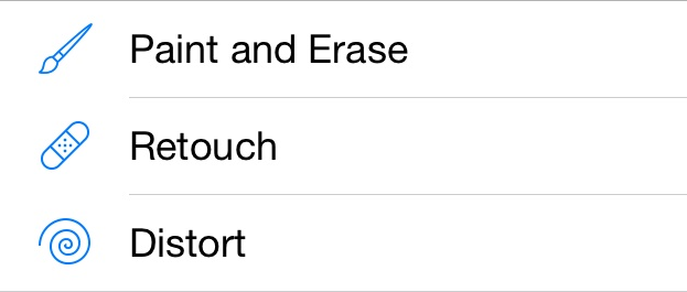
Complex and abstract features, however, should always be displayed with a proper text label. In such cases, icons are still useful as they can enhance the purpose of the menu items and they can also add a nice touch and personality to your app. The icons accompanying the text on the image below allow the user to quickly understand the functionality of these tools. It may take the user longer to decipher the functionality from just the titles alone.
In an earlier version of the header section on the University of St Andrews’ website, we experimented with an icon to condense the student portal links into a separate hidden navigation section.

When this icon was clicked, it would push in the navigation bar for links to the student portals. We were essentially playing devil’s advocate with this prototype purely for usability testing purposes. Would the user be able to easily identify that the links to their student / staff portal were hidden behind this icon?
The usability test results proved that the majority of users couldn’t decipher what links would be displayed upon interacting with this icon. Most said they would have to interact with it first to see what it did to then know its purpose. This is when an icon fails. It doesn’t fully represent the context of its function.
In conclusion, basic functionality can be effectively represented by icons but for complex features, text labels should be used. And if you use icons, always have them usability tested.