Implementing UniStats’s KIS widget into our design
What is the KIS widget?
Unistats is the official site to search for, and compare, data and information about university and college courses from across the UK. Key Information Sets (KIS) are comparable sets of data about full or part time undergraduate courses catered to meet the needs of prospective students.
KIS data is published on the Unistats website and can be accessed via an ad banner on the course web pages of universities and colleges. You can see the KIS widget on the St Andrews course search pages, such as this Art History one – just click into the ‘Overview’ section.
Including the KIS widget on course pages for prospective undergraduate students is mandatory. HEFCE provide a downloadable Unistats widget user PDF guide to assure and enforce the correct implementation of the KIS widget.
However, in an ever evolving digital climate, the design of the KIS widget isn’t quite up to scratch to fit the mould of a lot of modern university websites.
Problems with the KIS widget
The first glaring problem with the KIS widget is that it looks like a dated online advertisement. This appearance is subjecting it to unintentional banner blindness.
I mean, talk about overkill.
Many studies show that savvy internet users have been conditioned to ignore banner ads as they deem them unimportant on their search for specific content.
The second problem is that the KIS widget is not optimised for mobile. The widget itself is not responsive. This means potential students browsing with a mobile device are at a disadvantage compared to someone else browsing with a desktop computer.
The KIS widget looks like a web banner from last decade and it responds like one too.
Resolving these problems for best implementation
Unfortunately, we cannot change the design of the KIS widget. But we can manipulate it’s placement on our pages so that it is at it’s most beneficial.
Let’s start by getting rid of that banner blindness.
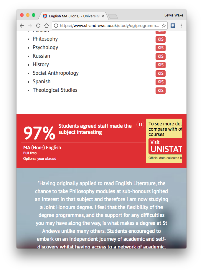
The placement of an “advertisement” on a webpage is important in order to achieve maximum engagement. Users disregard the routine, cliché ads, so we must find placement that is unconventional. This could be:
- At the top of the page above the fold.
- Alongside relevant paragraphs in the text
- Between sections in the content
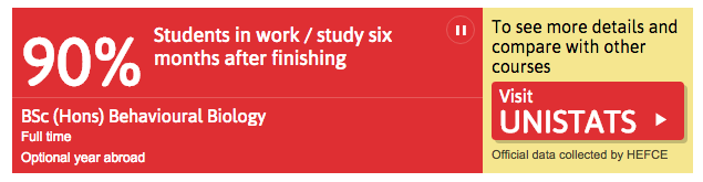
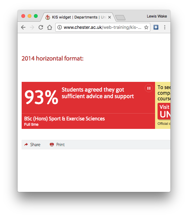
Our solution, looks a little like this:
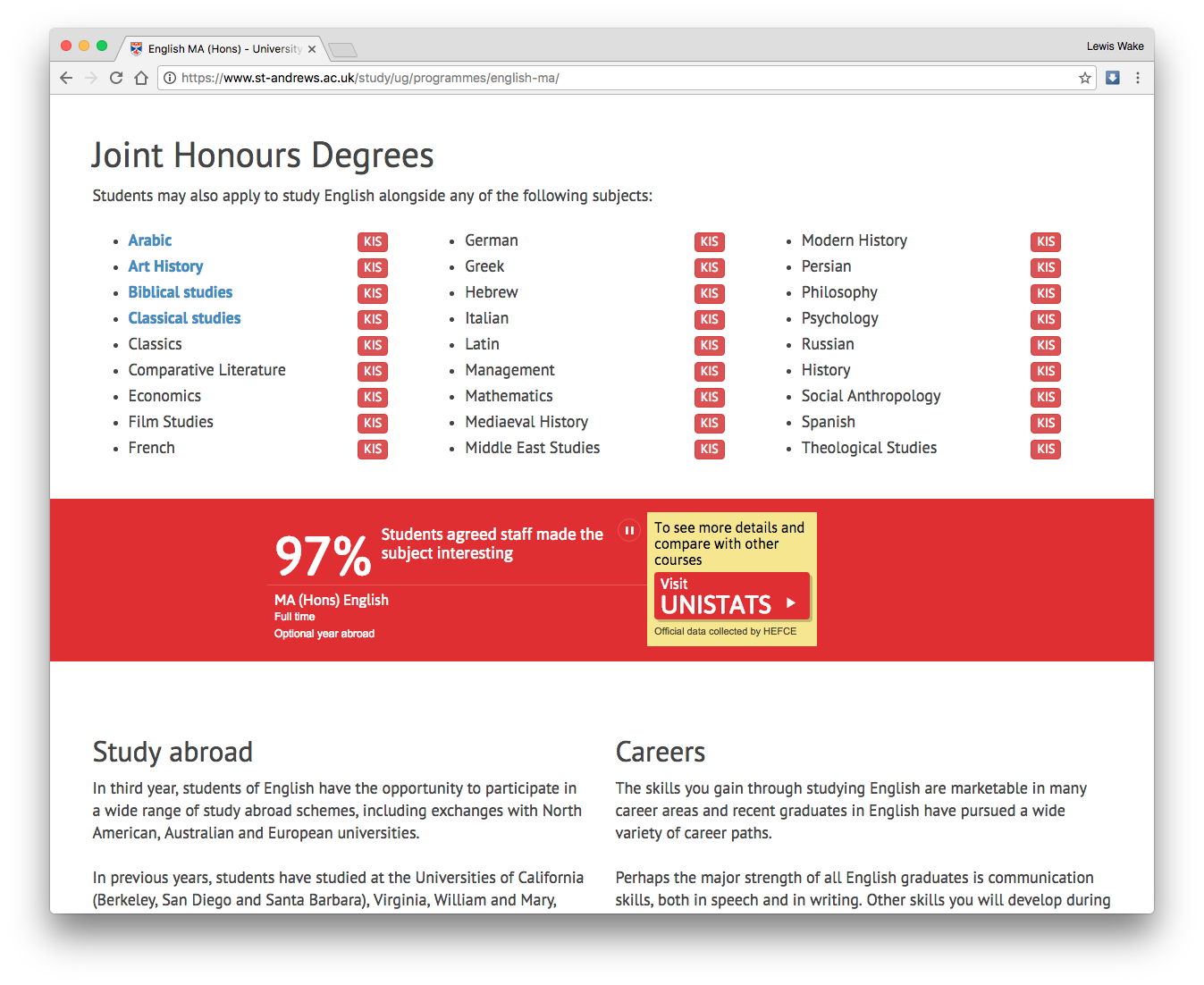
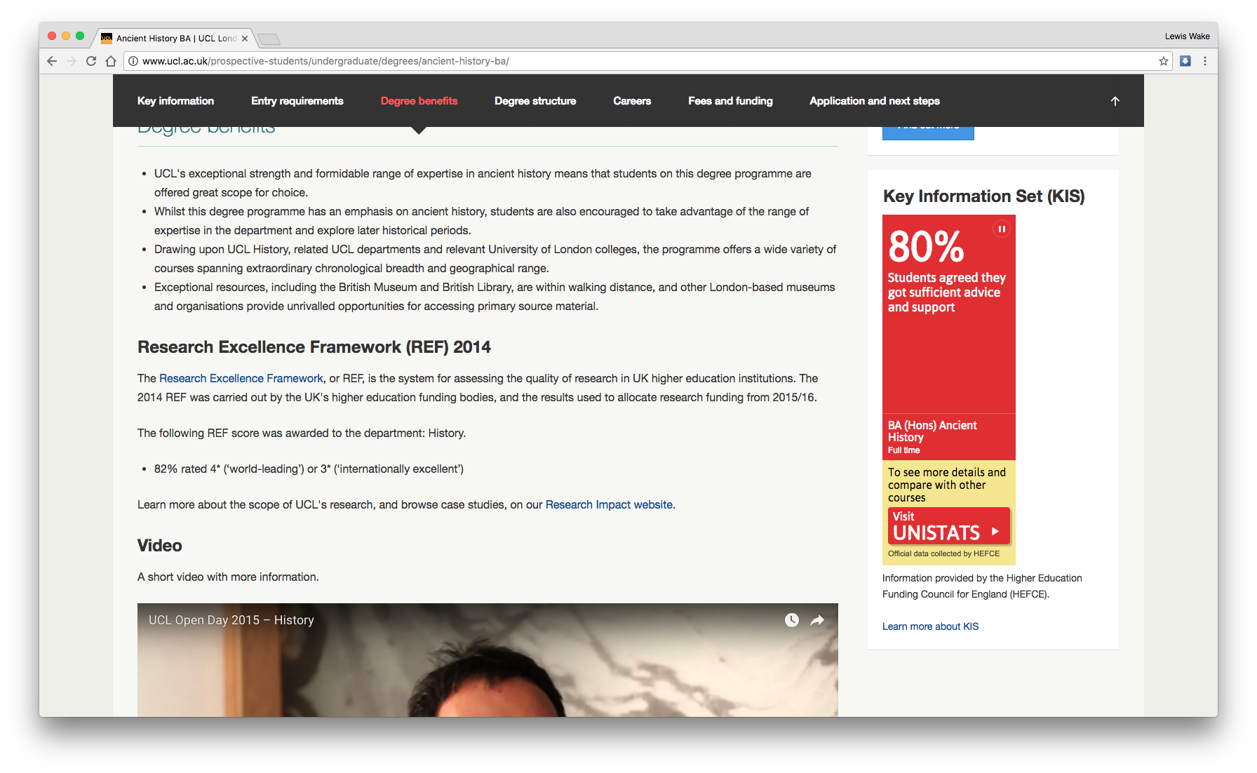
We have placed the main KIS widget in a full width banner of the same colour. The benefit to the red colour used is that it is so striking and bold that it cannot be missed. We’ve played that to our advantage.
The real kick is, no matter how we implement the KIS widget, it is still non-responsive.
Some universities are using the vertical orientation KIS widget app, like University College London.
This solution will work on a mobile device so long as the resolution of the screen isn’t thinner than the banner, but it’s placement makes it look like an advertisement again.
Unless Unistats get to work, a lot of potential undergraduate students across the country won’t be able to compare courses from their phones anytime soon.
Web advertisements can be beautiful, interactive, and surprising. The KIS widget can be too.