New School websites usability findings
Two weeks ago I conducted usability testing on the design for the new School websites on behalf of the Business Transformation Board who are running the Academic School Websites project. This project seeks to update and redesign the existing School websites using the digital pattern library (DPL). This post provides a summary of the test and an overview of the users’ experiences.
Test summary
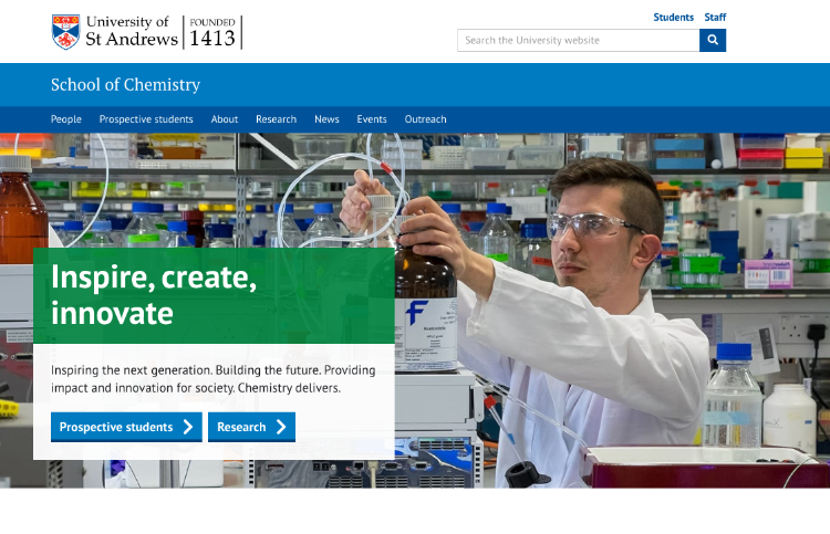
Five current students were used to test the Schools of English and Chemistry websites. The new School websites all use a standardised template which uses the DPL and was signed off by the Academic School Websites project board.
Before they completed the tasks, users were asked whether they had used a School website before, and if so, what they used it for. Four out of the five users said they had used a School website before, and that they mainly were looking for contact details or the School handbook. Participants felt that a School website should appeal to both prospective and current students.
The final usability test script for both audiences included the following tasks:
- Find a member of staff’s research publications.
- Find the School of English handbook.
- Connect with the School of English on Facebook.
- Find a School of English event which took place in the past.
- Find information about the electronics workshop on the School of Chemistry website.
Participants were also asked a supplementary question to gauge their opinion on their experience using the new School sites.
Key findings
The testing showed that students faced no major usability problems when interacting with the School websites and the majority of users were able to complete all tasks without issue.
- Overall students liked the look and feel of the new websites. None of the students tested disliked the new design, and many echoed notions that the School websites were “clear” and “easy to use”.
- There were no differences in the way undergraduate and postgraduate students used the new School websites.
- Students are unlikely to go to a School website for a link to the School’s Facebook page. Instead, the test participants stated that they would find the School’s page via Facebook.
- When students cannot quickly see the best way to navigate to a page, they are likely to rely on the search function in a page. There is a usability risk associated with this workaround because currently University search results are imprecise and show users results unrelated to their specific searches. Furthermore, there is also the issue of students believing that they were only searching the individual School website. This hindered participants trying to complete tasks as they were shown University-wide results, many of which took priority over the School information they were looking for.
- Only two participants selected the “Students” section in the header to go to the current student section on the School of English page. There is a risk that users who didn’t click that link associated it with the main link on the University website which leads to the main current students page. Although not explicitly shown within the test, using the heading “Current students” as a link to the School’s intranet or current students page could cause confusion for users and negatively affect the user experience.
User feedback
The feedback from students regarding the new School website is positive. In summary, there was the overall notion that the design had been improved and looked “cleaner” and “clearer”.
Some participants drew comparisons to the current School websites, stating that they were “a bit messy” and are “very difficult to use”.
Some additional feedback:
- “The new design is certainly nicer to look at, more friendly, and looks like you could be able to get where you want to go quicker.”
- “It’s very aesthetically pleasing with the blue.”
- “It was quite simple to complete tasks.”
- “The information density is quite sparse, which is good.”
- “It’s not clunky. It’s quite easy, easy on the eye.”
- “I do prefer the new [design] to the old [design], it looks a bit more cleaner compared to the old [design].”
Next steps
The first new websites will launch later this month, starting with the School of Divinity, with the remainder being rolled out in phases over the next 12 months. If you have any questions regarding the Academic School Websites project, please email [email protected].