Accordion icons
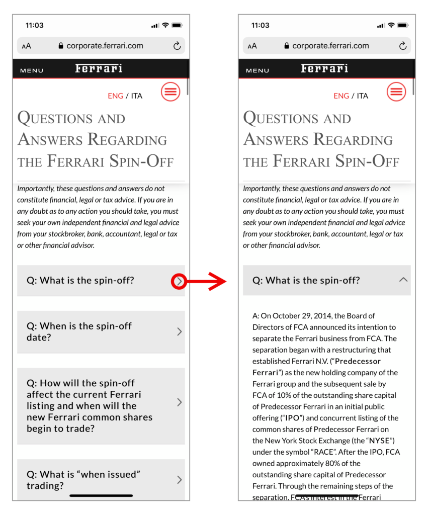
An accordion is a content block that can be expanded to reveal hidden information, usually to shorten the length of a page that contains large amounts of text.
Accordion icons differ greatly across the web, either in the graphic used to represent them or the way these function upon user interaction.
User study
The Nielsen Norman Group arranged a user study to try and determine which icons are most easily identifiable as an accordion and measure the user’s interaction with them.
Below are the icons used in the test:
Icons
There are some fundamental differences across the web in what these icons are used to represent. The ‘Caret’ and ‘Plus’ icons are most commonly used to indicate an expandable accordion. The ‘Arrow’ icon may be used for the same purpose but can also be used as a link off to a separate page.
The ‘Foil’ icon was created specifically for this test as an experiment to see if the type of icon actually made a difference. The ‘None’ icon, in this case, indicates it is a text-only label, with no graphic whatsoever.
Methodology
The study was taken in the context of mobile navigation, so results on a desktop may vary.
There were 136 participants, each shown one version of 11 non-interactive prototype websites. These were simple mockup websites, ensuring the attention was solely on the accordions and not other elements of the website.
For each prototype, the user was given a task where they had to find a piece of content that was labelled and held within an accordion. Data was then collected on where the participant tapped and what they expected to happen after they did so.
The results
The below graph indicates where on the accordion the user actually tapped.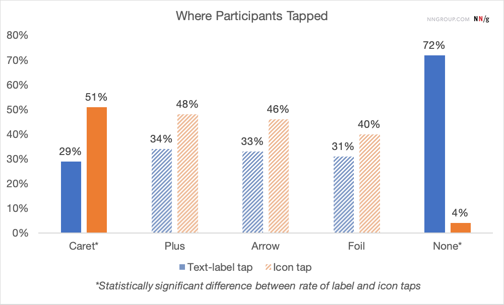
The majority of users successfully tapped the accordion area (around 5% completely missed it).
The most obvious winner here was the Caret, which received far more taps than its text label when presented.
All other icons (except the None option) scored fairly equally, meaning there was no clear preference for those icons.
The below graph indicates the percentage of users who expected to be taken to a new page.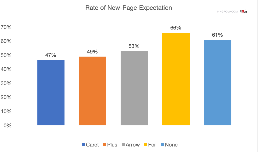
The three standard icons achieved quite similar scores. With users not having a strong expectation of any of them, though the Caret again scored slightly better than the others.
The Foil and None icons both scored particularly poorly, with a noticeable user expectation that they would leave the page.
Conclusion
From the five icons tested, it was clear Foil and None were the least identifiable as expandable accordions. The other three all rank quite similar, with the Caret icon proving to be slightly more recognisable.
On the University of St Andrews website, we do already use the Caret to signal an accordion, which the Nielsen Norman Group recommends (though the study ranks Caret, Plus and Arrow fairly equally).
Creating entirely new icons is not a good idea, as they subvert user expectations. The same applies to the use of no icon.
The biggest surprise was the number of users who expected to be taken to a new page across all five icons. Nearly half of all user’s expected the accordion to function as a regular hyperlink. This suggests accordions may not actually be so useful for presenting content.