New ideas for course finder
I recently came across a case study from GatherContent about the University of North Dakota’s new interactive programme finder.
Their programme finder makes clever use of search functionality to offer a filtering system along with a comparison tool.
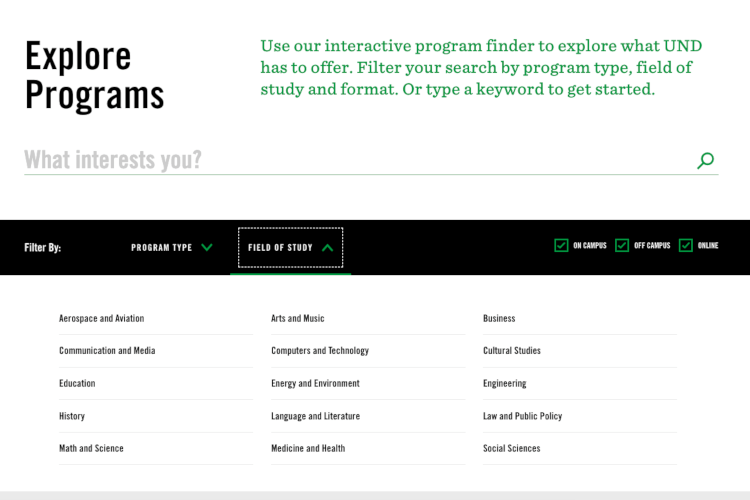
On the landing page of the programme finder, users are presented with a full list of UND’s programmes. From there, they can:
- search for programmes using key words
- filter by programme type (for example, only major degrees or only minor degrees)
- filter by field of study (for example, ‘Arts and Music’ or ‘Medicine and Health’)
- filter by mode of study (for example, ‘On campus’, ‘Off campus’ or ‘Online’)
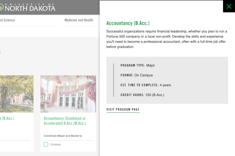
When a user clicks on a programme link, they are presented with a quick-look sidebar which gives a brief summary of the course and key information. From there, the user can click a further link to visit the full programme page.
The benefits of the quick-look sidebar is that it keeps the landing page free from unnecessary content clutter and allows users to get a little more information about a particular programme before navigating away from the programme finder page.
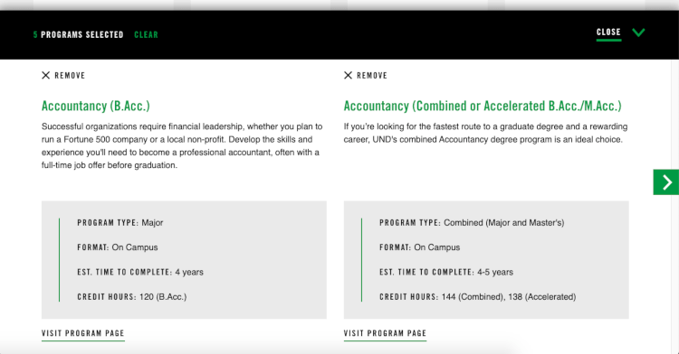
The coolest feature is the ability to compare programmes. Users can select any number of programmes and hit the ‘Compare’ link at the bottom of the page. This brings up a bottom bar with a quick-look of your selected programmes presented side-by-side.
Could we do this?
At St Andrews, we already offer a course search tool which uses our internal search engine, Funnelback. However, we could add filtering options like UND’s programme finder. At the moment, besides using the course search tool, our users can go to specific subject pages to search for courses. However, this doesn’t allow them to easily compare courses across different subjects (for example, if they are interested in both biology and chemistry, they would have to explore those two subjects separately). With filtering options, users could select multiple subject areas and see all courses within those subjects.
UND’s compare feature is particularly interesting. At St Andrews, we have many programmes that sound similar at a surface level (for example, what is the difference between our ‘Banking and Finance MSc’, ‘Finance and Management MSc’ and ‘Finance MSc’?). With a compare tool, we could carefully craft the quick-look information so that the key differences between the programmes are easily highlighted for users. If data tracking could somehow be applied to the compare feature, we could also see which courses our users commonly compare.
Our team would need to explore this functionality within Funnelback to see if we could apply similar features, but UND’s programme finder is a great example of how you can use a search tool to offer more ways for users to navigate through course options.