Developing custom blocks for WordPress
Since it became the default editor for WordPress sites back in December 2018, the WordPress block editor has gone from strength to strength in providing features and flexibility for creating content and designing pages.
The WordPress block editor, which became the default editor for WordPress sites in December 2018, now includes many content features and provides a high degree of flexibility for creating content and designing pages.
This has been achieved through the core WordPress blocks and custom blocks developed by third party companies and developers around the world.
The custom blocks that we’ve created for the University of St Andrews have been built using PHP, React, and the LazyBlocks plugin. You can see the custom digital pattern library (DPL) blocks in action on our example theme site.
The technology for creating blocks is new to the team, so there may not be as many features available as their DPL counterparts. If you are using these blocks and you notice any bugs, please raise a call through [email protected].
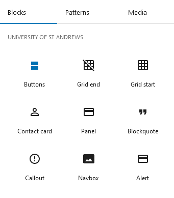
The following blocks are only available when using the University WordPress theme and should appear under ‘University of St Andrews’ in the block inserter. We’ve also edited the ‘table’ block to use the styling from the DPL, but this will be under the ‘text’ section in the block inserter.
- Buttons
- Grid start
- Grid end
- Contact card
- Panel
- Blockquote
- Callout
- Navbox
- Alert
- Accordion
Buttons
Containing only an editable text field and a URL input box, the new button block is easy to use and works similarly to the default WordPress button block. Multiple buttons can also be grouped together.
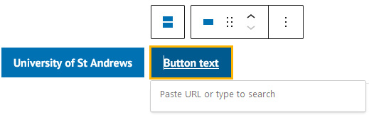
The available styles for the button block are:
- Primary button
- Primary button (large)
- Action button
- Secondary action button
- Secondary action and tertiary buttons
Grid start and end
The grid start and end blocks are used so that the navbox, panel and featured people blocks are formatted and laid out correctly on the page. Insert both the grid start and end blocks, select the relevant ‘grid type’ in each block, and then insert that block (for example, navbox if ‘navbox grid’ was chosen) in-between the start and end blocks.
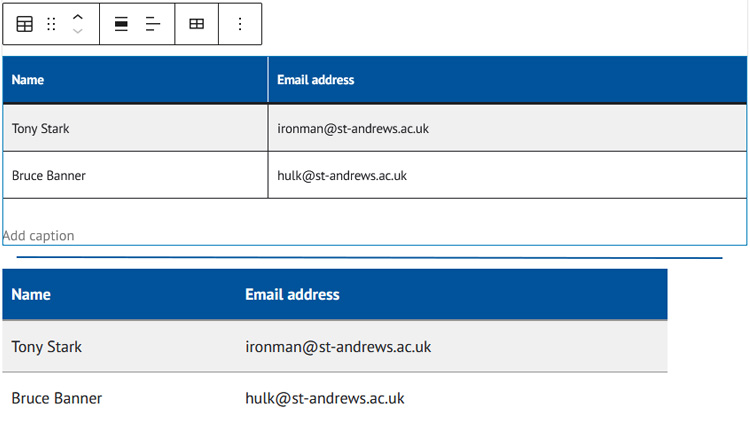
Table
Although not listed as a new block, we’ve edited the default table block to give the same look and feel as the table in the DPL. This doesn’t change its functionality – it still functions exactly like the default table block.
HYow the default table block will now look in the editor (top) and when displayed on a webpage (bottom):
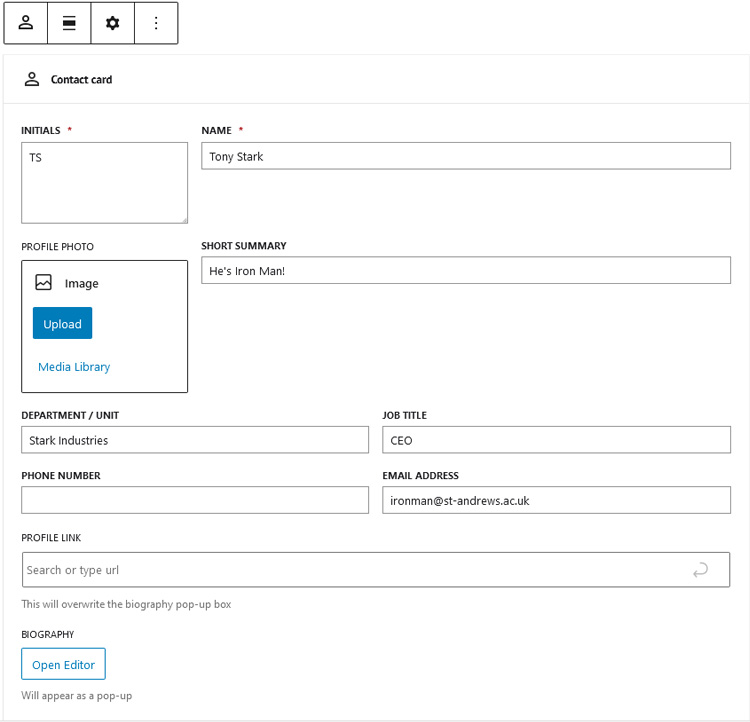
Contact card
The contact card block will list various pieces of contact information about a person, including contact information such as a phone number and email address. The block’s functionality on the front end will change depending on whether a URL is added. If a URL is not added, clicking on the person’s name or picture will generate a pop-up with the person’s contact details and a longer biography.
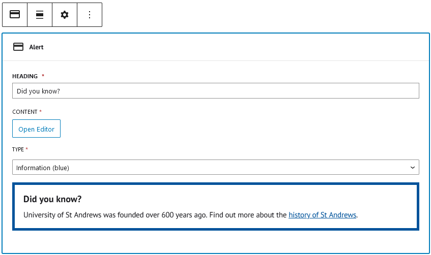
Alerts and callouts
The alert and callout blocks are used to convey information that is more important than the content around it. Although they are separate, both blocks are similar in how they’re set up in the block editor. Each block contains fields for a heading, content, and the type (border colour), and includes a preview of the alert or callout underneath.
See the alert pattern for more information.
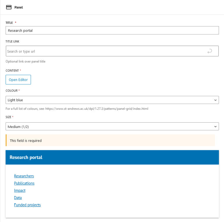
Panel
Panels are used to display text content in a card with a colourful heading. They are similar to navboxes but without the opportunity to insert images. Remember to put the grid start before the first panel block and the grid end block after the final panel block.
See the panel and panel grid pages for more information.
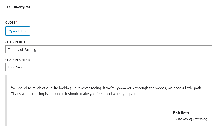
Blockquote
The blockquote can be used when you want to prominently display a quote from a person or a written excerpt. Featured in this block are fields for the quote itself, the citation title (for example, the book the quote was from), the author, and a URL for further details.
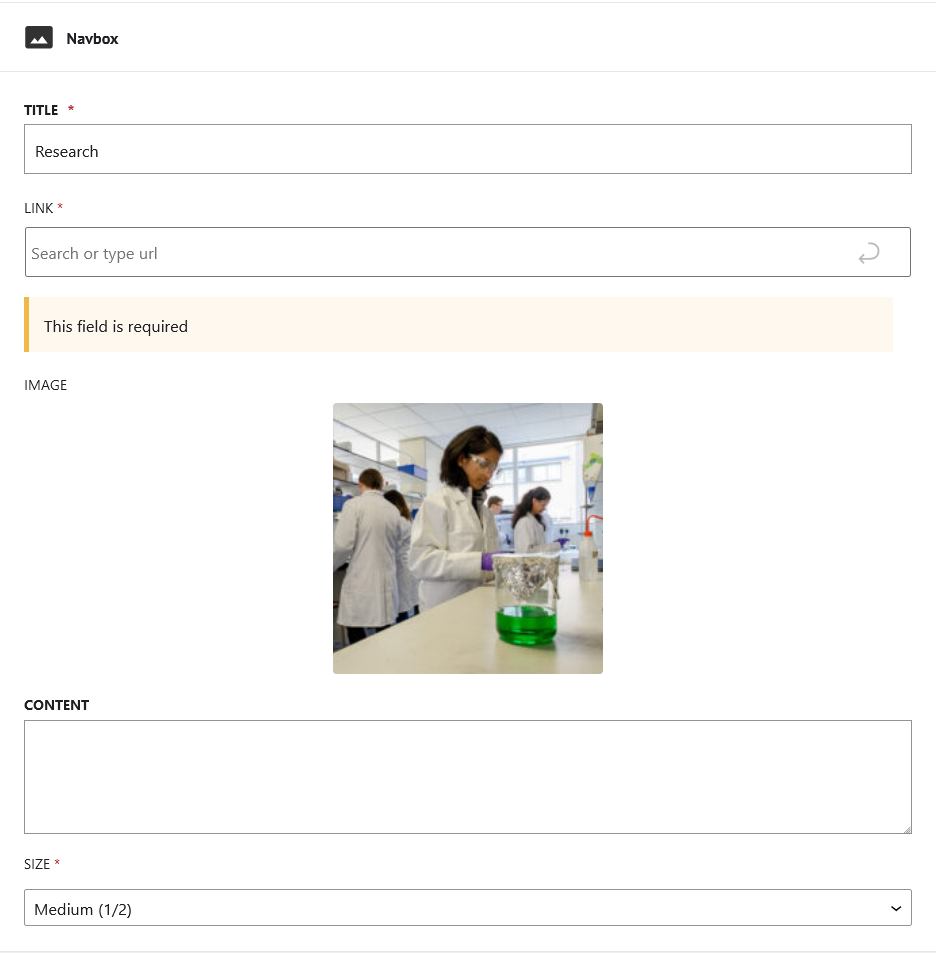
Navbox
We’ve had many requests over the years for an easier way to insert navboxes into WordPress sites, and we’ve finally delivered!
You can choose how to build them (for example, with or without images and content) and they can be used on both the default and full-width page templates. Remember to put the grid start block before the first navbox and the grid end block after the final navbox.
See the navbox page for more information on how to use them.
The future for custom blocks
While we plan to create and release block versions of most, if not all, the patterns in the DPL, the team aren’t sure of the best approach for developing them.
Since the Gutenberg block editor is built with React, developing with React appears to be the best solution. Although the team aren’t experts in React, we are eager to learn and improve our skills. This will help us add in functionality to future blocks and themes, and fix bugs and errors quickly when they occur.
With the LazyBlocks plugin, it’s much easier to create and update blocks as the interface is easy to use and blocks can be scaffolded using PHP and HTML, technologies the team have a lot of experience in. However, we’re missing a lot of features as we’re not using the ‘pro’ version of the plugin and, even if we were using the upgraded version, we still might not get the full functionality and flexibility that React can provide for development.
Whatever route we go down, we will continue making progress and push out updates in the future. If you are using these blocks and you notice any bugs, or would like to have your say on which block(s) we could create next, please let us know through the IT Service desk at [email protected].