Improving my T4 workflow with custom browser hacks
When web tools frustrate you, sometimes you can do something about it.
Working in web-based systems often means living with small frustrations: extra clicks, buried options, long scrolls, uncertainty about what system you’re using.
Individually, these things are trivial, but repeated dozens of times a day, they quietly drain attention and energy.
Over the last 11 months or so, I’ve experienced this using our enterprise content management system Terminalfour (T4).
It’s easy to assume that this is just the cost of using large, shared platforms and that your only options are to raise a support ticket, adapt your habits or bury the frustration and ensure it.
But the web has an unusual property: it’s built on open standards, and much of what we interact with lives in our own browser.
That means small, local improvements are sometimes possible without touching the system itself.
Over time, I’ve started treating repeated friction as a signal. When I notice myself doing the same awkward thing again and again, I ask myself whether it’s something I can improve locally, using browser extensions or small amounts of CSS.
About six months ago, I decided to do something practical about my biggest frustrations when working with T4.
I created the following T4 hacks:
Hack #1 Add custom buttons to the T4 navigation bar

Having used Terminalfour (T4) for years, I’ve built up a pretty solid mental map of how to get around the interface. But even after all this time, there are still a few things that trip me up. One is where to find the T4 media library.
In T4, the media library sits under Content in the left-hand menu. But I think of media as assets, so I find myself opening the Assets menu first.
After doing this for the hundredth time, I thought: I wish there was a button for the Media Library right next to Site Structure on the top navigation bar.
So using nothing but open web standards, I built a simple browser extension for Chrome and Firefox to inject a new button into the T4 navigation bar. It only took a few hours one weekend.
Now there’s no hunting around, I have a button where I expect it to be.
I also added a few more to help colleagues with their frustrations, and an options screen to select which ones you want.
Code
You can grab the open-source code and adapt it for your own use from the following GitHub repositories:
Hack #2 Highlighting types of links on preview pages
My next hack wasn’t due to a limitation of T4 itself, it was to solve a specific problem while I was editing content. On any T4 preview, it highlights links based on their type:
- red for T4 links
- blue for University of St Andrews pages, subdomains and the words ‘St Andrews’
- yellow for External links

It also checks for malformed telephone (tel:) links and it flags any email addresses it finds (blue for @st-andrews.ac.uk and yellow for exernal email addresses).
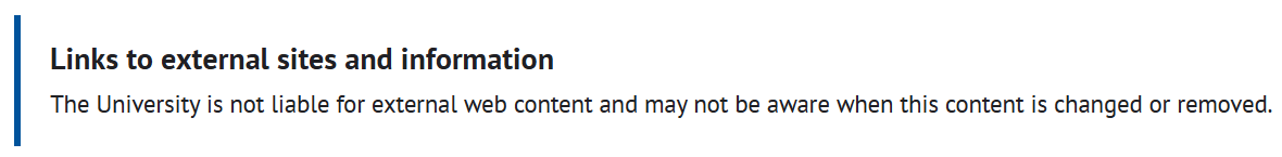
Why do I need this? Because if a page contains links to sites outside the St Andrews domain, our house style asks us to include a standard disclaimer at the bottom:
But I’d occasionally forget to add it and it then takes ages to manually hover over each link on a page to check the URL to find out if any are external links.
Instead, this extension gives me an instant visual cue. Tap the extension button, and I can see right away if there’s an external link and whether I’ve remembered the callout.
Code
You can grab the open-source code and adapt it for your own use from the following GitHub repositories:
Hack #3 Pin Save and Cancel buttons to prevent scrolling
My third hack saves me from scrolling long pages.
Some of our content templates are long. To save me time and prevent my scroll wheel from wearing out, I wrote a simple CSS hack (using the Stylish browser extension) to move the Save and Cancel buttons so they now hover at the bottom of the browser viewport instead of at the bottom of the page.

This was a satisfying fix. It’s very practical and it only took me a few minutes to implement, especially as I was using an existing browser plugin.
Code
For this you just need the Stylish extension for Chrome or Firefox, and you can grab the stylish.css file from this GitHub repository:
Hack #4 Colour coding T4 instances
Lastly, my fourth hack was to reassure me that I was using the correct version of T4.
We currently have three installations of T4: two for live content and one for development.
The problem is, they all look the same. Wouldn’t it be great, I thought, if they were colour coded so you could instantly verify which instance you were using.
I used the Stylish browser add-on again. One line of CSS for each instance fixed this for me.
Now T4 New is the default grey, T4 Old is red and T4 Dev is green.
A five-minute fix that gives me piece of mind that I’m editing the right version.
Code
For this you just need the Stylish extension for Chrome or Firefox, and the following code:
.skin-3 .navbar,
.navbar-container .ace-nav>li>a
{
    /* Red option */
    background-color: #cc3333 !important;
    /* Green option */
    background-color: #8dc63f !important;
}
It’s not the hacks, it’s the mindset
None of these changes are dramatic. They don’t alter T4 itself, they don’t affect other users or bypass governance. They simply remove a little friction from my own working environment.
The point isn’t the tweaks.
It’s the mindset behind them.
If a web-based tool frustrates you in small, repeatable ways, you may have more agency than you think. The web’s openness makes that possible, and acting on it can make everyday work calmer, safer and more intentional.
Resources
Illustration used in this article is from Storyset.