Hero banner redesign
We have taken feedback into consideration and optimised the hero banner used for home pages. The current hero banner has been in effect since 2015 with minor adjustments to improve accessibility over time.
Problems with the old hero banner
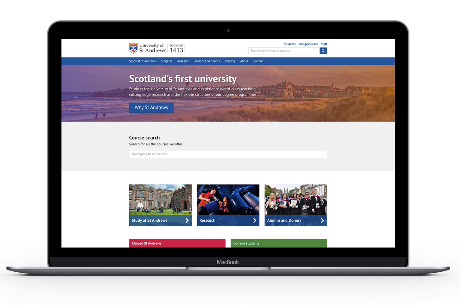
Image selection criteria is restrictive
Only certain types of images work in the hero banner. Selecting images for hero banners has been a complex process and there are a lot of acceptance criteria that they must meet to succeed. There are a lot of great images that help showcase the University’s character, but they are often thrown aside because they do not function correctly in the limited space provided by the hero banner pattern.
Poor text contrast ratio
Back when the pattern was launched, it never included a colour overlay. White text was displayed directly over the image.
We added a colour overlay so text was more accessible for visually impaired users.
The paragraph text of the hero banner is white text on hundreds of differing hues of whatever colour has been used to overlay the image. It is near impossible for us to accurately determine the contrast ratio of the white text. This poses problems when grading the accessibility the pattern. Visually impaired users may find difficulty in using the pattern.
Character is washed out
To cater for accessibility, we had to sacrifice the prominence of the background images. Because of this image, have been reduced to background noise. They only provided vague tone of the University. As a result, there is a lack of marketing appeal.
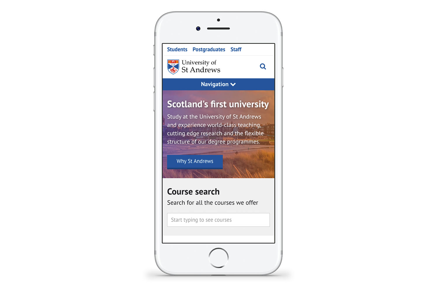
Image is a complete after thought on mobile
The hero banner background image is completely obscured on mobile devices. It may as well not be included.
Goals
In order to solve this problem, we needed to focus on the following goals for improvement:
- Feature the images, especially on mobile devices
- Reduce complexity of image selection criteria
- Increase contrast ratio of text
- Get rid of the colour overlay
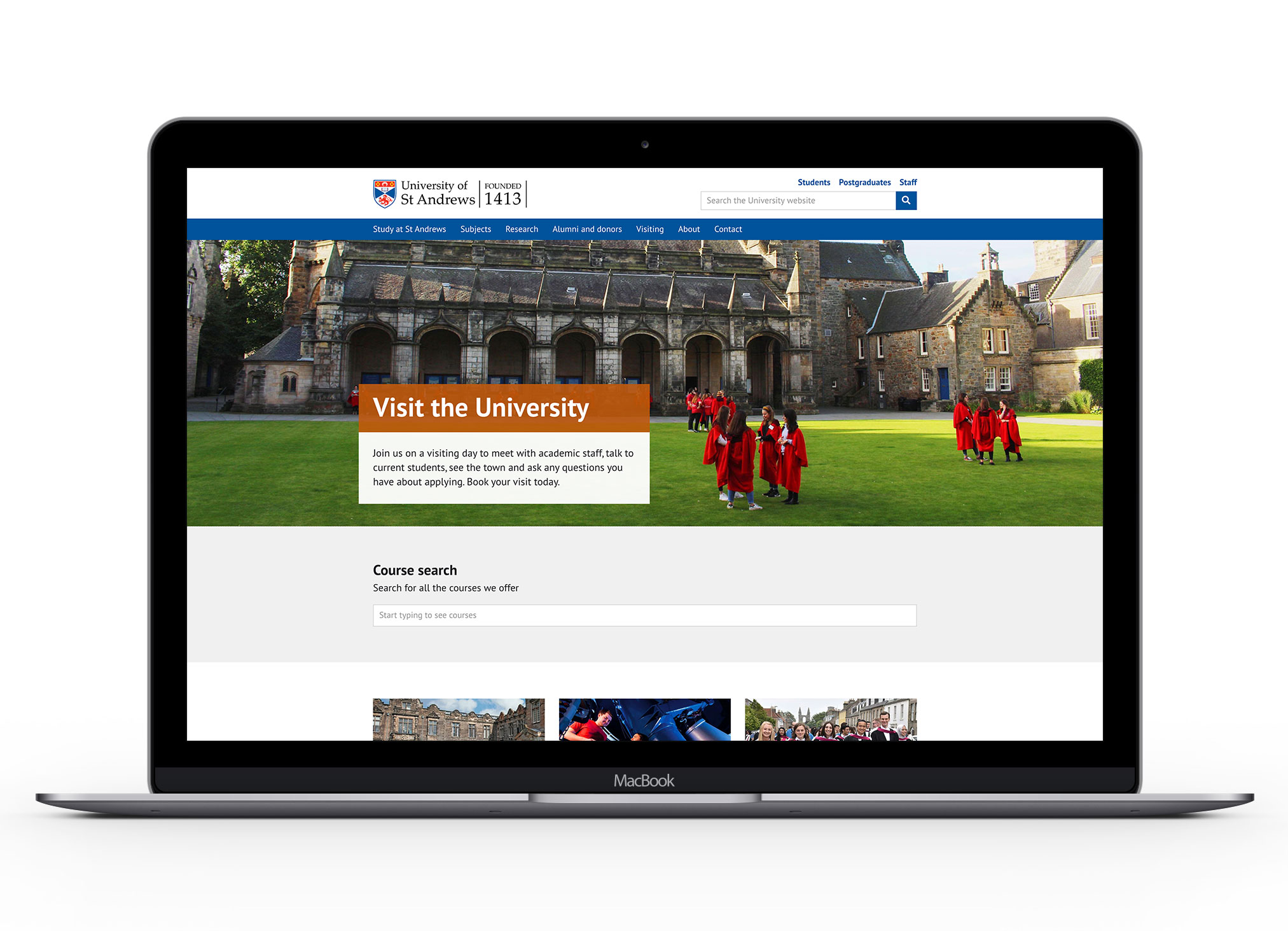
The new design
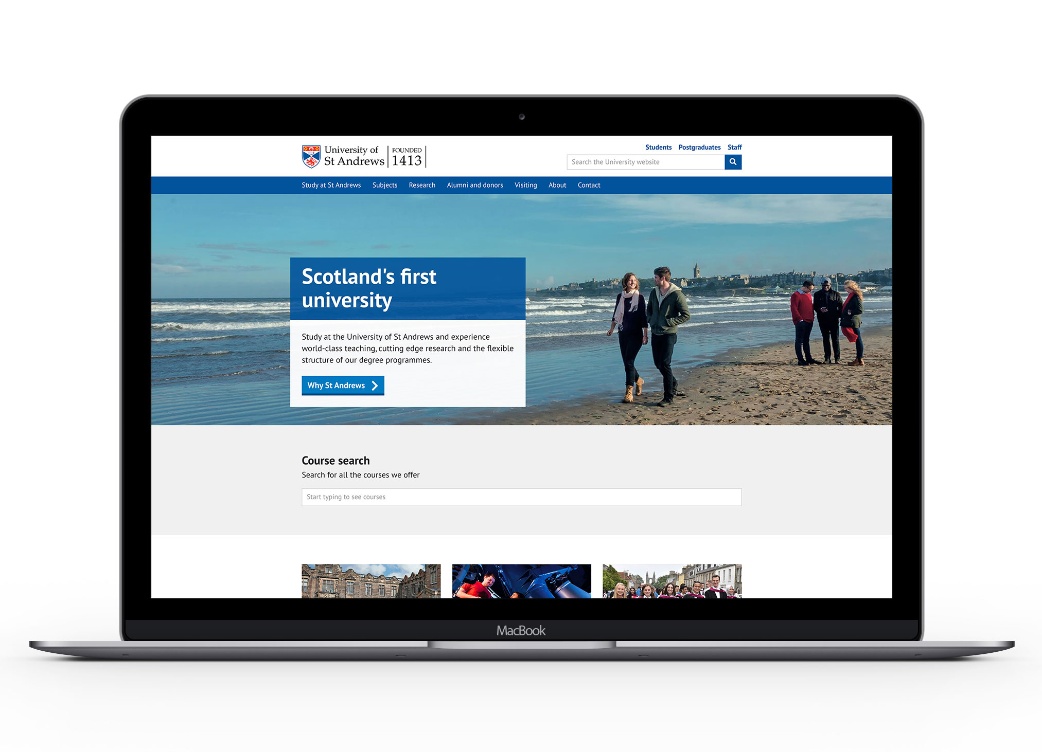
Enhanced focus on imagery
The new hero banner design has made imagery an equal priority to the call to action. The image is just as supportive for context as the paragraph text.
The full colour overlay has been removed to allow the colours of the image to portray character.
We have increased the height of the banner. This increases the letter box view of the pattern allowing more of the image to be featured.
Along with the removal of the colour overlay, this reduces the complexity of image selection for the hero banner pattern.
Paragraph text on white background
We have increased the contrast ratio of the paragraph text by making it dark text on a white background.
We can now use images we weren’t able to before
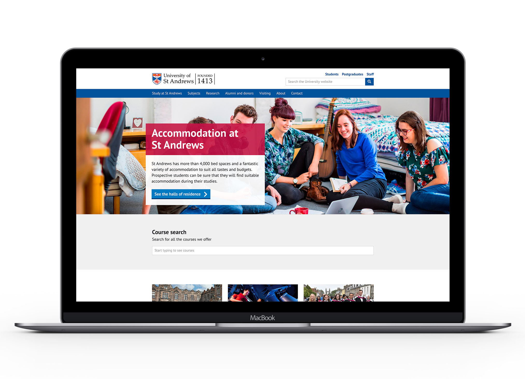
Due to the complexity of image selection, we were restricted from ever using close ups of people. By increasing the height and removing the colour overlay, we can now showcase student life in St Andrews from the hero banner.
Optional buttons
As a bonus, we have provided options for banners without buttons. These banners can be used to effectively communicate a brief tagline.

Featured images on mobile devices

The mobile view of the hero banner pattern now prioritises the image of the banner. This allows the full image to be displayed, rather than a letterbox view, so none of the image is obscured on mobile.