Window sizes and the fold
It can be difficult to design a webpage. Sure, there is a great deal of freedom. You are not limited by, say, the size of a piece of paper.
But there is, of course, a limit to what you can reasonably do with a webpage. One potential constraint is the size of a browser window. As monitors have increased in size over time, webpages have gradually become wider in order to fully use the available space.
Sometimes a web developer will be asked to optimise a webpage so that it looks perfect on a client’s setup, but not necessarily anyone else’s setup. While it may be common for something to be displayed at the bottom of a page on a physical publication, it is impossible to guess where the bottom of a monitor will be when designing a webpage.
Estimating browser sizes
There is not one set browser window size. While the vast majority of visitors use a display that is at least 1024 pixels wide, a handful are still using a display that is 800 pixels wide or smaller. Even then, there is nothing to say that the user has their browser window maximised! In essence, a user can be peering through a window as small or large as you can imagine.
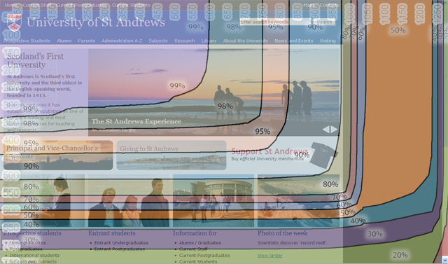
To help us out, Google have a useful tool called Google Browser Size. This is probably familiar to those whose work focusses on the web. But it may be useful to other content creators and website maintainers to see this in action.
Google Browser Size shows you an estimate of the browser window sizes of web users. It displays this data like a map with contours, which is then overlayed onto your webpage. As you can see, 80-90% of users can comfortably view the full width of the University website.
What about the ‘fold’?
Where is the ‘fold’? Almost everyone has to scroll to view all of the content on a normal webpage. But when does this begin to matter? At the 80% mark, where horizontal scrolling stops? The 50% mark?
It is impossible to say. The truth is that web content should be accessible to all users. If the motivation is to stop people from having to scroll, arbitrarily selecting a percentage of people who must scroll is not good enough.
But we needn’t worry about squishing up our webpages so that no-one has to scroll. The fact is that scrolling is okay. We all do it. The fold is largely a myth.
Don’t worry about where the fold is. Of course, what appears at the top of a page is important. But cramming everything up there will overwhelm users. They would prefer to scroll. Just lay out your page so that it entices your users to read on.
Designing with all users in mind
The evolution of browser window sizes is one of those challenges that can make web design a tricky job. Just as developers have become accustomed to designing for monitors at least 1024px wide, the mobile web is ensuring that we must always keep smaller displays in mind too.
The beauty of the web is that there is great freedom. We really don’t have to worry about concepts like the fold. The trick is to embrace this freedom while exercising restraint.
