Replacing the Flash world map
One of the biggest issues we have had to tackle while working on the new Study at St Andrews website is the entrance requirements and country information section.
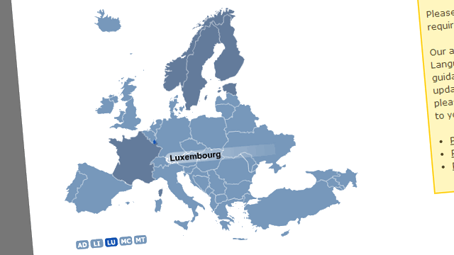
The website contained a Flash world map that was considered to be so bad that I was asked to implement changes ahead of the launch of Study at St Andrews.
So the current entrance requirements page, which has been in place since early December, could be seen as the real first (small) step towards what we are attempting to achieve. You might call it phase 0.5.
Problems with the Flash world map
When the Flash world map was first added to the website in 2009, it probably seemed like a good idea at the time. The mobile web had not yet truly taken off, and Flash was almost ubiquitous on desktop PCs.
But over time, usability and compatibility issues with the Flash map became painfully clear.
- The vast majority of mobile devices (including all Apple devices) do not support Flash, and even Adobe have given up on the issue.
- Selecting a particular country from the map required very fine motor control (particularly for small countries), not to mention strong geographical knowledge.
- It posed a host of accessibility issues:
- It was impossible to navigate the map using only a keyboard.
- It required sight to be able to use the map.
- It was terrible for search engine optimisation:
- Because content was pulled into the page using JavaScript, it was impossible to provide a URL for each country, and search engines could not crawl the content.
The interim quick fix
The solution that we implemented in December 2013 was to remove the Flash map, and give the entrance requirements section a new navigational system, while using the existing content.
It was clear that there were many issues with the content, but fixing it all up-front would have risked delaying the Study at St Andrews project as a whole. So as a compromise we used the old content as an interim measure.
Our new navigational system was a comparatively simple A–Z list of countries. Each letter of the alphabet was listed, and clicking on it would open an accordion to reveal the full list of countries that begin with that letter.
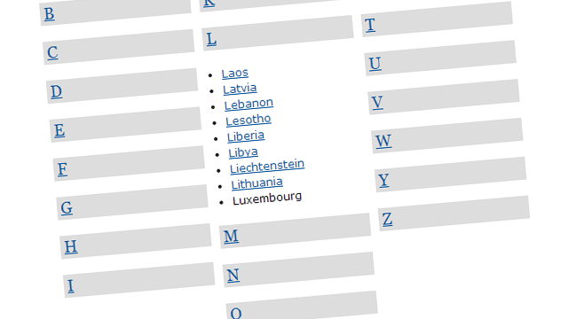
We also re-arranged the structure of the entrance requirements section behind the scenes, so that each country had its own individual webpage. This meant that for the first time admissions officers could supply inquirers with a URL rather than asking them to use the cumbersome Flash map.
One step better — Study at St Andrews launch
For the launch of the Study at St Andrews website, we have used the same basic idea for the navigation system. The new website makes heavy use of accordions, so it fits in well with the rest of the website.
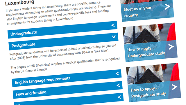
The country page itself is now broken up more clearly into separate sub-headings for undergraduate entrance requirements, postgraduate entrance requirements, English language requirements. There are additional sections for fees and funding and, where applicable, visas, and country representatives and agents.
Rationale behind the A–Z layout
A few people have asked us why the A–Z list is laid out the way it is, with letters A–I in one column, J–Q in the middle column and R–Z in the third column.
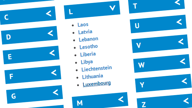
I agree that having A-B-C in the first row, then D-E-F in the second row, and so on, would be more intuitive on the desktop layout.
However, the new website uses a responsive design. On a mobile layout these columns collapse into one single column. So laying it this way would result in the list displaying on mobile devices as A-D-G-J-and so on.
With a lot of extra HTML code, it would be possible to display A-B-C on the top row on desktop, while maintaining alphabetical order on mobile. However, this would require a lot of extra HTML.
It would also have the undesirable effect of pushing down the all three columns when you open an accordion, rather than the one column as it does with our solution.
We will monitor any feedback on this closely to consider if we need to rethink this approach.
Next steps
We will be launching this new version of the entrance requirements pages along with the launch of the rest of the Study at St Andrews website in early March. We have given the content a light polish and a lick of paint.
However, it has become clear that the content is not yet fully ideal. So we anticipate doing a lot of further work on these pages in the next few months, as it is important for the user and for the University that we get this right.