Results from usability testing of PGT pages
Usability testing is a technique used to evaluate a product as it is developed by testing it on others. It has been used by the digital communications team in the past to gain insightful qualitative data about user experience. It is this first-hand view of user experience which makes usability testing so valuable, as we would be unable to find this information through analytics or surveys alone.
Usability testing
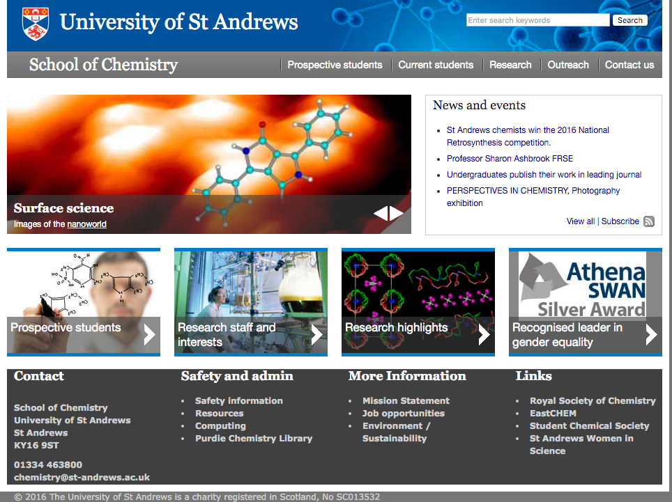
For this test, our key objectives were to benchmark current postgraduate taught course information on the ‘old’ style pages and gain an understanding of user experience with the ‘new’ style postgraduate taught course pages. The ‘old’ style pages refer to pages which exist within a School’s website where course information is dispersed across many webpages. For example, the School of Chemistry:
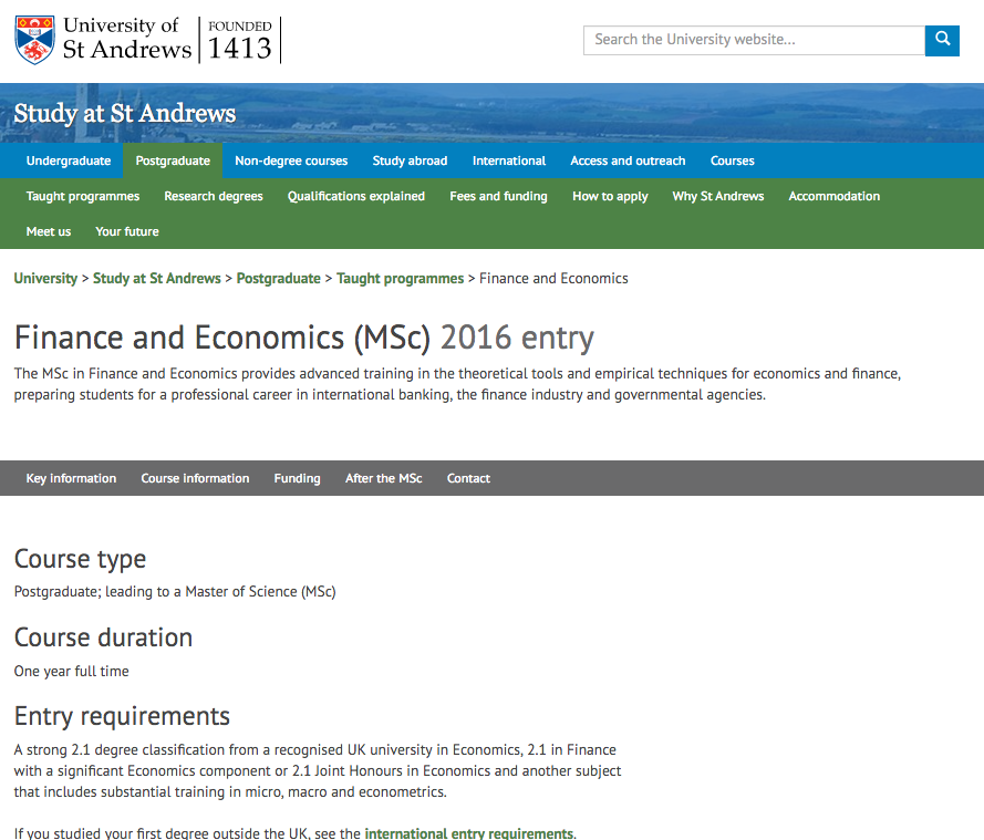
The ‘new’ style pages refer to the newly designed postgraduate taught pages, such as the Finance and Economics MSc page. These pages contain all of the relevant information a student could need when looking into a course.
The criteria for the participants was that they should be prospective postgraduates, so we set up a stall at the postgraduate visiting day on 9 April. We tested nine prospective students; five in the group were testing the old style pages, and four tested the new style Economics postgraduate course page. The test took around 15-20 minutes.
After asking them a few introductory questions to understand their background and break the ice, the participants were asked to complete a series of tasks. These tasks had been decided beforehand and both the testers and the staff member conducting the testing had to follow the script. These tasks were:
- Find out how much the course would cost
- Find out what some of the modules are on that course
- Locate the contact information of someone who could tell you more about that course
- Sign up for a visiting day
Key findings
- All users spent more than two hours on the internet per day. Eight out of the nine users used a combination of a mobile and a laptop or desktop computer. Only one tester used their laptop solely. Overall, with the new style postgraduate course page we found that the average time needed to complete a task was reduced by 70%. The number of clicks was also reduced and the overall feedback was that the design was more appealing and easier to navigate.
- The total average time spent completing all of the tasks was far higher for the old pages than for the new pages. (6 minutes 27 seconds for control as opposed to 2 minutes 3 seconds for the test group.)
- The number of clicks needed to complete a task were far higher for the old pages than for the new pages. (22 on average for the control group and 8 for the test group)
- All general comments from control group highlighted faults with the website.
- All participants liked the new design of the homepage and Study pages.
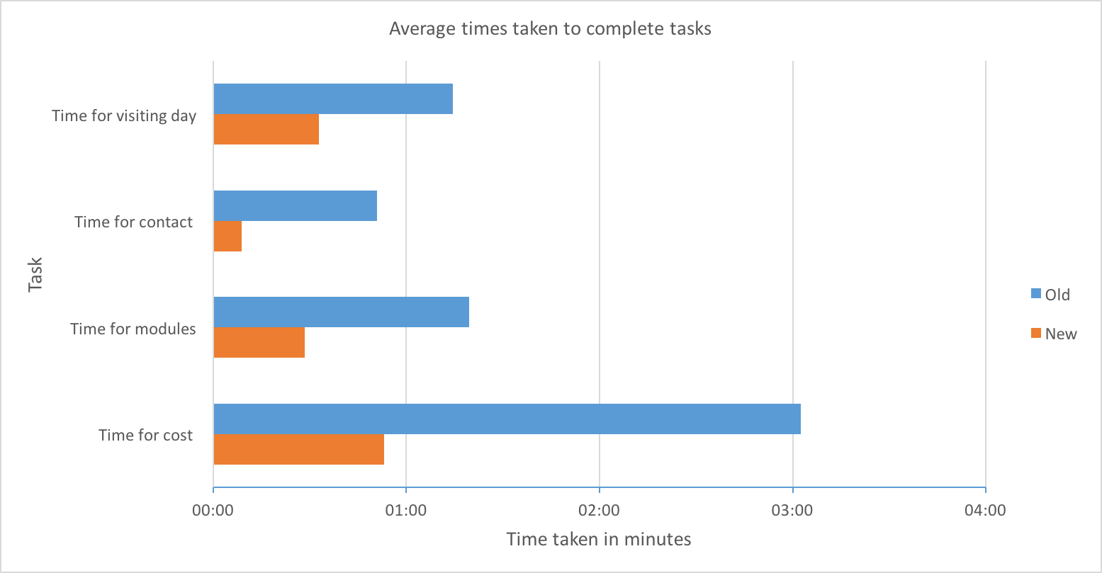
Time
The chart below shows the difference in average times it took to complete tasks on the old and new style pages. The average time taken to complete tasks on the old style pages was, for all tasks, more than double the average time taken on the new style pages. This tells us that information was harder to find on the old style pages, thus taking the participants longer.
The average time for finding the cost of the course was far higher than the other tasks due to that task being the first the participants had to complete. This meant that the user had to click on more links to find the information. We realised that once the participants were within a School’s page or in the postgraduate study section of the website they found the information for subsequent tasks much faster.
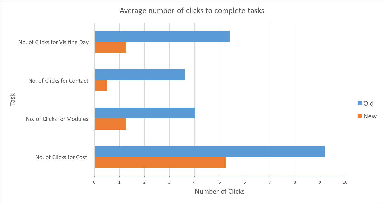
Number of clicks
The chart below highlights the average number of clicks needed to complete each task. It is clear that the new-style pages dramatically reduced the number of clicks needed to find information. This shows that when key information is collected, organised and brought to the forefront of a webpage, the user journey is improved.
Examples
Below is a video showing one of the testers completing the first task: finding out how much a course would cost. In this example, they had to find out how much the Classical Studies MSc cost. It takes the user 3 minutes and 18 seconds to find this information. The user spent 1 minute and 34 seconds of that time navigating the PDF prospectus.
During the task, the participant appeared confused and whilst looking for the cost information said “it feels like I’m on the wrong page… it just seems more general.” Commenting generally at the end of the task, they said “critical elements like tuition fees should go on the main page so you can see them instantly”.
The video below shows a participant finding the pricing information for the Finance and Economics MSc via the new-style page. The time taken for this is dramatically reduced at 39 seconds, and the tester’s user flow is more streamlined.
Conclusions
This round of usability testing illustrated that information was easier to find on the new style postgraduate page. Not only did participants find the information faster, but they clicked on fewer links to complete the task. The testing also provided an insight into areas for improvement within the new postgraduate pages, which highlights how valuable usability testing is in allowing us to constantly enhance our pages to meet users’ needs.