Redesign of University maps
The University maps page has been in existence since 2008. It uses code from Google to display locations on a map of St Andrews. The map has now been redesigned so that it uses the latest Google code and the digital pattern library to provide a better user experience on desktop and mobile devices.
Original map design
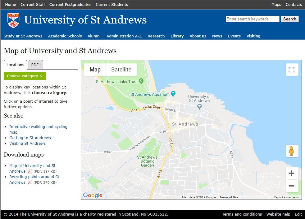
The original map required the user to click on a link called ‘choose category’ before they could see any locations. This was fine on desktop, but didn’t work on a mobile device.
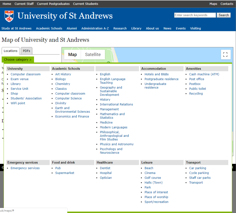
The user could select a University category such as computer classrooms, or a non-University category such as postbox.
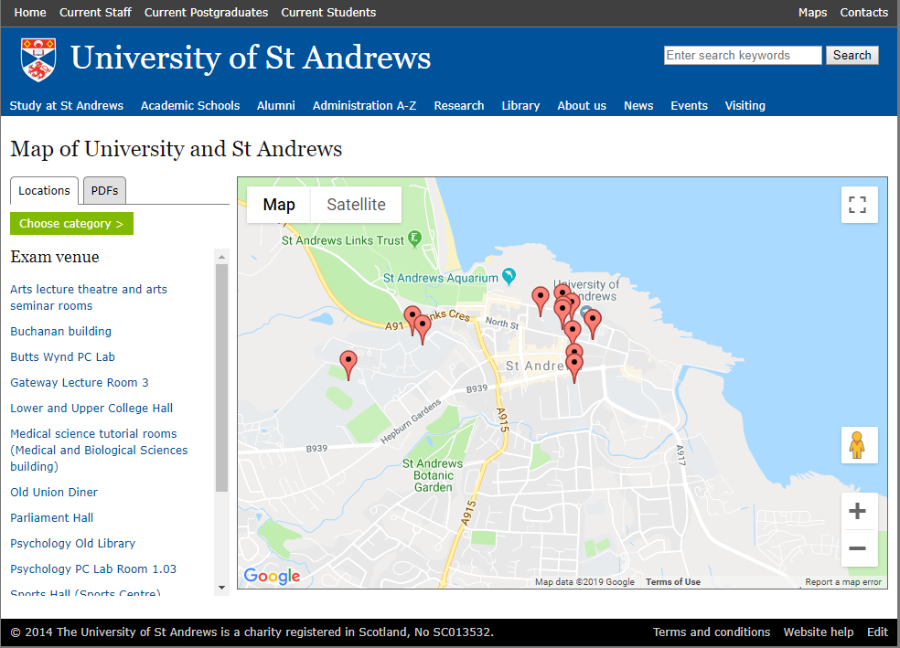
Once a category had been selected, the locations would be displayed on the map with links on the left hand side.
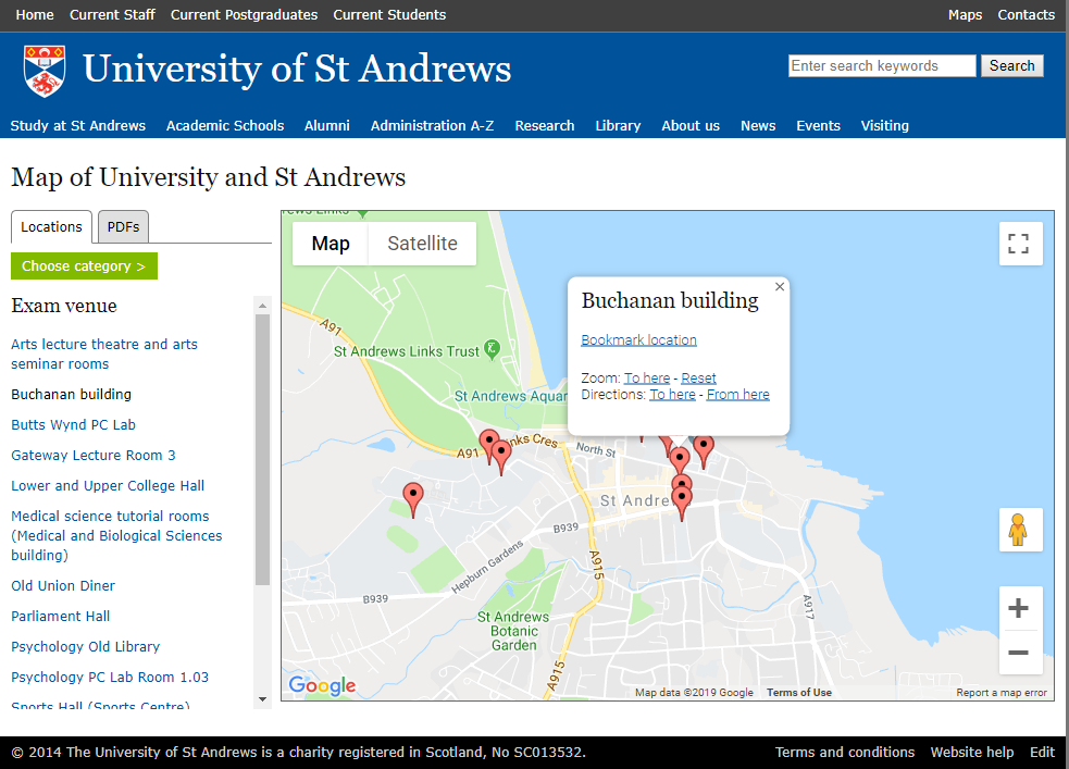
Clicking on the map pin, or a link on the left hand side, would display a pop-up window. The pop-up window gave the user the options to bookmark the location, zoom into the map location or find directions to or from the location.
New map design
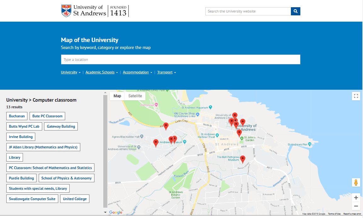
The new design retains a lot of features from the original e.g. user can find a location by selecting a category from a drop-down list, and the map has the minimum of features. It improves on the original in a number of ways. For example, users can now search for a location. We have also reduced the number of locations so they are just related to the University to make the maps easier to search and manage.
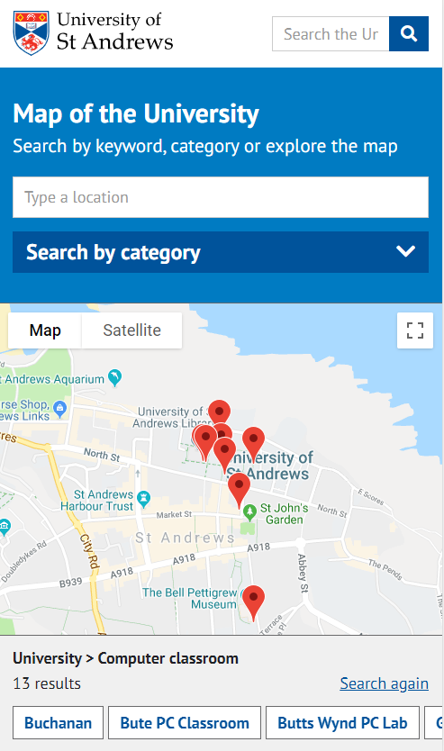
On desktop the map shows links to categories on the left hand side, while in mobile these move below the map where the user swipes horizontally to find the link to a location.
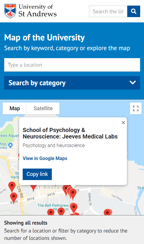
Like the original design, clicking a map pin or a link, will open a pop-window above the pin. We have removed the option to find directions, instead we provide a link to that location in Google maps where the user will get the full Google map experience.
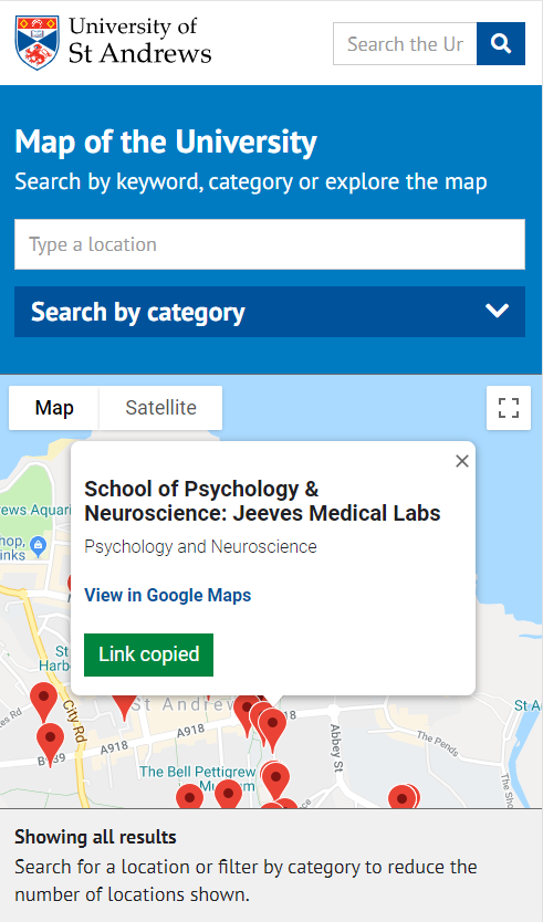
There is also a prominent button that will allow the user to copy a link to the location that can then be pasted into say an email or instant message. When the link is copied, the button changes from blue to green and the message changes to clearly indicate to the user that it has been copied.
Future enhancements
The new maps design offers a number of enhancements over the original, but we need to do usability testing to find out if the maps could be improved further. In the meantime, we hope that the revised design does improve the user experience for everyone.
