Designing for users of screen readers
A screen reader is a software application that enables people with visual impairments to use a computer or mobile device. Users of screen readers can benefit from accessible web-based services. This guidance is for web and digital professionals who want to make sure that their service is optimised for users of screen readers.
Describe images and provide transcripts for video
Don’t only show information in an image or video.
Users with severe sight impairments cannot rely on visual communication. They require additional aid when interpreting information. Alternative text describes the appearance and function of visual elements and we must provide it.
Provide descriptive text for photos, illustrations, diagrams, graphs, animations and videos so a screenreader can read it aloud.
For example, answer these questions when writing alternative text for photographs:
- What is specifically in the photo?
- What is happening in the photo?
- Where was the photo taken?
If a picture is worth a thousand words, then the alternative text should be those thousand words. (Though maybe a little less than a thousand…)
Alternative (‘alt’) text is good for informing search engines too.
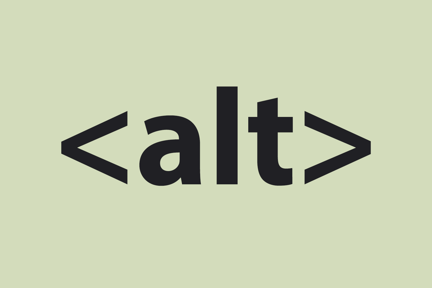
Examples of alt text
- Bad (missing alt text):
<img src="puppy.jpg"/> - Bad (keyword stuffing):
<img src="puppy.jpg" alt="puppy dog baby dog pup pups puppies doggies pups litter puppies dog retriever labrador wolfhound setter pointer puppy jack russell terrier puppies dog food cheap dogfood puppy food"/> - Better:
<img src="puppy.jpg" alt="puppy"/> - Best:
<img src="puppy.jpg" alt="Dalmatian puppy playing fetch"/>
Also use audio-description and captions in videos, either as a natural part of, or in addition to the narration.

Follow a logical linear layout
Don’t spread content all over a page.
A screenreader takes people through a web page in the order patterns and components appear in the HTML code. This might not be the same as how they appear visually on the page.
It can be confusing if web page elements are announced out of context or in the wrong sequence.
A user’s flow can be interrupted because the next element expected – for example, a submit button after an input field – appears a lot later or earlier in the HTML, even though visually it is close by.
Ensure that screen readers can navigate pages in the correct order.

Structure content using HTML5
Don’t rely on text size and placement for structure.
A screenreader will usually read out text with the same voice regardless of font size, weight or other styling. Screen readers will also not convey the visual arrangement of content on a web page, and what that arrangement implies.
To interpret a web page effectively, users need correctly marked up elements like headings, form labels and lists.
Building blocks of the page (header, navigation, main content and footer) should be set outwith landmark tags, so the structure can be announced audibly, understood and jumped to by the user.
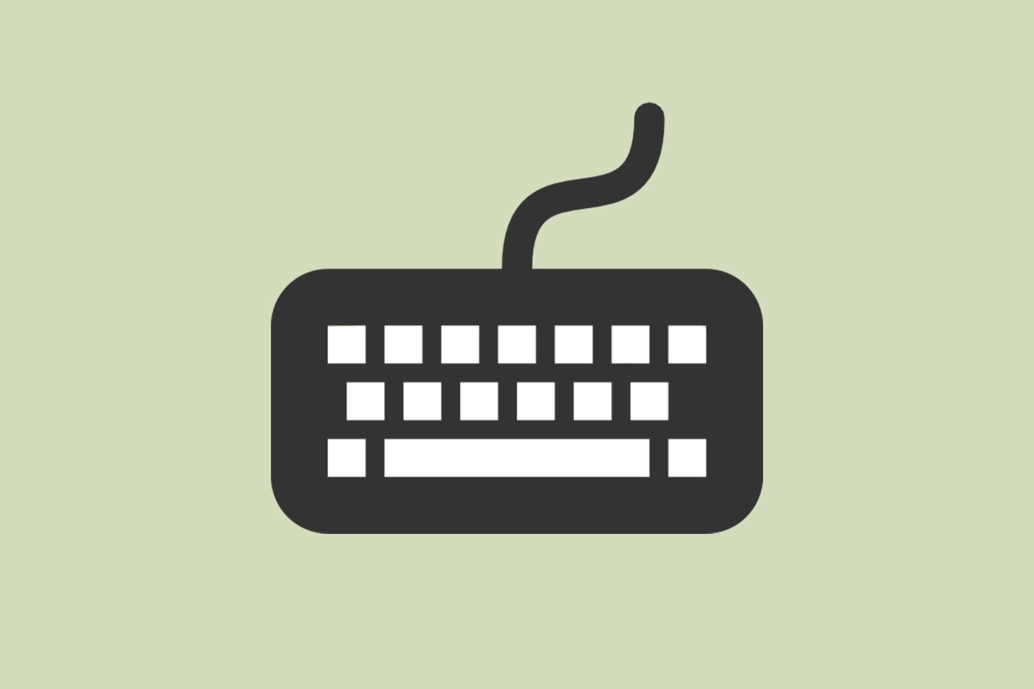
Build for keyboard use only
Don’t force mouse or screen use.
People who use screen readers often cannot see a mouse pointer. Instead of a mouse they use the keyboard to navigate, moving between elements such as links, form fields and buttons.
Ensure that all the actions on the page can be started and finished using only a keyboard. This includes: closing notifications, getting help, controlling videos and submitting forms.
You can test this yourself right now. Try tabbed browsing on this blog post for starters:
- Previous: Shift+Tab
- Select: Enter
- Next: Tab
Resource: I Used The Web For A Day With Just A Keyboard
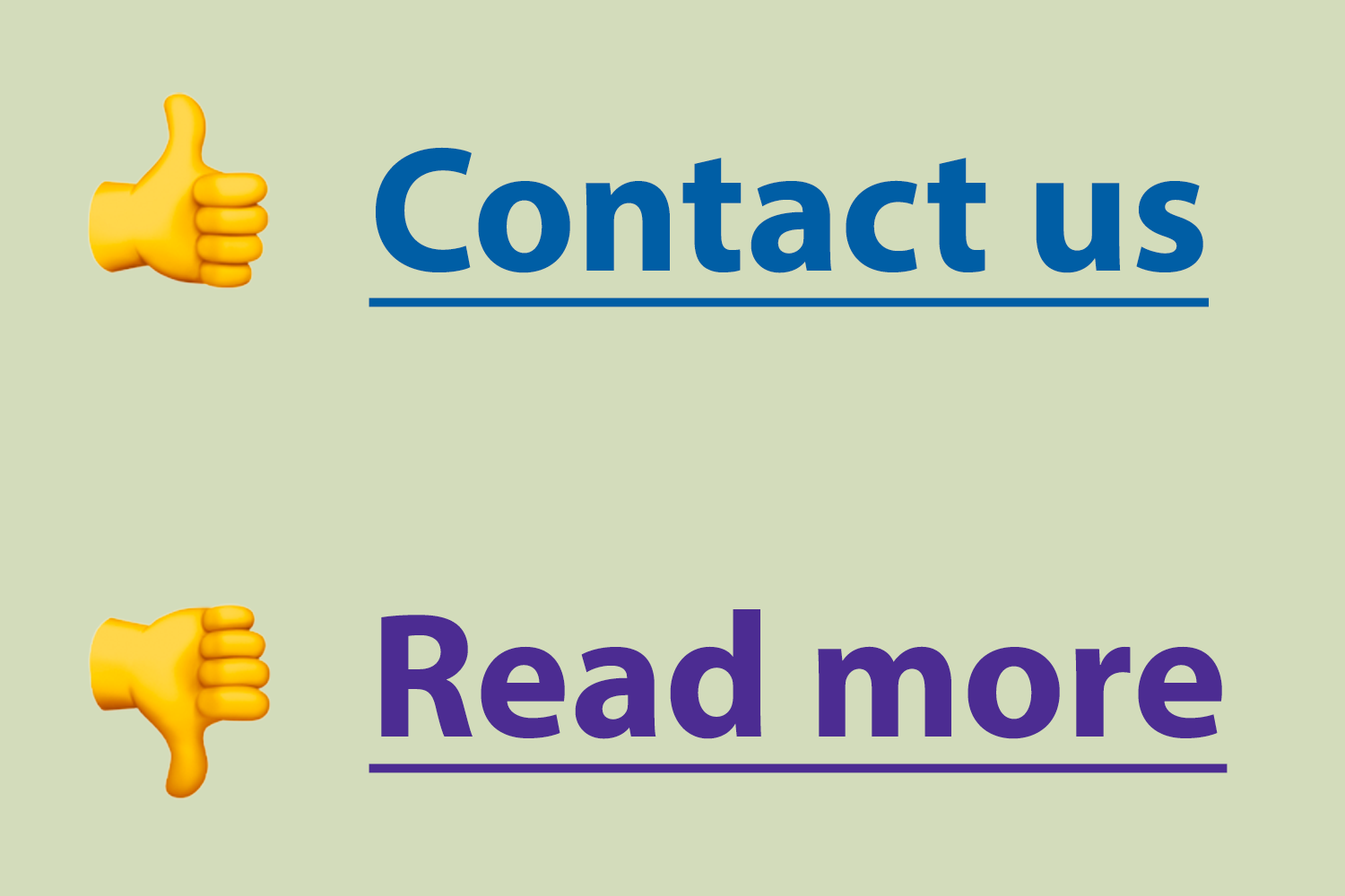
Write descriptive links and headings
Don’t be vague.
Screen readers can read out a list of all the headings or links on a page. This enables the user to jump to the desired item without listening to all the content.
Heading links need to make sense out of context – a list of ‘Read more’ links is meaningless.
Instead, describe the target section so the user can decide whether that information is right for them.
For instance, avoid:
To download the Word template, click here.
Instead, write:
To download Word templates, go to the Office 365 templates page.
Try out a screen reader yourself for free
If you own a smartphone, tablet, or computer, you may be surprised to learn there are already widely used screenreader applications built-in to the operating systems of these devices.
My recommendation is to use one of the screen readers on a device of choice on a webpage you frequently visit to understand how a screen reader interprets it.
Android
iOS
- VoiceOver for iOS
- [Video] Assistive Tech: VoiceOver on iOS
- [Video] How to navigate your iPhone with VoiceOver
Mac
Samsung
Windows
No one should be excluded because of their disability.
As well as being the ‘right thing to do’, it’s a legal requirement to treat people with disabilities equally, in terms of opportunities and experiences. When designing a service, accessibility should be a priority.
Understanding accessibility means we can build services that work for everyone, whatever their access needs.
For best practice, follow current accessibility and plain English guidelines, as well as the requirements of the Equality Act 2010 and Northern Ireland equality legislation.
Resources for this article
- Information from this post heavily used advice from the poster series, Dos and don’ts on designing for accessibility, designed by the Home Office
- A case study on a partially sighted screenreader user
- How to create content that works well with screen readers
- Designing for Screen Reader Compatibility
- Websites and Mobile Applications Accessibility Regulations 2018