Keyboard accessibility improvements to the University website
Keyboard accessibility is one of the most important aspects of web accessibility. The latest release of the digital pattern library (DPL) includes improved support for users who rely on a keyboard to browse our web pages.
Several factors impact on a keyboard user’s ability to view and interact with a web page. Here are some details of the new changes which will shortly start appearing on the University website and WordPress theme.
Focus states
One of the most visible new changes occurs when an interactive element, such as a link or button, is the point of focus. Keyboard users typically use the tab key to sequentially move through these elements and WCAG requires that it is clear when an element is in focus.
Browsers generally support this by default, but styling may vary between these, with some using a feint dotted outline and others a blue glow. Many website designers mistakenly choose to remove the focus styles altogether, to avoid this inconsistency problem.
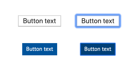

The challenge was to create a style that could be applied consistently to any interactive element which also meets accessible colour contrast ratios. The University brand colours that are used online are predominantly shades of blue and grey. This closely resembles the colours used on the GovUK website and we looked to the fantastic GDS team for inspiration on how they tackled this problem. The two images above show how the previous DPL focus style did not provide sufficient contrast with some foreground and background colours.
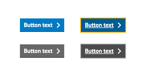
We have chosen a shade of yellow to provide effective contrast against a wide range of background colours and the elements that are in focus. This colour is now reserved in the DPL palette for the sole purpose of highlighting focus or active states. This is used alongside using the dark grey colour for text, underlines and borders to standardise how interactive elements behave. Active states have also been styled for buttons to indicate when an element has been activated either by a keypress, mouse click or tap. This is a useful additional visual indicator for all sighted users.

Underline to distinguish links
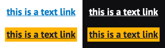
The default browser styling for links is underlined text. This makes it easier to distinguish links from surrounding text and aids in quicker interaction using a mouse click or finger tap. It also gives sighted users, navigating by keyboard, a clear indication of what links can be accessed.
The latest DPL release restores the importance of underlined text, to indicate links, across most design patterns. Navigation menus and buttons also make use of underline styling to signify focus state, in addition to the new yellow outlines and backgrounds.
This provides additional support to colour blind users who might not be able to identify an interactive element or focus, by colour alone. We used the Chrome browser plugin, I want to see like the colourblind to test how elements, such as buttons, performed against various simulated colour-blindness conditions.
Navigation order
Automated accessibility testing tools can only go so far, and it takes additional user testing to sense check that pages fully meet the new accessibility standards. The new version of the DPL has been tested using both the NVDA screen reader for Windows and the VoiceOver screen reader for Mac OS – alongside testing keyboard navigation using the tab key.
This has led to code changes for various design patterns in order to:
- Make the order of interactive elements more logical.
- Remove duplicate links to the same location, for example, a thumbnail link and a text link both to the same page could both have previously received keyboard focus.
- Improve the switch of focus to an element that becomes active, for example, when opening a modal window, the keyboard focus switches to the open window and its contents.
Other accessibility improvements
The latest release of the DPL includes many other accessibility improvements and recommendations, in both its own documentation and the code examples provided. This includes:
- Using appropriate HTML5 elements such as <header>, <footer>, <nav> and <button>.
- Improved use of ARIA attributes.
- Improved instructions and help text for screen reader users.
- Correct ordering of headings.
The DPL provides a starting point for meeting accessibility regulations, but a large portion of the responsibility still rests with content creators and editors to publish web pages and other resources that follow the guidelines. For further information about the website and web application accessibility regulations please contact the digital communications team – [email protected].