Making charts accessible for the web
Charts and graphs are a great way to present complex information in a visual format that can make them easier to understand, but care must be taken to keep this information accessible for everyone.
There are a wide range of different types of charts, that can be used to meet different use cases, but they generally all consist of a mix of lines or blocks, in different colours or patterns and labelled with text and numbers. Typically, charts are published on web pages as images, but this can cause problems for users who are colour-blind or use screen reader software. Care must be taken that sufficient colour contrast is used and alternative text descriptions are available.
We have recently used two different methods to provide accessible charts on the University website.
Images with text descriptions
The equality, diversity and inclusion progress reports were produced both for print and web and included complex charts and custom infographics to present the data.
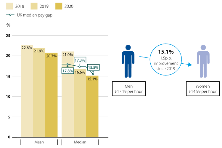
To make the web pages consistent with the published report the graphics were embedded as SVG images to retain clarity at different zoom levels, and a short caption included for each. Where the web version differs is that each image has additional supporting text descriptions. These aim to describe what is being displayed on the image in plain English and provides an alternative for users who may find text easier to understand over complex charts. The text descriptions are accessible for screen readers and provides a useful fallback, should an image fail to download.
Google charts
To work with dynamic data, we have also been trialling the use of Google Charts, to provide a simple method of displaying information in a standard set of chart types. While the charts themselves are generated using HTML5 and SVG additional accessibility is provided by also including the chart data in an accessible HTML table for screen readers.
As with any chart, colour contrast needs to be considered for colour blind users and should be set in the chart config options. Tools such as this colour generator can be used to create accessible colour palettes and scales to use on your charts.
For now, trials continue but check back later for further blog updates on how we are using Google Charts.