Three invisible design decisions that are more important than you think
Good design is invisible, if it functions well and serves it’s purpose then the world can live in harmony.
If you go to a supermarket and have a bad customer experience, you are likely to raise a complaint. If you have a good customer experience, you are not likely to praise staff for their service.
Here are some decisions that designers spent a lot of time making, so you don’t have to.
Should the button read “Log in” or “Sign in”?
According to NNGroup’s review of 50 large websites, using “Sign in” is more common. The phrase “Log in” is less common.
However, the phrase “Sign up” is just as common. This can be confusing when the two phrases are paired together.
Using the phrase “Log in” makes “Sign up” call to actions more obvious as they are further apart visually and faster to scan than using “Sign up” and “Sign in”.
This is especially beneficial to non-native English speakers.
Conclusion
Make “Sign up” actions more obvious by using “Log in”, especially when pairing them together.
Should the page title say “My dashboard” or “Your dashboard”?
When we use technology we are interacting with a tool to obtain information. We are communicating with a computer to show the data we wish to see.
When a system is describing content that is specific to you, you should use the second person tense. This is the computer talking with you.
For example:
- Your photos
- Your settings
- Your choices
When you are telling the system what to do, you should use the first person tense. This is you talking with the computer.
For example:
- Publish my photos
- Publish my attachment
Conclusion
Using a computer is a two-way conversation. Use “Your dashboard”.

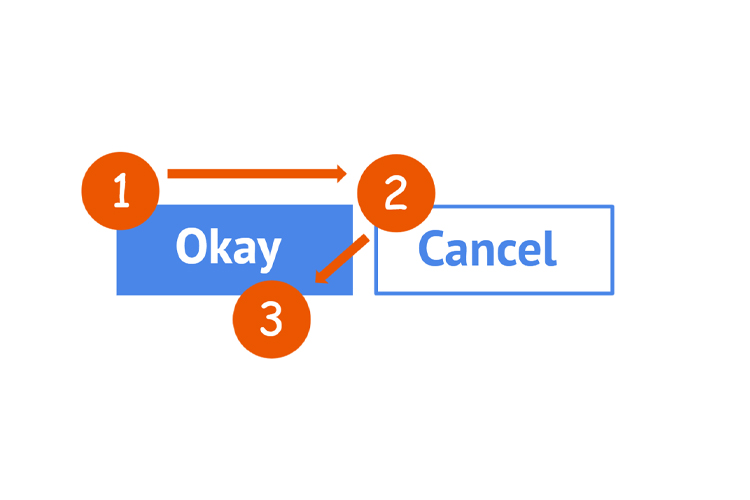
Should the “Okay” button come before or after the “Cancel” button?
For speakers of languages with left-to-right directionality, there is an intuition that the positive context action should come first before the negative action.
In some contexts, having the “Okay” button on the left of the “Cancel” button seems correct.
However, in the context of human computer interaction, having the “Okay” button on the right of the “Cancel” button is better as there is less eye movement required.
By placing the “Okay” button on the left, the eye requires three visual fixations before primary action is selected. Left, to right, to left again.
By placing the “Okay” button on the right, the eye requires two visual fixations before primary action is selected. Left, to right.
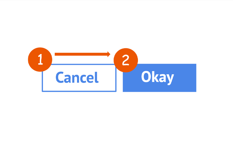
Conclusion
Two is less than three. Put the “Okay” button on the right.