Should icons be solid or hollow?
Icons are everywhere in graphic and web design. They’ve become second nature to how we interpret tasks and actions for interacting with physical and digital interfaces. However, just because they are widely used doesn’t mean there is no room for wrong interpretation.
The biggest difference between icon sets is those which are solid and those which are hollow. But which is best?
Selecting the correct icons for use in a digital interface is not a matter of preference. Research shows that some icons have faster recognition rates than others, and it varies entirely to the context in which they are used.
Allowing a user to interpret and recognise an icon faster will allow them to complete their task with a higher success and satisfaction rate.
Research study
A research study, “Filled-in vs. Outline Icons: The Impact of Icon Style on Usability”, from the University of North Carolina at Chapel Hill, sought to determine whether single-color, “flat” icons would be more quickly and accurately selected by users when presented in either a filled-in or outline style.
An application was developed that allowed participants to take a test measuring their speed and accuracy in selecting prompted icons from an array of distractors. The test was made available on the web and was completed by 1,260 participants.
Averaged across the 20 unique icon forms used in the test, the outline style led to slightly longer task times, but only when icons were displayed in white against a black background.
For individual icons, the effects of icon style were inconsistent and, except for a few exceptions, quite small.
Solid icons were generally faster to recognise than outlined hollow icons as they are often silhouettes of real-life objects. There were some instances where outlined hollow icons performed better. The main identifier was due to certain characteristic cues that the icons had.
Characteristic cues
Characteristic cues are the key identifiers for users to recognise icons. Humans are quick to recognise patterns and familiar shapes, but without characteristic cues, icons and objects can become unidentifiable.

In the test, the padlock icon had no keyhole and was the most misidentified icon with over a quarter of all failures. The keyhole is an essential characteristic cue for the icon to look like a padlock.
When are solid icons faster to recognise?
Most icons are silhouettes of real-world physical objects. We don’t see the world as a cartoon, nothing is truly outlined. This is why humans are faster at recognising solid icons as we have an intuitive familiarisation with shapes.
That’s not to say that we can’t recognise outlined icons, but, they do become harder to recognise if they are overly detailed at the lines are too close together.
The study found that the thumb, scissors, and tools icons were faster to recognize in a solid style. This is because the outline style of these icons all have narrow inner spacing on their cues that create visual noise.
When are hollow icons faster to recognise?
The study found that three icons were faster to recognise when outlined as opposed to their solid variants. This is due to their characteristic cues being more obvious and distinguished as an outlined object.
The characteristic cues of some solid icons risk being misinterpreted when they are scaled to a smaller size. When solid, the characteristic cues risk blurring into the main body of the object.
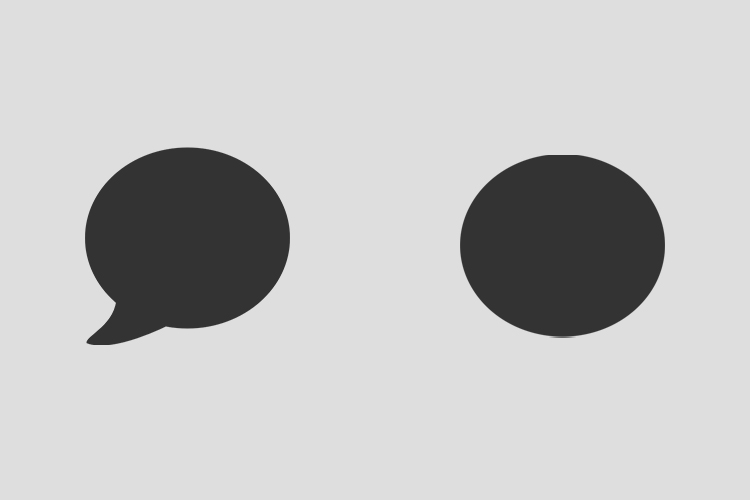
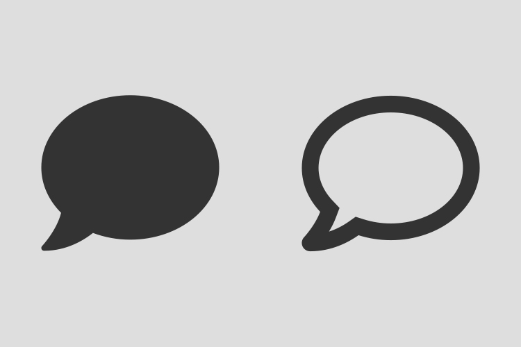
The three icons that performed faster in the test as outlined objects were the speech bubble and the key icons.
Which calendar icon is more recognisable as a calendar icon?
Both of these calendar icons are from the same FontAwesome icon set. Which calendar icon is more recognisable as a calendar icon? Try it for yourself and comment your thoughts.

Key takeaways
- Icons consist of characteristic cues that need to be clearly identifiable
- Solid icons are faster to recognise unless their cues are subtle and not salient
- Outline icons are more recognisable when they have wide inner spacing
- Use solid icons if the outline version creates narrow inner spacing