Don’t make me think
‘Don’t make me think’ is a book by Steve Krug, first published in October 2000. It is one of the most popular introductions to user interface design, with 600,000 copies published in 20 different languages. Now, after 21 years, has the advice come of age, or has the internet moved on so that it is no longer relevant?
Contents
The book consists of 11 chapters.
- Don’t make me think
- How we really use the web
- Billboard design 101
- Animal, vegetable or mineral?
- Omit
needlesswords - Street signs and breadcrumbs
- The first step in recovery is admitting that the home page is beyond your control
- The farmer and the cowman should be friends
- Usability testing on 10 cents a day
- Usability testing: the movie
- On not throwing the baby out with the dishes
The first seven chapters focus mainly on how to improve the navigation of a site, while the remainder focuses on usability testing. The following is a brief summary and some highlights of some of these chapters.
Chapter 1 – Don’t make me think
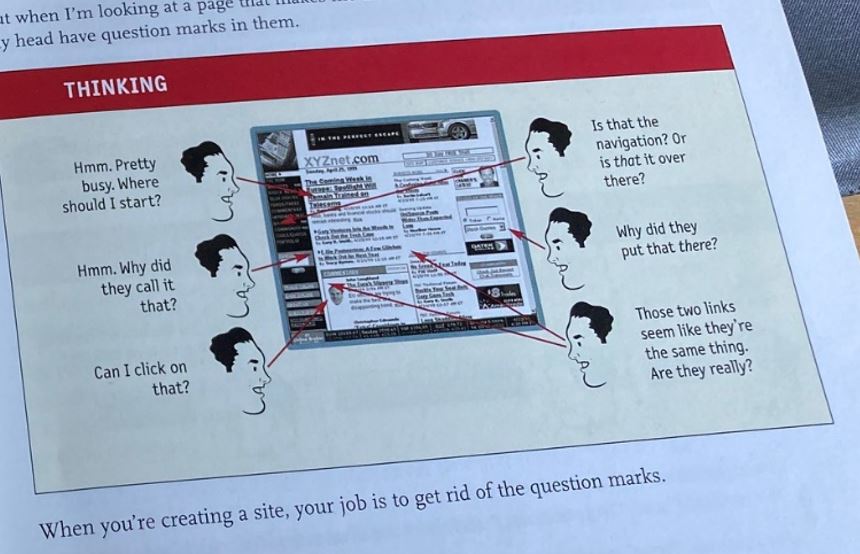
The book starts by considering what’s the most important factor to ensure to make sure a website is easy to use? The answer is not ‘nothing should be more than two clicks away’, or ‘speak the user’s language’, or even be consistent. It’s don’t make me think!
Things that make us think:
- Cute or clever names
- Company-specific names
- Unfamiliar technical names
The goal should be to make each page self-evident. Steve says that sometimes if you are doing something original or groundbreaking, or very complicated you have to settle for self-explanatory – it takes a little thought to get it, but only a little. If you can’t make a page self-evident, you at least have to make it self-explanatory.
“When designing a site, your job is to get rid of the question marks.“
Chapter 2 – How we really use the web
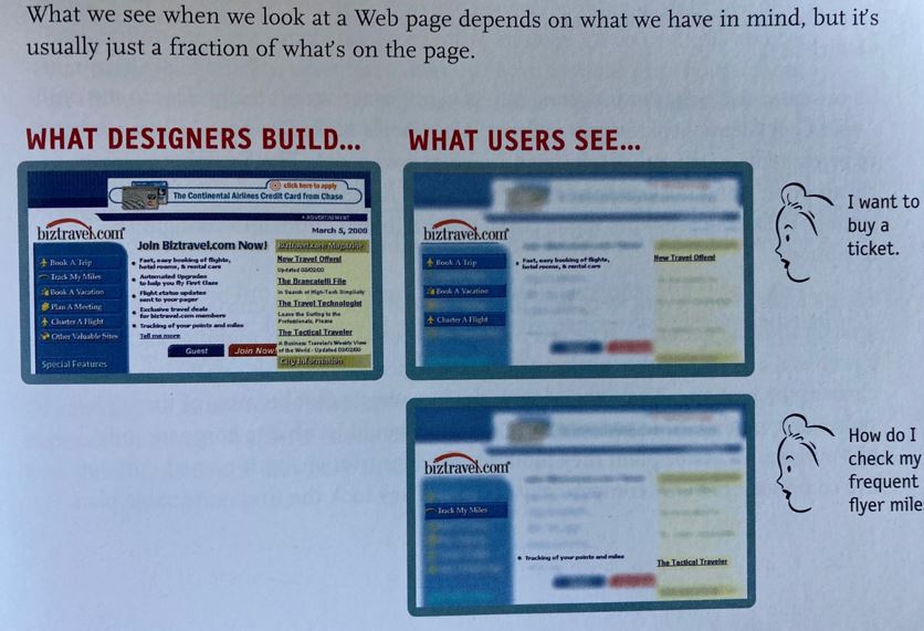
When creating sites we act as though people will carefully read each page. What they actually do (if we are lucky) is glance at each new page and scan some text. Steve says the reality is closer to a ‘billboard going by at 60 miles per hour’!
Why do we scan?
- We are usually in a hurry – most web users tend to act like sharks – keep moving or die.
- We know we don’t need to read everything – we are just looking for the bits that match our interest or task at hand.
- We are good at it – we have been scanning newspapers, magazines, books all our lives to find the parts we are interested in and we know it works.
We assume users will scan a page, consider all the options and then choose the best one. In reality, we choose the first reasonable option, known as ‘satisfycing’. As soon as we find a link that seems like it might lead to what we are looking for there is a good chance we will click on it.
So why don’t users look for the best choice?
- We are in a hurry
- There is not much penalty for guessing wrong. This assumes pages load quickly, if they don’t we make choices more carefully.
- Weighing options may not improve our chances on poorly designed sites. You are usually better off going with the first guess and using the back button if it doesn’t work out.
- Guessing is more fun – if you guess right it is faster and introduces the element of chance of running into something good.
“If your audience is going to act like you’re designing billboards, then design great billboards.”
Chapter 3 – Billboard Design 101
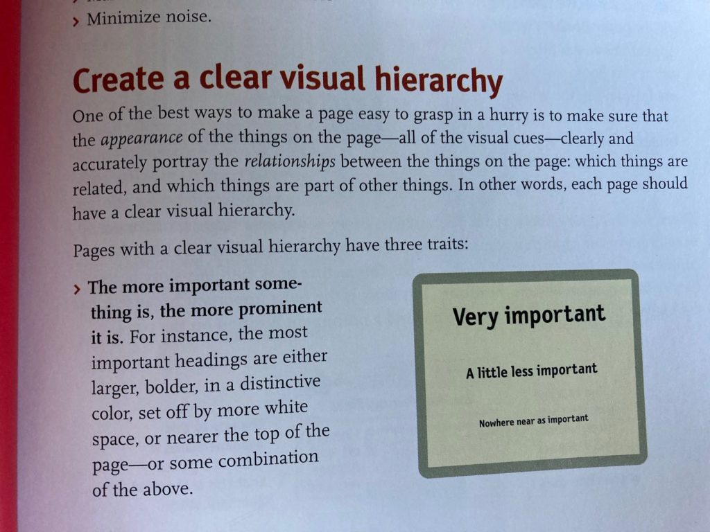
Chapter 3 considers how to make it easy for users to find information while scanning a website. The first is to ensure there is a clear visual hierarchy. This can be achieved by having headings in different sizes.
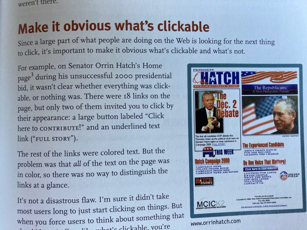
The other way web designers can help users is to make it obvious what is clickable or not. This can be achieved by having links that are easily distinguishable for other text, by having large clickable areas. The example in the book shows a web page that is clearly showing its age, but the principles are still very valid today.
Chapter 4 – Animal, vegetable or mineral
It has often been the case that web designers have specified the maximum number of clicks a user takes in order to get to any page on a site. Steve says that while this seems useful criteria but what really matters is not the number of clicks but rather how much thought is needed to take you to get to what you want.
In general, it’s safe to say that users don’t mind a lot of clicks as long as they have confidence they are going in the right direction. This is summed up by Steve’s second law of usability:
“It doesn’t matter how many times I have to click, as long as each click is a mindless, unambiguous choice.”
Chapter 5 – Omit needless words
Steve Krug’s third law of usability is:
“Get rid of half the words on each page, then get rid of half of what’s left”
Getting rid of words that no one is going to read has several benefits:
- It reduces the noise level of the page.
- It makes the useful content more prominent.
- It makes the pages shorter, allowing users to see more of the page at a glance without scrolling.
Steve particularly highlights two specific kinds of writing: happy talk and instructions.
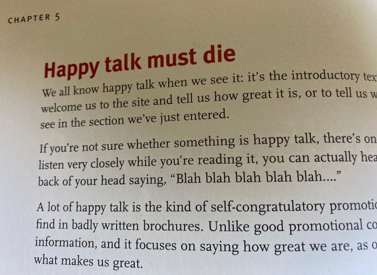
Examples of happy talk are introductory text that welcomes us to a site and tell us how great it is or tell us what we are about to see. A lot of happy talk is self-congratulatory promotional writing that conveys no useful information. Most web users have no time for small talk, they just want to get right to what matters.
The other major source of needless words is instructions. No one is going to read instructions unless they get stuck. The objective should always be to make everything self-explanatory. If instructions are needed, keep them to a minimum.
“Your objective should always be to eliminate instructions entirely by making everything
self-explanatory.”
Chapter 6 – Street signs and breadcrumbs
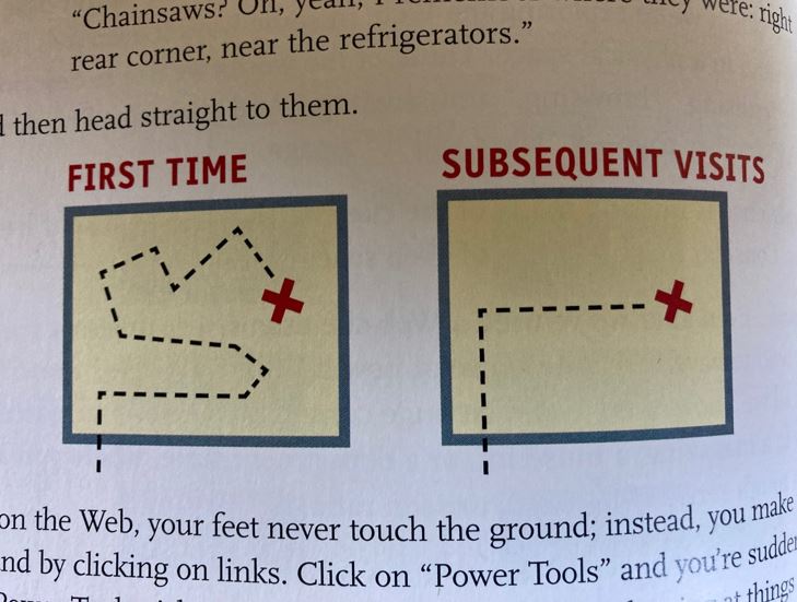
In this chapter, the longest in the book, Steve first considers how you navigate a shop for the first time and then based on this knowledge find an item more quickly on other visits. In a shop, we use the signs etc. and our ability to scan shelves to find what we are looking for. If things don’t work out you can usually ask someone for directions. This is similar to the web, except there is not normally someone around to ask for help. If you can’t find what you are looking for you will leave.
When exploring a website it feels like you are moving around in a physical space, but it is different:
- No sense of scale – you have no idea how many pages there are.
- No sense of direction – no left and right.
- No sense of location – in physical spaces we accumulate knowledge as we move around. We develop a sense of where things belong and can take shortcuts to get to them.
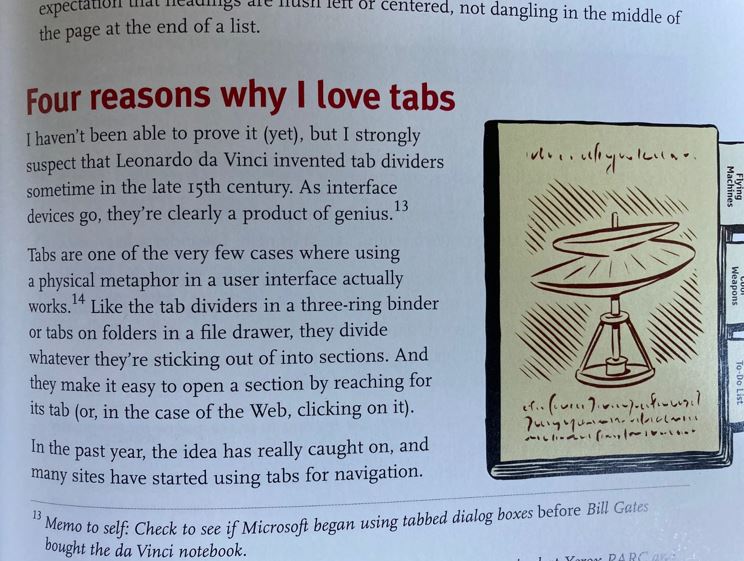
On the web, you have to remember where something is in the conceptual hierarchy and retrace our steps. This is why bookmarks are helpful. Steve also says this is why the homepage is important. However, at this point in the book, I think that the web has moved on, in that searching for information has become the expected way of getting what you want from a site. Steve’s love of tabs to navigate a page is also something that has fallen out of vogue, particularly with the advent of mobile web design, which the book predates.
Having said that, the emphasis in the book on having a well-structured site and making sure the navigation works well is still very relevant today.
“Navigation isn’t just a feature of a web site, it is the web site.”
Chapter 7 – The first step in recovery is admitting the home page is beyond your control
This chapter considers what the purpose of the home page is and how to avoid too many people giving their opinion about it resulting in a site that is confusing and difficult to navigate.
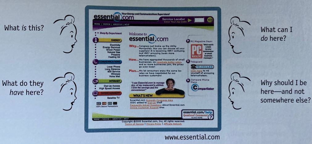
The home page has to answer four basic questions at a glance, correctly and unambiguously:
- What is this?
- What can I do here?
- Who do they have here?
- Why should I be here and not somewhere else?
While the emphasis of this chapter is on the home page, these four questions are relevant to any web page and are true today. However, the remainder of the chapter where Steve gives examples of what constitutes a good home page design is hard to relate to. For example, Steve considers the use of rollovers and drop-downs for navigation, which are no longer a common pattern.
Chapter 8 – The farmer and the cowman should be friends
The remainder of the book starts to look at usability testing and the best approach to take. The quotation ‘the farmer and the cowman should be friends’ is the title of a song from the musical Oklahoma. Steve uses this as an example of what happens in teams where there are different perspectives on what constitutes good design based on what they do for a living. For example, designers tend to think that most people like sites that are visually interesting because they like sites that are visually interesting. On the other hand, developers tend to think that people like sites with lots of features because they like sites with lots of features.
These different view points miss the point. There is no such thing as the ‘average user’, one who is like us. The danger of seeking such a user is that it reinforces the idea that good web design just involves determining what people like. Rather it is summarised by:
“All web users are unique, and all web use is basically idiosyncratic”
Chapter 9 – Usability testing on 10 cents a day
Chapter 10 – Usability testing: the movie
Chapter 11 – On not throwing the baby out with the dishes
The remaining three chapters of the book go into depth on how to carry out usability testing. The advice given in this part of the book is timeless and is full of great advice. For example, Steve emphasises that focus groups, where small numbers of people react to ideas and designs, is not a usability test.
Focus groups can be good for determining what your audience wants or needs, for testing the names of features, or finding out how they feel about the competition. But they are not good for learning whether a site works and how to improve it. Testing has to be carried out one user at a time.
Testing reminds you that not everyone thinks the way you do or uses the web the way you do. But, how many users should you test? Steve says:
- Testing one user is 100% better than testing none.
- Testing one user early in the project is better than testing 50 near the end.
- The importance of recruiting representative users is overrated – it is much more important to test early and often.
- The point of testing is to inform your judgement, to choose with greater confidence what the appropriate solution is.
- Testing is an iterative process – need to test, fix, and test again.
- Nothing beats a live audience reaction.
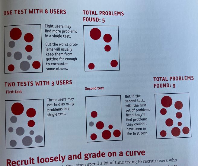
Steve advocates that the ideal number for each round of testing is three to or at the most four users. The first three are likely to encounter the biggest problems. It is more important to do more rounds of testing. Testing only three users ensures that another round of testing will happen. It also means that it is possible to test and debrief on the same day. It is better to stay focused on the biggest problems, fix them and then test again as soon as possible.
The whole of these three chapters can be summed up by:
“If you want a great site, you’ve got to test”
Conclusion
While parts of Steve’s book show its age, the central advice is very relevant today. I could have cited more nuggets of advice, but it would be best if you can get a copy of the updated book, published in 2014 and discover these for yourself. For further details see Steve Krugg’s website: sensible.com

