Unpacking the power of data at Information+ 2023
In late November, I had the pleasure of attending Information+ 2023, a conference that brought together data visualisation professionals from across the world in equally as many fields. The experience was incredibly informative and enlightening, offering a deep dive into the current and emerging trends in how we communicate complex data.
The conference showed the need to rethink our approach to data collection and presentation. In a world awash with data, finding novel and engaging ways to present it is critical. The conference highlighted several innovative approaches, including the use of interactive tools and thoughtful consideration of user experience in data visualisation.
Insights
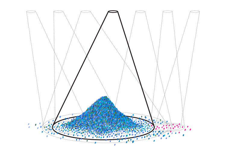
The conference shed light on a lot of the pitfalls and best practices in data visualisation. One particularly relevant talk by Erik Escoffier discussed the biases inherent in datasets, exemplified by Google Experiment’s ‘An Ocean of Books’ project. This case study revealed how certain collection methods can inadvertently exclude significant demographics, like women authors, highlighting the need for more inclusive data practices.
Complementing this, Muna Alebri’s talk, Inclusivity in the visualisation research: are we leaving right-to-left readers out?, showed that a vast majority of Computer Human Interaction research is sourced from a small, predominantly English-speaking segment of the world, shedding light on the overlooked needs of non-English speakers in data visualisation design.
These insights will help steer the Digicomms approach to analysing and communicating data about the web – making the information we share more accessible and inclusive.
Tools
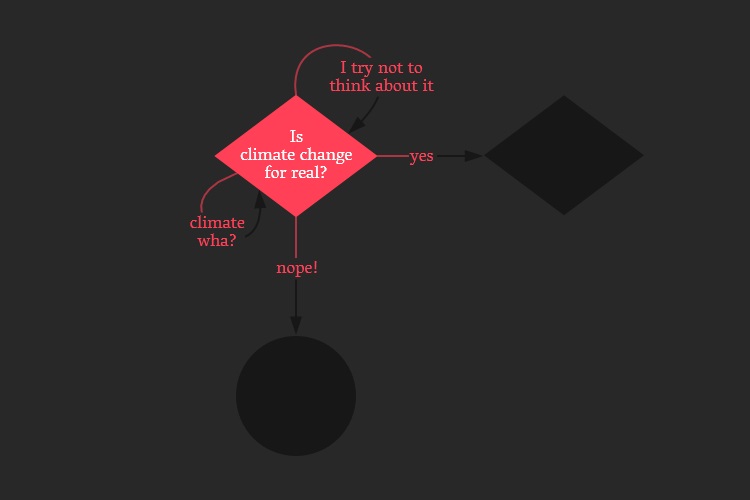
I was particularly impressed by the tools showcased at the conference, especially Olli, an innovative accessibility tool for data visualisations that enables users to navigate charts through their keyboard. Alongside Olli, another standout tool I learned about was the Interactive Flowchart developed by UCLAB Potsdam. This tool facilitates the creation of intricate, interactive flowcharts, greatly enhancing the ability to visualise complex processes and decision trees in a user-friendly manner.
It shows how advancements in visualisation tools are making data interpretation and interaction more intuitive and accessible. Both of these tools showcase big steps towards broadening the reach and impact of data visualisation, reinforcing the importance of innovation and inclusivity in the field.
New friends
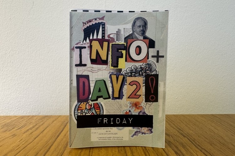
Beyond learning, the conference was a hub for sharing and collaboration. The friendly atmosphere encouraged attendees to share their craft: one attendee even made mini zines for each day of the conference that featured data visualisations from the previous day’s talks. I was fortunate enough to get to speak to many people working in the field whose knowledge and resources I will continue to learn from as I grow in my role as a data analyst.
The conference showcased the passion, creativity, and collaborative spirit of the data visualisation community. Information+ 2023 was a blend of ideas, innovation, and inspiration that shows the future of data visualisation is bright.