Mobile first and responsive design
The core design mission of the new St Andrews website is to cater for mobile devices, as these are rapidly becoming the dominant medium for web.
While most organisations still commission a website to look good on their computer first and work on mobile second, we have made the switch to a responsive web design just in time.
If we had waited any longer, then our website would soon become redundant and reflect badly on the University.
As the mobile becomes the main device for browsing the web, “mobile-first” will become less of a buzzword and more of a requirement.
We’re not only making our site become more accessible on mobile devices, we are also interpreting the best of mobile app designs and implementing them into our website’s design. It won’t be long before the difference between a mobile app and a website may disappear entirely.
Responsive design
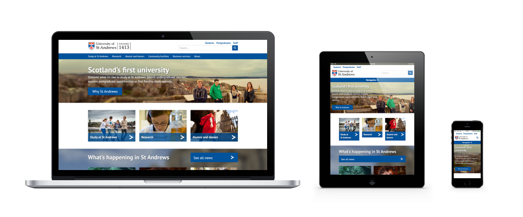
We have adopted the bootstrap framework to allow our site to be fully responsive on all devices. What is responsive design? Here’s a helpful video with a brief explanation.
At this time, the team have catered for mobile first and desktop second. The site is fully responsive and can be viewed at all resolutions. However, there are instinctive methods a user will apply when browsing a desktop version of a site that differ from mobile. These methods will be catered for over time as we adapt the website for higher resolutions.
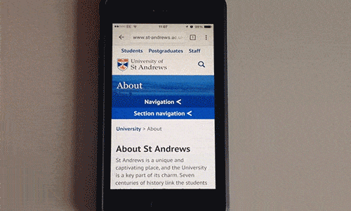
Mobile gestures
In the early days of web, you might remember navigating a page by using a thin bar to the right of your browser window called a scroll bar. Some level of precision was required to use this tool. The more experienced users would use a scroll wheel on their mouse to navigate a page and also test their eye-hand coordination when clicking on small buttons with pin-point accuracy.
In 2015, we have more or less adapted to natural user interfaces. We have cut out the middle man of sidebars, and now rely on our own evolutionary blessing, thumbs.
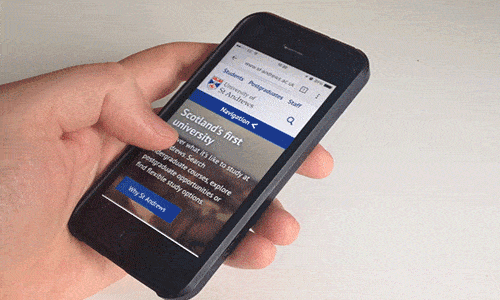
Modern websites have adapted to have fewer items to click on, and have much more scrolling. We see fewer text links on pages, and more big clickable buttons. This is a result of using smaller screens which are responsive to touch. We’re now less focused on things being ‘above the fold’ or how many scrolls it takes to reach the bottom of the page, as these things change depending on the device the user is holding. Instead, the focus is on not overloading a user with information, and making navigation as natural as possible.