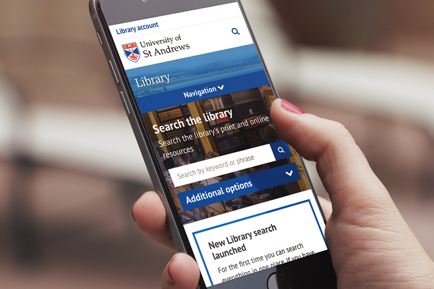
New University library homepage
On Monday 13 January 2019, the digital communications team launched an improved University library homepage. This update was made in light of the feedback gathered by library staff in focus groups and from the design…
On Monday 13 January 2019, the digital communications team launched an improved University library homepage. This update was made in light of the feedback gathered by library staff in focus groups and from the design…
We are presented with a plethora of options when it comes to browsers and devices to access the web with, but which ones do the world at large use? Does this make a difference in how we design and build websites? This…

The core design mission of the new St Andrews website is to cater for mobile devices, as these are rapidly becoming the dominant medium for web. While most organisations still commission a website to look good on their…
As part of our work around developing a solid strategy for the University website for next few years, over the last couple of days we’ve been doing a little ‘competitor analysis’ and have visited over 200 university…
It feels like the web is evolving at a frightening rate these days, and while we’re being encouraged to design for mobile first even the technical specifications (particularly HTML5, and CSS3) haven’t settled down yet…
Ink is a fairly new framework from Zurb, who brought us the Foundation CSS framework, for creating responsive HTML emails. It’s been a while since I’ve been asked to help put together an HTML email but as news of this…