Grid—a simple guide to responsive web design
It feels like the web is evolving at a frightening rate these days, and while we’re being encouraged to design for mobile first even the technical specifications (particularly HTML5, and CSS3) haven’t settled down yet and are still subject to change.
For example, there is currently a lot of energy being put into how to deal with responsive images: you don’t necessarily want mobile devices (possibly with smaller screens and slower bandwidth) to download images that would be more appropriate on desktop browsers, with larger screens and possibly fibre-optic broadband connections.
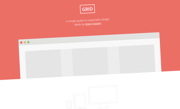
If you are feeling a little overwhelmed by it all and wondered where to start then I can recommend Grid, a simple guide to responsive design, created by Adam Kaplan, a designed from Chicago.
In seven simple steps he unpacks all the important stuff: why and how. And then he ends it with an encouraging, non-threatening challenge: practice makes perfect.