New Museums and Collections website
I say “new”, but the Museums and Collections website actually launched a good few months ago now. But I have been so busy over the summer that I haven’t got round to writing about it, until now.
I recall that the very first meeting I had when I began working here two years ago was about the Museum Collections Unit’s web presence. The ultimate result was this new website, which we worked on during the spring and summer.
The visual design was created by Steve Evans, the Web Manager. It was then passed on to me to build within our content management system, TerminalFour Site Manager.
It is a fairly complex website, and definitely the most challenging project I have worked on. I really enjoyed stretching my limits and working with T4 Site Manager in new ways.
Creating the homepage
My first task was to create the ‘four panels’ page, as I called it. This is the overarching Museums and Collections homepage, which links through to the individual websites for each of the four museums. Each museum is represented by a square, which expands to reveal more information when the user hovers over it.
This uses JavaScript, which has not been a particular strong point of mine in the past. But I am beginning to wonder if that has changed, because I surprised myself when I managed to achieve this result quite quickly.
Personally speaking, this is not the sort of design I would normally opt for. But in the end I think it has turned out quite well and feedback from others has been positive.
Building the website in T4 Site Manager
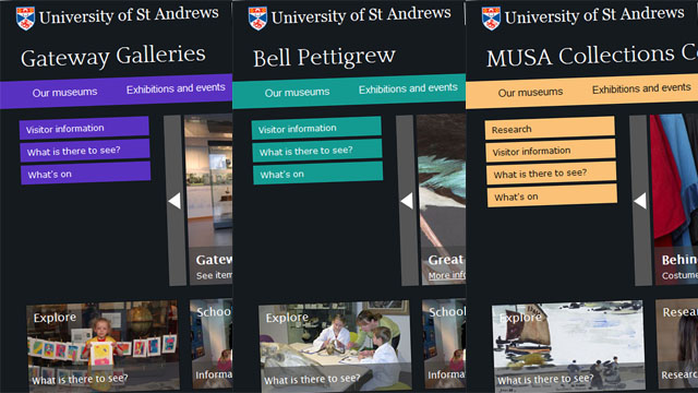
The five websites themselves all share the same basic building blocks, but are subtly given unique identities. For this, I had to be quite creative in the way I built the website in T4 Site Manager, in order to avoid unnecessary duplication. I did not want to create several styles (which can be a pain to maintain in the long run) and templates that all looked almost but not quite the same.
This meant creating lots of navigation objects and ‘related’ sections instead. This is one of the trickiest parts to get right. It is a jigsaw puzzle with lots of different potential solutions, but each with their own little pros and cons. So it takes some careful thought. But it’s easily worth it for the long-run benefits it brings in terms of ease of maintenance.
A bit of creativity in using existing navigation objects was also required to give each museum’s website its unique identity. This allowed me to use the same style (page layout) for each website, while still being able to assign different CSS stylesheets to each website’s homepage, and separate stylesheets again for the lower level pages. This is what enables each website to have its own colour scheme, yet still all use the same style.
Other interesting bits
While working on this website, I also used the Google Maps API v3 for the first time for the maps on the visitor information pages. As far as I know, it is the only part of the University website that uses this newest version of the Google Maps API.
I was surprised to find it pleasingly easy to work with, and I think it provides a smoother user experience than version 2. The newer version is designed to work better on mobile devices too.
Another interesting part of the website is the virtual tour of MUSA’s Learning Loft. This was another first for me, working with Flash as well as JavaScript (normally we only use Flash for videos). But again this turned out to be reasonably straightforward in the end, and looks really good on the webpage.
Visual design
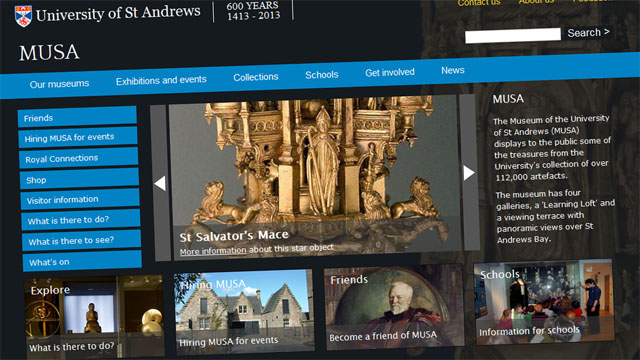
Initially the Museums and Collections website was going to be a more conventional affair. But Steve was inspired to create something more striking after seeing some of MUSA’s physical promotional material. Steve’s decision led to him creating a brilliant design. The Museums and Collections webpages are now, in my view, some of the very best looking pages on the University website.
On reflection, the decision to go with an image-heavy design makes perfect sense for a Museums and Collections unit that can draw on 600 years of history for its visuals. There are some fantastic images of some of the objects in the collections, which helps make these webpages particularly appealing to look at.
Summary
The new Museums and Collections website was a brilliant project to work on. It threw all sorts of challenges at me, but this was a great opportunity to learn. It took a while to get it right, but I think the result is a really eye-catching website.


