Standardising the use of Google Maps
Look through the University’s website and you’ll find that there’s a wide variety of map styles being used. With things like map size, marker colour, how marker information is displayed (information window) and many other features varying throughout the site.
Standardisation
Most of the maps on our site are already using Google Maps but they all seem to be different in some way or another. There are also a handful of maps that use other providers such as Bing and Streetmap, there are even a couple of pages where an image of a map is being used or where users have to download a PDF version of a map.
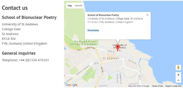
This variation led us to the decision to create a new standardised map style so that all of our maps will have a consistent look and feel, and work in the same way across the whole site. To achieve this we developed a new map pattern for our digital pattern library. With our new pattern we have created a map with a standard height and width, marker colour and information window.

Easy to use
One of the main challenges we faced when creating the new map pattern was to make sure that its implementation would be as easy as possible for both developers, creating applications or web pages, and content editors.
To achieve this we decided to make the pattern have the ability to use either internal or external data for the map marker locations. Using external data allows us to can keep all of the map function and style code separate from the location data. This way, non-technical minded users can update location information without having to search through complicated code, this is especially useful when using maps within our content management system. On the other hand, internal location data can be use when developing standalone applications or where location data doesn’t need to changed.
Mobile friendly
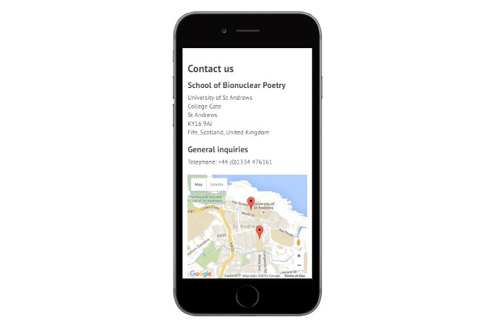
Another one of the main challenges was to make sure that our design was responsive. With more and more people using mobile and tablet devices to access the internet we had to make sure that our maps would work on a wide range of devices and still maintain a consistent look and functionality. We also had to make sure that the map didn’t take up the whole screen on a mobile device. If it did take up the whole screen the user could end up being trapped on the map unable to scroll through the rest of the page.

These issues were resolved by using the Bootstrap framework. The design for our new website uses this framework so we were able to use Bootstrap classes to ensure our map design resizes itself based on the screen size of the device that’s being used to view it.