Scrolling and the illusion of completeness
How can web designers and developers encourage users to scroll? In 2018, the Nielsen Norman Group reported that 57% of user’s viewing time was spent above the fold (the first visible area of a webpage without scrolling), with the percentage drastically dropping off afterwards. The Nielsen Norman Group (NNG) has dubbed this issue the “Illusion of Completeness” – when the initial visual content on the screen seems complete but actually, more information exists below. This post is a summary of Kim Salazar’s article on “The Illusion of Completeness” and how it applies to the University website.
What is the illusion of completeness?
The term “illusion of completeness” was coined all the way back in 1998 by Principal of the Nielsen Norman Group, Bruce Tognazzini –
“The first screenful of a web page tends to look complete. Unless the screen happens to break across some graphical element or divides a line of text in two, users will assume they have seen it all and will move on.”
So, if the first screen of your webpage looks like the page is complete but it is not, users can miss valuable information and it can prevent them from achieving their goals easily, which isn’t good for usability.
The following sections show what design styles could give off the impression that the content is finished and therefore, will create the illusion of completeness.
Hero banner
A full-page image with a heading and a call-to-action button is eye-catching and visually appealing but it often pushes important information off-screen.
In the article, the Nielsen Norman Group conducted a usability study and asked users to visit the example site and find out what service the company offered. 75% of the users did not realise that they could scroll down the page and were ultimately unable to find out what the company did. All the users clicked the call-to-action button and entered their details only to find out that the service was not even available in their area.
Distinct horizontal lines
Horizontal lines will usually indicate the end of a section, but users may also assume that it is the end of the page. A break in the content marked by a full-width container line creates a visual barrier and discourages people to scroll further down the page.
Expansive space between elements
If there is a lot of space between one piece of content and the next, it can give the impression that there is nothing else to see below. Users will not continue to scroll if it looks like nothing else is there for them to look at
Content interruptions
Adverts, social media sharing buttons and links to other internal pages are just some of the things that can indicate that they have reached the end of the page. If these things are put in the middle of a piece of content, users may be put off scrolling, especially if the user is on a tablet or a mobile phone. Even if these interruptions were placed at the end of an article, people may assume that there is no more content or information underneath, when there could be a comments section or related article links.
Incorporating these techniques into the St Andrews website
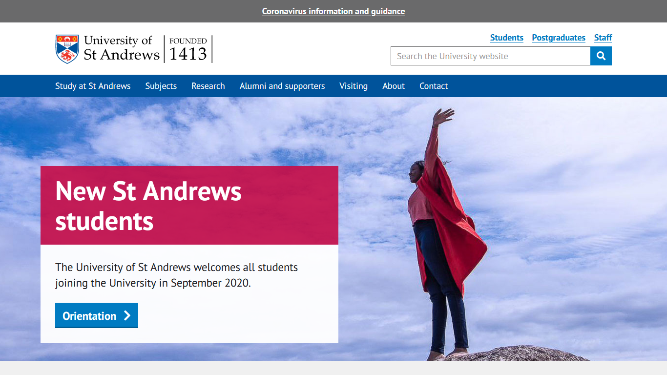
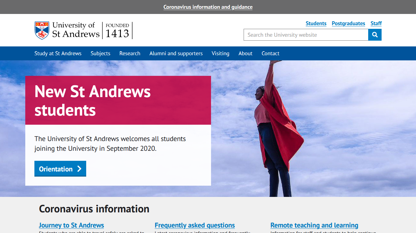
We can use some of these techniques on the University homepage to see if it would make a difference in removing the illusion of completeness and encourage users to scroll. The screenshot sizes are based on analytics showing the average screen resolution of users visiting the University homepage.
The hero banner takes up most of the screen, pushing down the Coronavirus information section. The blank space below the hero banner may suggest that this screen has no more information or content to offer, which is not the case!
By reducing the height of the hero banner and some of the blank space underneath, the Coronavirus information section now peeks above the fold. Below the Coronavirus information sub-headings, the cut off text indicates to users that there is information below the fold and encourages scrolling down to find out more.
Avoiding the illusion of completeness
To summarise, these design practices should be avoided to encourage users to scroll and prevent the illusion of completeness:
- Avoiding full-screen hero content. If using hero banners, carousels, or full-screen video, make sure that the additional content peeks above the fold to show users that there is more content available to scroll down to.
- Be aware of contrasting lines and vast space between content. These design elements can incorrectly signify to a user that the content has ended.
- Do not interrupt the content. If anything must be added to the middle of a piece of content, such as an advert or social media sharing links, let the users know that the content continues further down the page.
- Test on many devices. Take all the previous points into consideration and make sure it translates over effectively to different screen sizes and devices.

