Bad UX design fails
The internet is a wonderful place. It is a modern library of all knowledge, the epicentre of human creativity, and the source of horrible user interface patterns that create an infinite amount of frustration.
This post is a series of rants. Spooky stories for everyday internet folk. So brace yourself as I, a digitally dependent millennial, tear apart common user experiences that are a chronic annoyance.
Unrelated on-load overlays
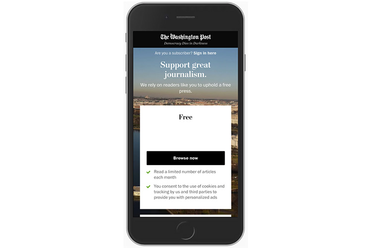
You have completed a quick Google search and clicked on a result ready for the answer you’ve been looking for to be provided. The page loads. You begin to read the content, ready to scroll down the page.
Suddenly, you are stopped.
The screen darkens to a shadowy grey and a boxed message appears.
Subscribe to our newsletter!
You can no longer scroll the page to find your answer. You have been prevented from doing so by this hurdle.
A smartly dressed pop-up demanding that you subscribe to the newsletter of a company you have only just heard of.
You don’t even know what the company does. You just know that they have the answer you’re looking for, and that’s all you care about.
If a website forces you to deviate from your current internet journey, then that is bad UX.
You spend the next 20 seconds of your life looking for the microscopic close icon that requires a precision click to dismiss this ad.
You give up and click back to your Google results page. You never want to go to that website again…
The solution
Keep the call to actions relevant to the user journey. If the user has interest in signing up for a newsletter, then allow them to freely navigate to a dedicated page where they can do so.
Do not impede their journey. Nobody likes that.
Clicking on the wrong link because the web page moved itself
You’ve landed on a new web page and instantly see the link to your desired destination.
You click, and at the last possible second, you notice that the web page has moved itself and made you click on the wrong link.
The website loaded in some fancy javascript application, and because it took so long to load, it moved a bunch of links around when it finally appeared after you started browsing.
Was it even worth it? Should you have been more patient? Should you be blaming yourself?
No. You should be blaming the website.
If a website has forced you into a mistake, then it is bad UX.
You are now on the wrong page and have to navigate back.
This time, you wait for the page to fully load before clicking on your desired link because you know not to be tricked by the website again…

The solution
Make your navigation web pages simple to reduce load times. Don’t force the user to download unnecessary applications or code that is irrelevant to the website’s top tasks.
Unnecessarily long dropdown lists
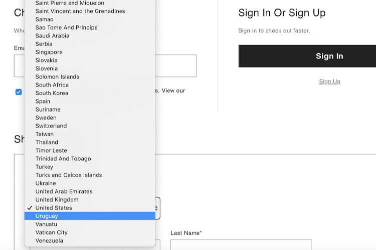
You are filling out a form on a website. Time to choose your country of residency.
You click on the dropdown and are presented with a list of every country on the planet. There are no grouped categories. It is just a long alphabetical list.
You submit yourself to the task of scrolling to the bottom of the list to click on ‘United Kingdom’.
Ukraine.
United Arab Emirates.
United States.
Uruguay.
Wait. Where is “United Kingdom”?
You have now to scroll up the list to find Scotland and hope it is actually there.
If a website presents you with a long dropdown list with no subheadings and no indication of what you are actually looking for, then that is bad UX.
The solution
Don’t use dropdown lists with more than ten options. Use an auto-complete box instead.
On this example, if the user types in ‘Scotland’, then auto-complete it with ‘United Kingdom’.
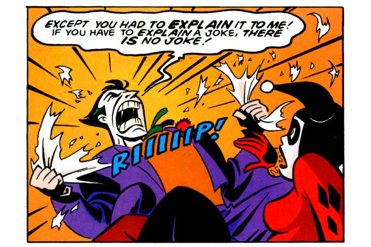
Instructional videos on how to use the website
This is a short and simple one.
If a user has to watch an instructional video walkthrough of how the website works, then that is bad UX.
If you have to explain why a joke is funny, then it is a bad joke.
If you have to explain how a website works, then it is a bad website.
The solution
Make your website simple for the user. Design, test, and build alongside a representative of the user group. It’s that easy.