Avoid uninformative link phrases
Links are more useful when they make sense out of context.
Studies show that most users inevitably skim the page for links and headings, so your link titles should be punchy and clear; specific calls to action, even out of context.
Screen readers can read out a list of all the headings or links on a page. This enables the user to jump to the desired item without listening to all the content.
You should avoid non-informative link phrases when writing for the web.
It is also a legal requirement to ensure links comply with the Web Content Accessibility Guidelines (WCAG).
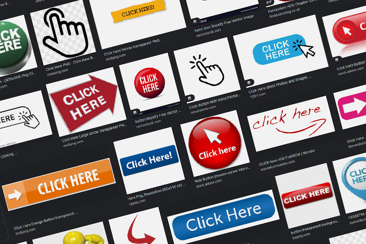
Examples of uninformative link phrases
- Click here
- Here
- More
- Read more
- Link to name of a page
- Info
Why are these link phrases uninformative?
None of these make sense out of context. The user must read each sentence in full to understand what the link does.
They don’t even make that much sense when in context. The user would have to click through and a read some of the following page before they knew if the link was what they were looking for.
Uninformative link phrases are not unique. This makes it harder for users to skim a page and find the correct link for them.
Place the link on text that clearly and uniquely describes where the link goes.
Make your links compelling!
Users who are skimming for relevant content are likely to ignore uncompelling link phrases. Make the preface of your link interesting to encourage users who are looking for your content to engage with it.
Example of a uncompelling link
Click here for an article on accessible links.
Example of a compelling link
We have a comprehensive article describing how screen reader users use links.
The phrase “click here” is redundant by default…
The phrase “click here” is unnecessary, even if it precedes a more meaningful phrase.
For example, a link that says “click here to access your orders” can be just as easily be shortened to “your orders.”
There is also the argument of the action “click” still being a standard in today’s world. Users access links not only with clicks, but with taps, buttons, key presses, even kinetic movement.
What do links look like for keyboard users?
Keyboard users navigate webpages with the tab button. The cursor jumps directly from link to link when the tab button is pressed.
Since the page jumps down to the link, the clearer the link title alone is, the less likely they have to use their arrow keys to scroll back for more context.
What do links look like for screen reader users?
Screen reader users can press a hotkey to bring up a list of links on the page.
These links are presented completely out of context.
In a well structured page, the list might read:
- Study
- Subjects
- Research
- Meet us
In a poorly structured page, the list might read:
- click here
- click here
- read more
- more info
We have written about designing for users of screen readers before. Here is an example video of a user navigating webpages with the JAWS screen reader software.
Resources regarding uninformative link phrases
- “Click Here” to “Read More”: Why Ambiguous Links are Problematic – PopeTech
- Why use descriptive links? – Mario Eiland, with a screen reader – YouTube
- You’re not still using “Read More” are you? – Prototypr.io
- Creating valid and accessible links – The A11y Project
No one should be excluded because of their disability.
As well as being the ‘right thing to do’, it’s a legal requirement to treat people with disabilities equally, in terms of opportunities and experiences. When designing a service, accessibility should be a priority.
Understanding accessibility means we can build services that work for everyone, whatever their access needs.
For best practice, follow current accessibility and plain English guidelines, as well as the requirements of the Equality Act 2010 and Northern Ireland equality legislation.