Don’t make me think
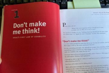
‘Don’t make me think’ is a book by Steve Krug, first published in October 2000. It is one of the most popular introductions to user interface design, with 600,000 copies published in 20 different languages. Now, after…
‘Don’t make me think’ is a book by Steve Krug, first published in October 2000. It is one of the most popular introductions to user interface design, with 600,000 copies published in 20 different languages. Now, after…

Experienced designers will likely agree that inspiration from other sources is not stealing when it comes to user interface design. It’s called “best practice research”. One phrase I reiterate when others…
Why we banished the hamburger menu from our iPhone app The hamburger menu is one of the oldest icons in the history of graphical user interfaces. It was included in the Xerox Star, one of the first ever graphical user…
Improving Gov.uk’s navigation This is an interesting article about changes to the navigation of Gov.uk. I was struck by the fact that Gov.uk has three different ‘content areas’: mainstream, specialist and whitehall.…
‘Hey, you there’: the trouble with audience-based navigation Gov.uk shared something very interesting about their experience with audience-based labels in their webpages. They found that people do not always identify…
Side drawer navigation could be costing you half your user engagement The side drawer navigation menu is similar in function to the hamburger menu, as used on the Study at St Andrews website. The side drawer /…
Global navigation is less useful on large, complex websites Here is a thought-provoking article about global navigation. We made the decision to remove the University’s global navigation menu from the Study at St…
One of the biggest issues we have had to tackle while working on the new Study at St Andrews website is the entrance requirements and country information section. The website contained a Flash world map that was…
User expertise stagnates at low levels When users learn how to use a website, they are doing just that – learning how to use it. This is why consistency is so important. Terminology, navigation menus and the general…
Lost for words: Google stops providing keywords A couple of weeks ago, I covered the news that Google Search was no longer passing on keyword data to analytics tools. This blog post from the Government Digital Service…